pk <- data.frame(
  ID = c(1, 1, 1, 2, 2, 2),
  TIME = c(0.5, 1, 2, 0.5, 1, 2),
  DV = c(2.1, 3.8, 3.0, 1.6, 2.9, 2.4)
)

pk
ID TIME DV
1 1 0.5 2.1
2 1 1.0 3.8
3 1 2.0 3.0
4 2 0.5 1.6
5 2 1.0 2.9
6 2 2.0 2.4Big idea: Before fancy plotting libraries, there is base R. If you understand plot(), you understand the core idea of visualizing relationships in R.
By the end of this lesson, you will be able to:
plot().Even though modern workflows often use ggplot2, base R plotting is still important because:
When you call:
plot(x, y)R takes one numeric vector (x) and places it on the horizontal axis, and another numeric vector (y) on the vertical axis. It then draws a visual relationship between them.
In pharmacometrics (PMx), this simple relationship — time vs concentration — is the backbone of nearly every exploratory analysis.
pk <- data.frame(
ID = c(1, 1, 1, 2, 2, 2),
TIME = c(0.5, 1, 2, 0.5, 1, 2),
DV = c(2.1, 3.8, 3.0, 1.6, 2.9, 2.4)
)
pk ID TIME DV
1 1 0.5 2.1
2 1 1.0 3.8
3 1 2.0 3.0
4 2 0.5 1.6
5 2 1.0 2.9
6 2 2.0 2.4Think of:
ID → subject identifierTIME → time after dose (hours)DV → observed concentrationEach row is one observation. Each column is a variable.
plot()plot(pk$TIME, pk$DV)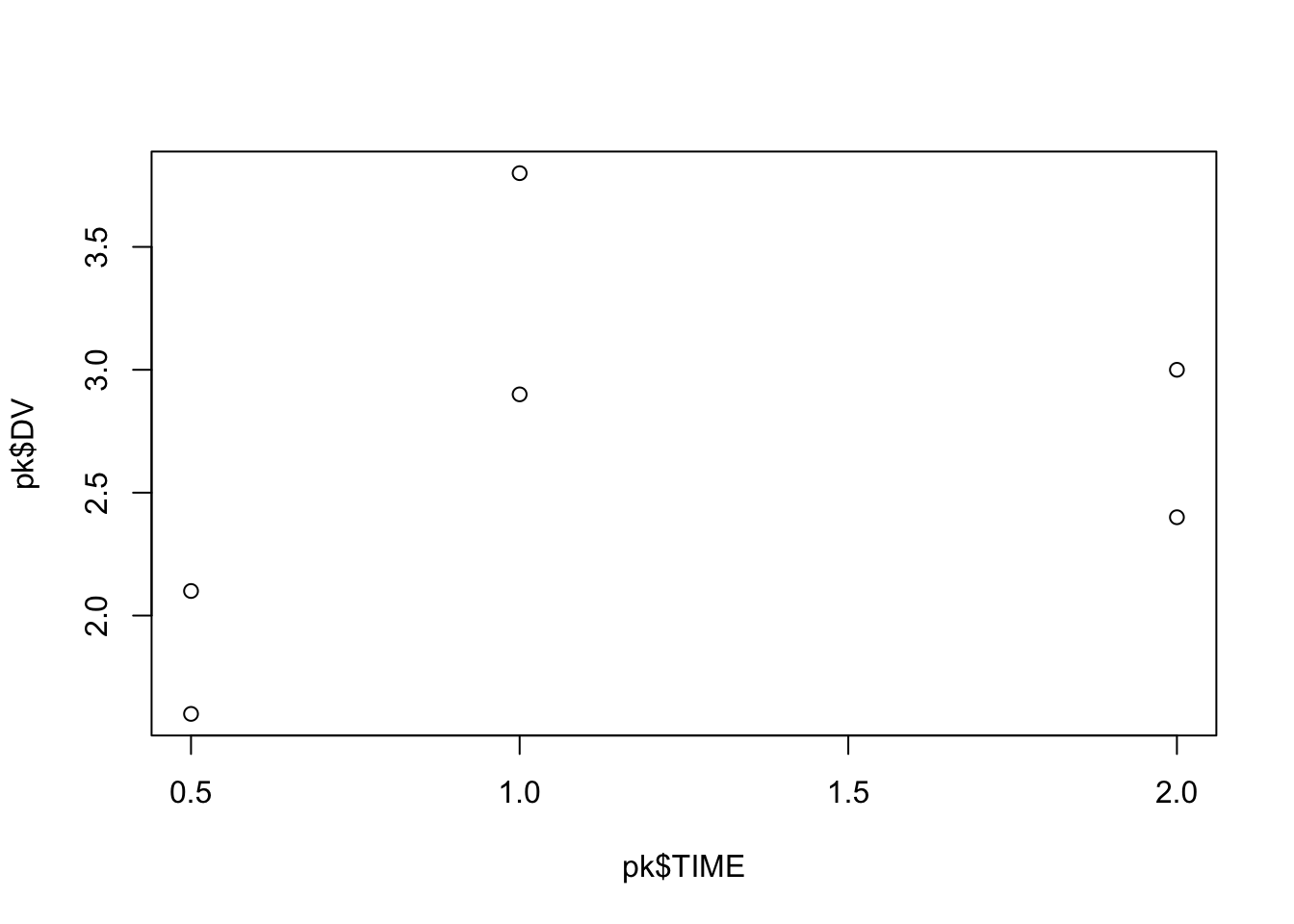
This produces a scatter plot.
Behind the scenes:
TIME is mapped to the x-axis.DV is mapped to the y-axis.This alone already lets you visually inspect trends, variability, and potential outliers.
plot(
  pk$TIME,
  pk$DV,
  xlab = "Time (hours)",
  ylab = "Concentration (mg/L)",
  main = "Concentration vs Time"
)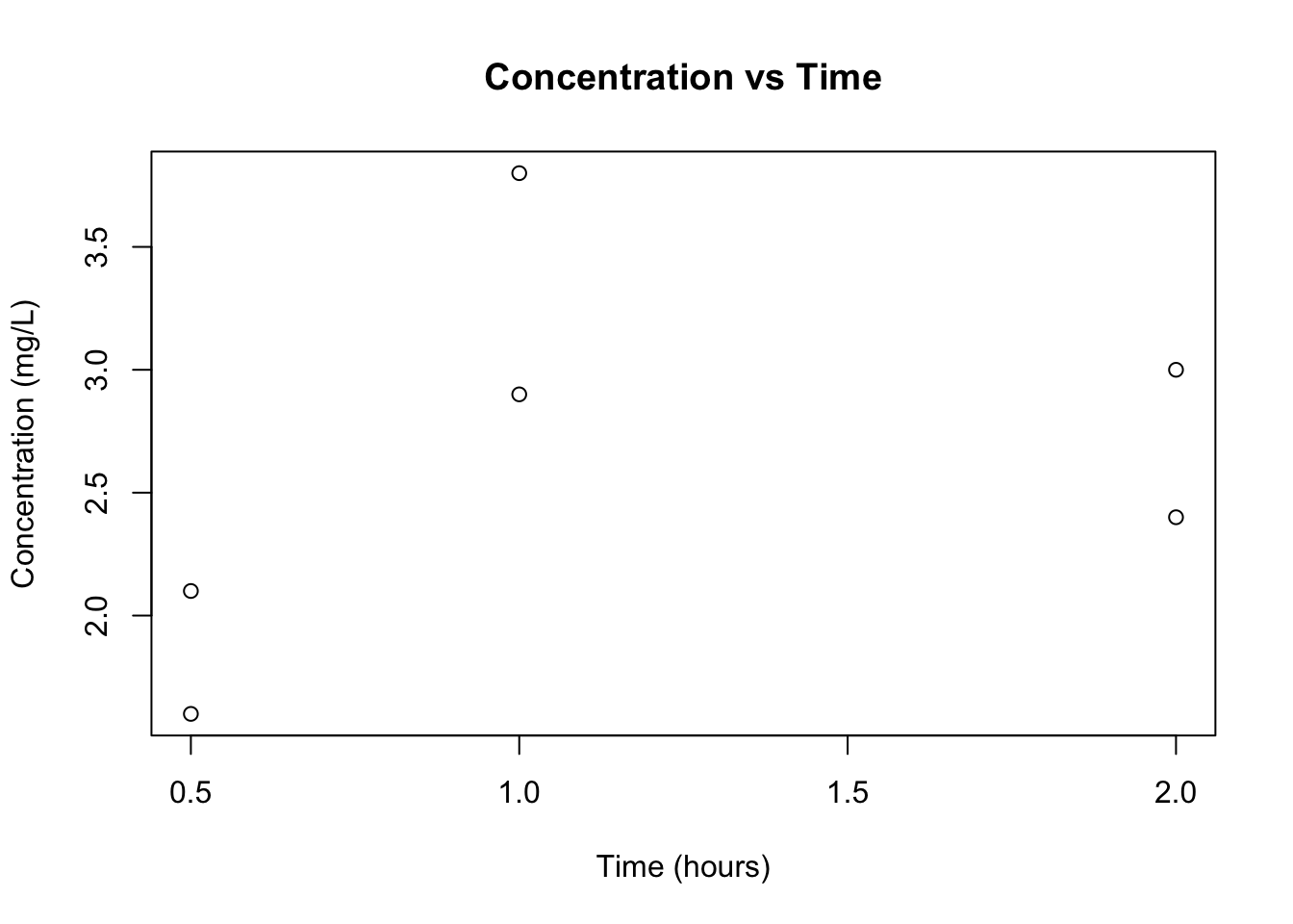
Now the plot communicates clearly what is being shown.
PMx habit: Always label axes with units. Plots without units are scientifically incomplete.
By default, plot() draws points (type = "p").
Common options:
"p" → points"l" → lines"b" → bothplot(
pk$TIME,
pk$DV,
type = "b",
xlab = "Time (hours)",
ylab = "Concentration (mg/L)"
)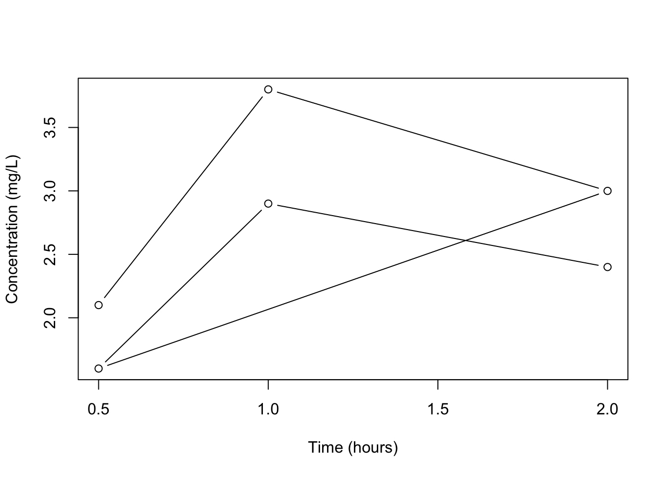
In PK, type = "b" is often useful because it shows both measurements and trajectory.
We should not connect observations across subjects. Instead:
plot(NULL,
     xlim = range(pk$TIME),
     ylim = range(pk$DV),
     xlab = "Time (hours)",
     ylab = "Concentration (mg/L)",
     main = "PK Profiles by Subject")

for (id in unique(pk$ID)) {
  sub <- pk[pk$ID == id, ]
  sub <- sub[order(sub$TIME), ]
  lines(sub$TIME, sub$DV, type = "b")
}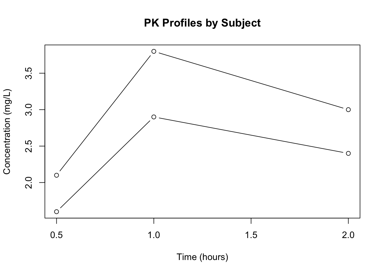
Steps:
This structure is conceptually how many PK visualizations are built.
plot(
  pk$TIME,
  pk$DV,
  log = "y",
  type = "b",
  xlab = "Time (hours)",
  ylab = "Concentration (mg/L, log scale)",
  main = "Semi-Log PK Plot"
)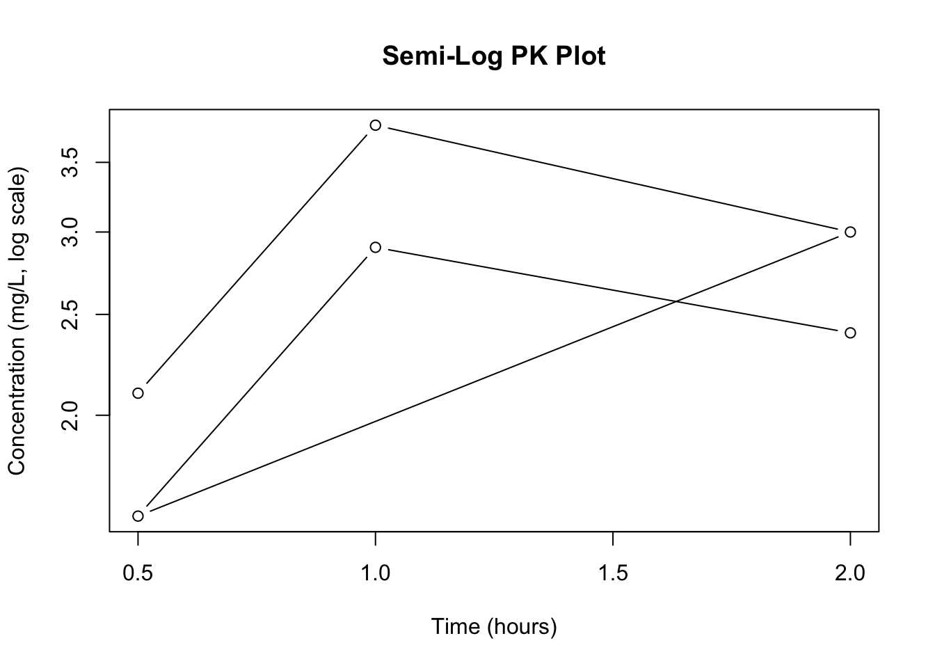
log = "y" keeps time linear but log-transforms concentration.
Semi-log plots help identify exponential decline and elimination phases.
str() if a plot behaves strangely.TIME vs DV.plot(pk$TIME, pk$DV,
xlab = "Time (hours)",
ylab = "Concentration (mg/L)",
main = "PK Plot")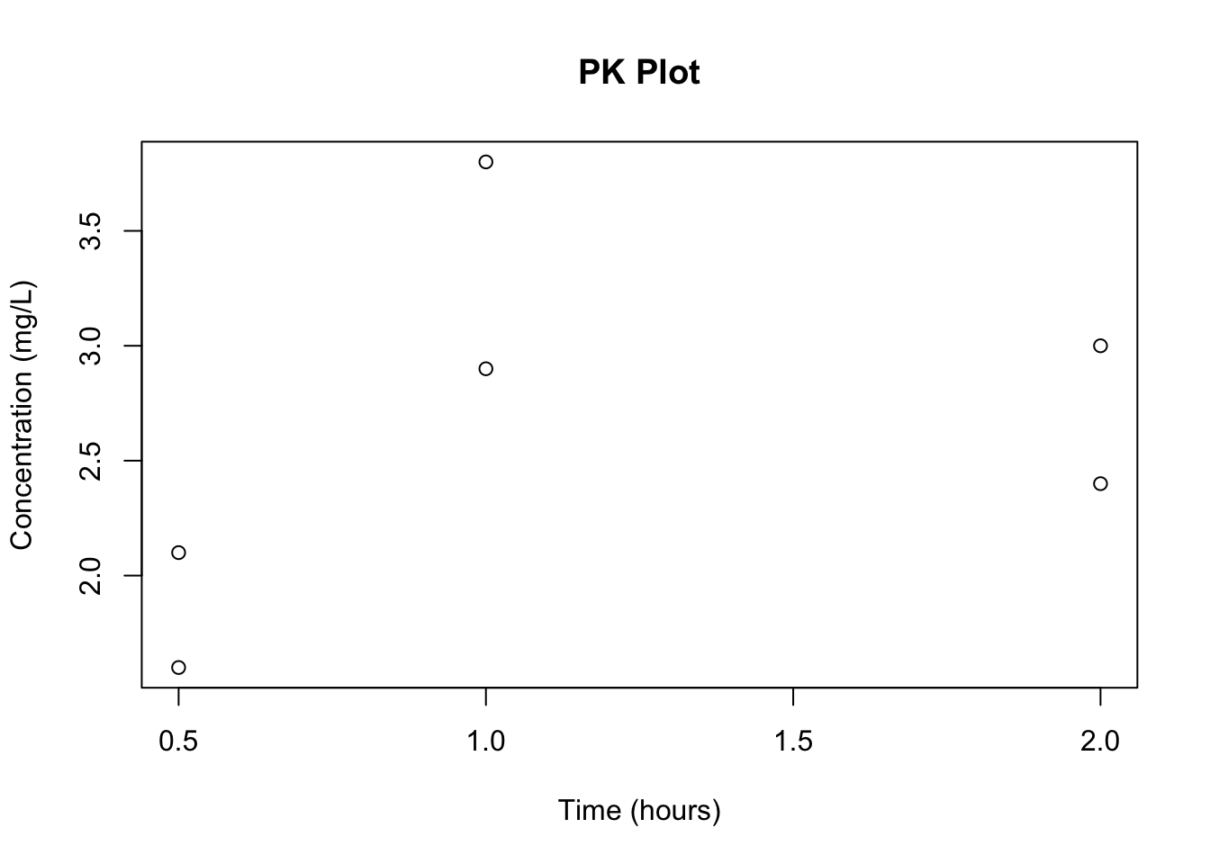
plot(pk$TIME, pk$DV,
     type = "b",
     log = "y",
     col = "red",
     pch = 16,
     lwd = 2,
     xlab = "Time (hours)",
     ylab = "Concentration (mg/L, log scale)")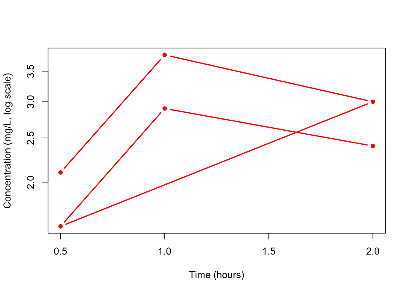
You now understand the foundations of plotting in R:
plot(x, y) creates a scatter plot.type controls points vs lines.lines() allows layered plots.Everything else in R visualization builds on these ideas.
plot(x, y) → fastest way to visualize two numeric vectors.type = "b" for PK profiles.log = "y" for semi-log concentration plots.