library(tidyverse)
library(nlme)

data(PBG, package = "nlme")

pbg <- as_tibble(PBG) %>%
  rename(
    DV   = deltaBP,
    DOSE = dose,
    ID   = Rabbit,
    TRT  = Treatment
)Dose–Response Visualization
Visualize dose–response relationships using the PBG dataset from nlme: grouping, log-dose scaling, stratification, and nonlinear intuition.
Tip
Core idea of this lesson: Dose–response plots reveal functional relationships.
Unlike concentration–time data, dose–response visualization focuses on shape, saturation, and group differences.
Learning Objectives
By the end of this lesson, you will be able to:
- Construct grouped dose–response plots correctly.
- Connect repeated measurements within subject.
- Use log-dose scaling appropriately.
- Stratify by treatment.
- Recognize visual signs of nonlinear response behavior.
Key Ideas
- Dose–response plots focus on functional relationships (shape, curvature, saturation), not time dynamics.
- Repeated measurements must be connected by subject (
group = ID) to preserve structure. - Log-dose scaling helps reveal nonlinear behavior, especially at low doses.
- Stratification (e.g., by treatment) allows comparison of shifts in response patterns.
- Individual-level structure should be inspected before adding summary trends.
- Visual patterns suggest hypotheses about nonlinearity and group differences — they do not confirm them.
Why Dose–Response Is Different from PK Profiles
Concentration–time plots show how drug levels evolve over time.
Dose–response plots answer a different question:
How does response change as dose increases?
This shifts interpretation toward:
- Curvature
- Saturation
- Relative shifts between groups
- Within-subject consistency
Note
Dose–response visualization prepares you to think about nonlinear models — but here we focus strictly on visual structure, not model fitting.
Setup
Worked Example 1: Basic Dose–Response Plot
ggplot(pbg, aes(DOSE, DV, group = ID)) +
  geom_point() +
  labs(
    title = "Dose–Response",
    x = "Dose",
    y = "Change in Blood Pressure"
  ) +
  theme_minimal()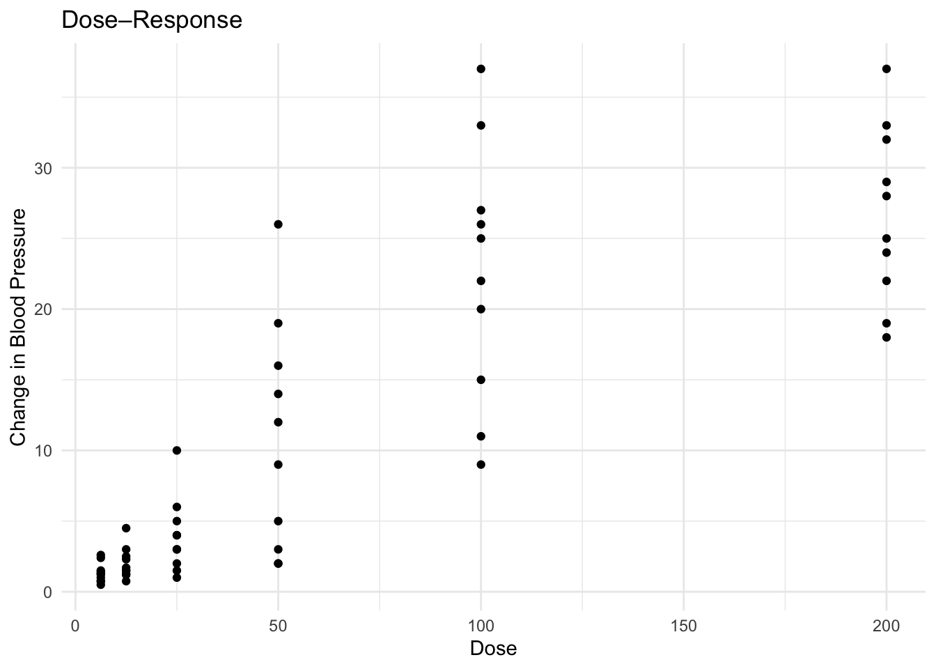
Questions to ask:
- Do curves increase monotonically?
- Do responses plateau?
- Is variability consistent across dose levels?
Worked Example 2: Log-Dose Scale
ggplot(pbg, aes(DOSE, DV, group = ID)) +
  geom_point() +
  scale_x_log10() +
  labs(
    title = "Dose–Response (Log Dose Scale)",
    x = "Dose (log scale)",
    y = "Change in Blood Pressure"
  ) +
  theme_minimal()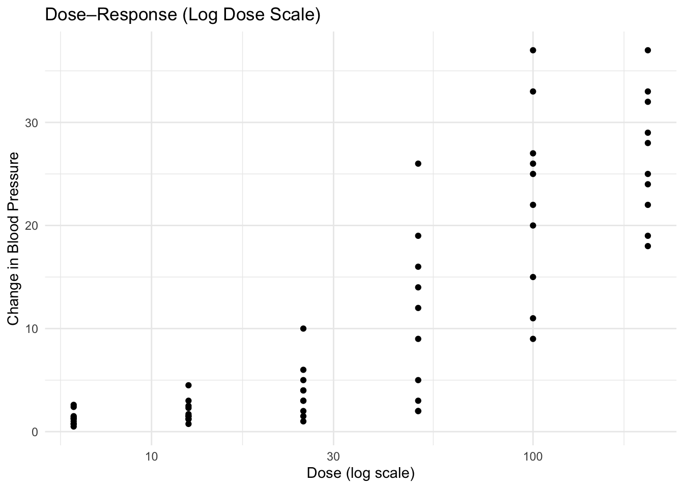
Note
Log scaling often linearizes the lower-dose region and spreads out low-dose values, making curvature easier to see.
Worked Example 3: Stratify by Treatment (Facet)
ggplot(pbg, aes(DOSE, DV, group = ID)) +
  geom_line(alpha = 0.5, color = "grey40") +
  geom_point() +
  facet_wrap(~ TRT) +
  scale_x_log10() +
  labs(
    title = "Dose–Response by Treatment Group",
    x = "Dose (log scale)",
    y = "Change in Blood Pressure"
  ) +
  theme_minimal()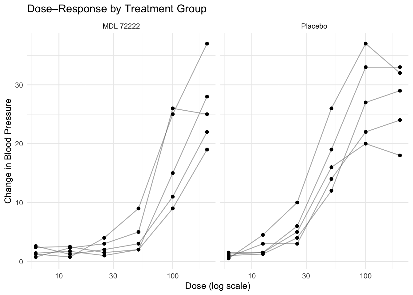
Ask:
- Does one treatment shift the curve?
- Is maximal response reduced in one group?
- Is curvature different?
Worked Example 4: Add a Mean Trend Overlay (Cautiously)
ggplot(pbg, aes(DOSE, DV)) +
  geom_point(alpha = 0.4) +
  stat_summary(fun = mean, geom = "line", linewidth = 1) +
  scale_x_log10() +
  labs(
    title = "Mean Dose–Response Trend",
    x = "Dose (log scale)",
    y = "Mean Change in Blood Pressure"
  ) +
  theme_minimal()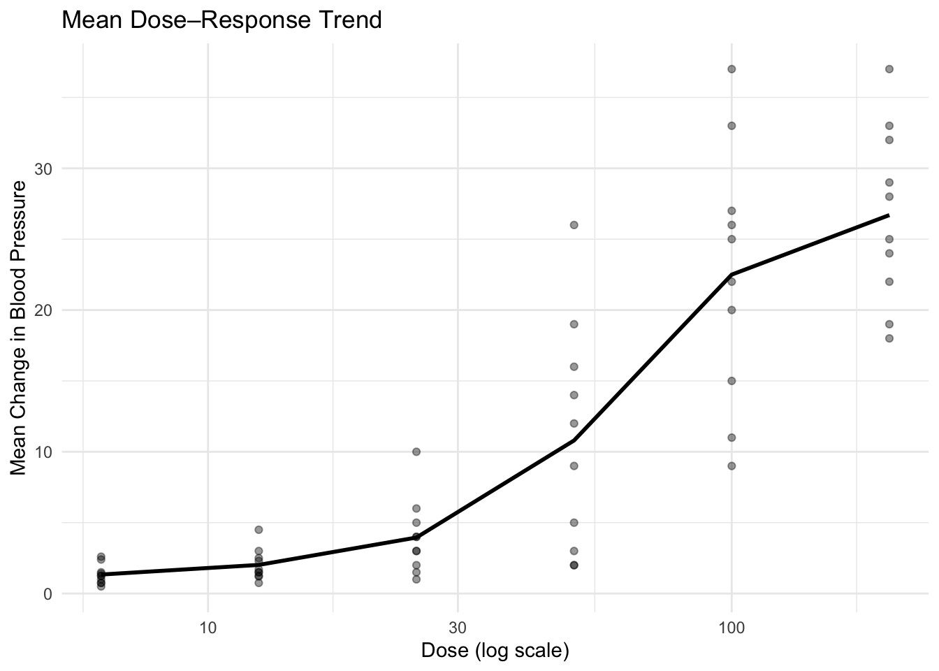
Warning
Always inspect individual curves before trusting the mean.
Summary lines can hide heterogeneous responses.
Interpretation Discipline
When reading dose–response plots, ask:
- Is there evidence of saturation?
- Is the relationship linear or curved?
- Are differences between treatments vertical (magnitude) or horizontal (potency shift)?
- Is variability increasing with dose?
These visual cues guide modeling decisions later.
Strategies
- Always start with individual lines.
- Try log-dose scale when dose spacing is multiplicative.
- Compare treatment groups using faceting.
- Use summaries only after structural inspection.
- Describe patterns before speculating about mechanisms.
Practice Problems
- Recreate the dose–response plot without grouping. What happens?
- Compare linear vs log-dose scale visually.
- Add color by treatment instead of faceting.
- Overlay mean trends by treatment.
- Write one sentence describing the apparent nonlinear pattern.
TipStep-by-Step Solutions
# 3) Color by treatment
ggplot(pbg, aes(DOSE, DV, group = ID, color = TRT)) +
  geom_point() +
  scale_x_log10() +
  theme_minimal()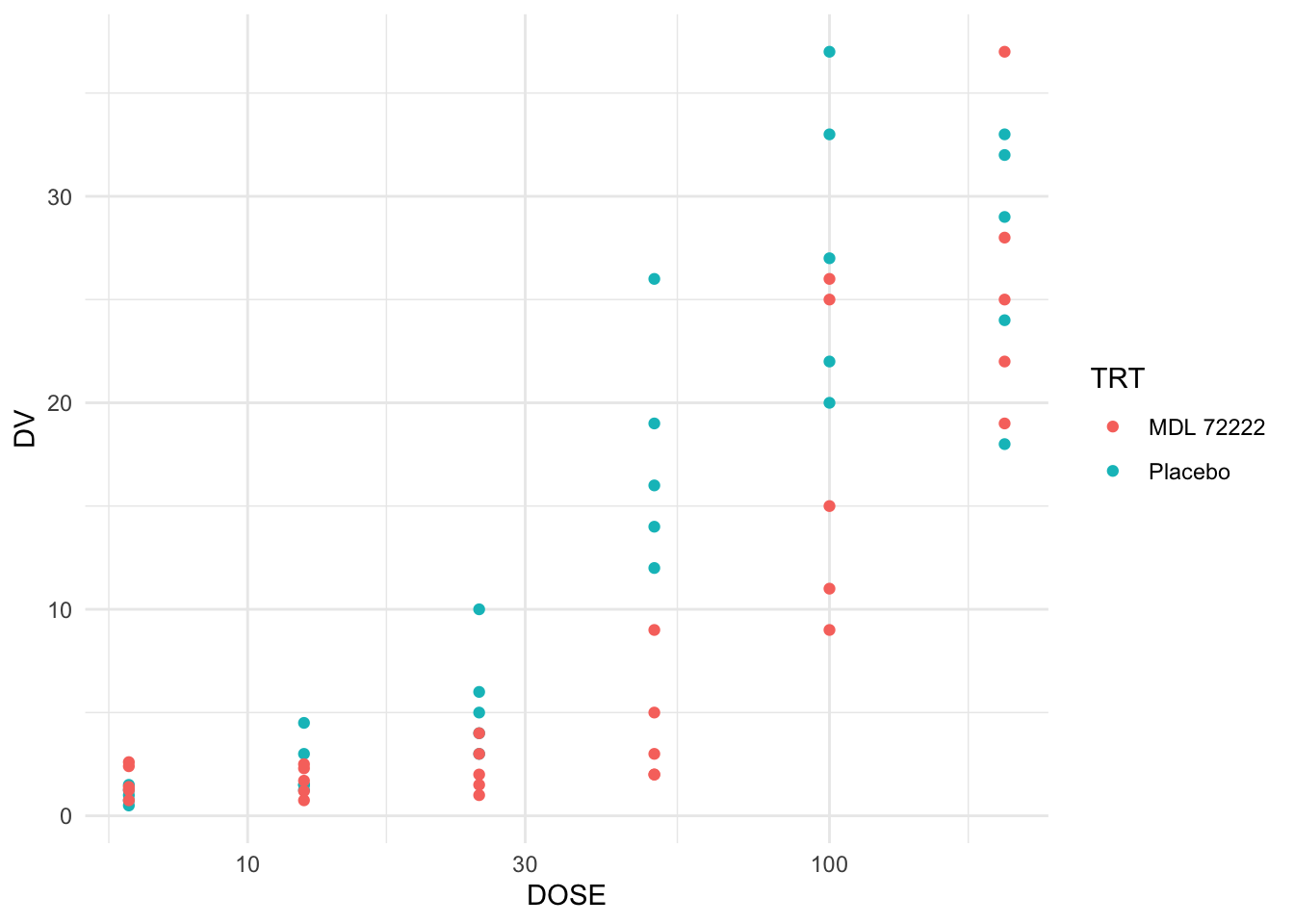
# 4) Mean by treatment
ggplot(pbg, aes(DOSE, DV, color = TRT)) +
  stat_summary(fun = mean, geom = "line", linewidth = 1) +
  scale_x_log10() +
  theme_minimal()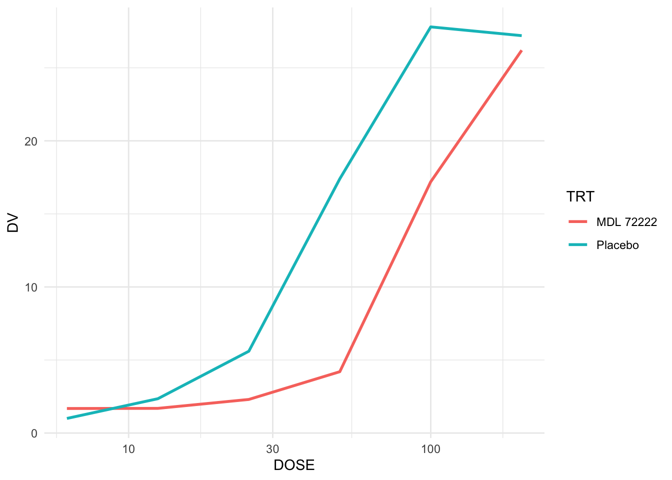
Summary
In this lesson, you:
- Built grouped dose–response plots.
- Used log-dose scaling to clarify nonlinear patterns.
- Stratified by treatment.
- Added cautious summary overlays.
- Practiced disciplined interpretation without modeling.
Dose–response visualization builds intuition for nonlinear behavior —
but visual structure must be understood before modeling begins.
TipQuick Checklist
- Are lines grouped correctly?
- Does log-dose scaling improve clarity?
- Are treatment differences consistent?
- Are summaries hiding variability?
- What hypothesis would you test next?