library(tidyverse)
library(here)

derivedpath <- here("courses", "foundations-r", "data", "derived")
resultspath <- here("courses", "foundations-r", "results", "qc")

dir.create(resultspath, recursive = TRUE, showWarnings = FALSE)

path <- file.path(derivedpath, "analysis_prelim.csv")

if (!file.exists(path)) {
  stop("Preliminary dataset not found. Render the previous lesson first:\n", path)
}

analysisprelim <- read_csv(path)

# Observation rows only
obs <- analysisprelim %>% filter(EVID == 0)Visualization-Driven QC on the Preliminary Dataset
Use plots and lightweight tables to discover duplicates, spikes, and time issues in the preliminary assembled dataset.
Tip
Big idea: Visual QC is where the real problems show up.
We are not fixing yet — we are finding, documenting, and prioritizing issues.
Learning Objectives
By the end of this lesson, you will be able to:
- Load the preliminary assembled dataset and isolate observation rows.
- Use profile plots to detect spikes, negative values, and inconsistent shapes.
- Identify duplicate records by key fields.
- Detect suspicious scaling or extreme values.
- Create a short, prioritized QC to-do list for data fixing.
Key Ideas
- Tables catch structural issues; plots catch scientific issues.
- Dose-stratified profiles are the fastest way to find problems.
- Duplicates often look harmless in tables but distort summaries and models.
- Time misassignment often shows up as strange profile shapes.
- Your QC log should reflect evidence, not guesses.
Setup
Worked Example 1: Quick Disposition Checks
We start with simple counts so we know the size of the dataset before looking for specific problems.
tibble(
  nsubj = n_distinct(analysisprelim$ID),
  nobs  = nrow(obs)
)
# A tibble: 1 × 2
nsubj nobs
<int> <int>
1 50 458obs %>% count(BLQ)# A tibble: 2 × 2
BLQ n
<chr> <int>
1 BLQ 159
2 <NA> 299Worked Example 2: Individual Profiles by DOSE (Log Scale)
Individual profiles make shape problems visible. Faceting by DOSE helps separate expected dose-related differences from suspicious profile behavior.
p1 <- ggplot(obs, aes(x = TIME, y = DV, group = ID)) +
  geom_line(alpha = 0.35) +
  geom_point(size = 0.8) +
  facet_wrap(~DOSE) +
  scale_y_log10() +
  labs(
    title = "Individual Concentration–Time Profiles by DOSE (Log Scale)",
    x = "Time After Dose (h)",
    y = "Concentration"
  )

p1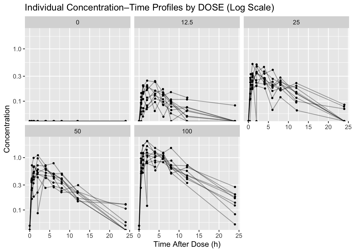
ggsave(file.path(resultspath, "profiles_by_dose_log.png"), p1, width = 9, height = 6)Worked Example 3: Find Duplicates by Key Fields
After the plot raises suspicion, we use key fields to locate duplicate observations precisely.
dups <- obs %>%
  count(ID, TIME) %>%
  filter(n > 1) %>%
  arrange(desc(n))

dups
# A tibble: 11 × 3
ID TIME n
<chr> <dbl> <int>
1 001 2.03 2
2 002 6.00 2
3 003 4 2
4 009 7.98 2
5 009 NA 2
6 018 12.0 2
7 026 12.1 2
8 038 5.95 2
9 039 NA 2
10 041 2 2
11 049 NA 2write_csv(dups, file.path(resultspath, "duplicate_id_time.csv"))Worked Example 4: Detect Impossible Values
Next, we scan for values that are biologically or analytically implausible and save the affected records as evidence.
neg <- obs %>% filter(!is.na(DV) & DV < 0)
neg %>% select(ID, DOSE, TIME, DV) %>% slice_head(n = 10)
# A tibble: 1 × 4
ID DOSE TIME DV
<chr> <dbl> <dbl> <dbl>
1 047 100 6.03 -0.926spikes <- obs %>%
group_by(ID) %>%
mutate(med = median(DV, na.rm = TRUE)) %>%
ungroup() %>%
filter(!is.na(DV) & med > 0 & DV > 8 * med) %>%
select(ID, DOSE, TIME, DV, med) %>%
arrange(desc(DV))
spikes %>% slice_head(n = 10)# A tibble: 0 × 5
# ℹ 5 variables: ID <chr>, DOSE <dbl>, TIME <dbl>, DV <dbl>, med <dbl>Worked Example 5: Time Misassignment Clues
Finally, we look for profiles where the maximum concentration occurs very late, which can signal a sample-time problem.
latepeaks <- obs %>%
  group_by(ID, DOSE) %>%
  summarise(
    tmax = TIME[which.max(DV)],
    cmax = max(DV, na.rm = TRUE),
    .groups = "drop"
  ) %>%
  filter(!is.na(tmax) & tmax > 12) %>%
  arrange(desc(tmax))

latepeaks
# A tibble: 0 × 4
# ℹ 4 variables: ID <chr>, DOSE <dbl>, tmax <dbl>, cmax <dbl>
Warning
- Do not “fix by eye” inside plotting code.
- Do not delete rows yet.
- Visualization is for detection, not correction.
- You should be able to point to an ID/time/value as evidence for every issue you list.
Strategies
- Start with simple plots: individual profiles, stratified by DOSE.
- Use log scale to expose multiplicative differences.
- Add quick tables to locate exactly which IDs are affected.
- Document issues now; fix in the next lesson.
Common Mistakes
- Fixing records directly in plotting code.
- Treating a suspicious plot pattern as proof without checking the underlying rows.
- Looking only at summary statistics and missing subject-level profile problems.
- Forgetting to save evidence tables for duplicate or impossible values.
- Dropping apparent outliers before deciding whether they are data errors.
Practice Problems
- Create a linear-scale version of the profile plot and save it to
courses/foundations-r/results/qc/. - Count how many subjects have duplicate
ID + TIMEkeys. - Identify 3 subjects you suspect have time misassignment and write down why.
- Add at least 3 issues you found to your QC log.
TipStep-by-Step Solutions
p1lin <- ggplot(obs, aes(x = TIME, y = DV, group = ID)) +
  geom_line(alpha = 0.35) +
  geom_point(size = 0.8) +
  facet_wrap(~DOSE) +
  labs(
    title = "Individual Concentration–Time Profiles by DOSE (Linear Scale)",
    x = "Time After Dose (h)",
    y = "Concentration"
  )

ggsave(file.path(resultspath, "profiles_by_dose_linear.png"), p1lin, width = 9, height = 6)
p1lin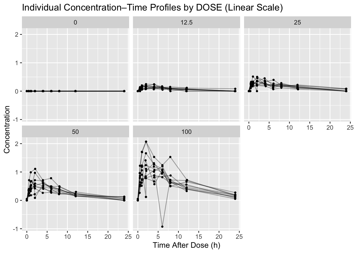
obs %>%
  count(ID, TIME) %>%
  filter(n > 1) %>%
  summarise(n_subjects = n_distinct(ID))
# A tibble: 1 × 1
n_subjects
<int>
1 10Summary
- You loaded the preliminary dataset and focused on observation rows.
- You used dose-stratified profiles to detect spikes and inconsistencies.
- You identified duplicates and impossible values with quick tables.
- You generated a prioritized list of issues to address next.
TipQuick Tips
- Start with profiles by DOSE.
- Use log scale early; it reveals multiplicative problems fast.
- Always back every issue with a table of IDs and values.
- Save QC figures so your decisions stay defensible.