library(tidyverse)A Minimal End-to-End PMx Workflow
See how R tools combine into a coherent, reproducible PMx-style workflow from start to finish.
Tip
Big idea: PMx work is not about isolated commands — it is about a clear, repeatable sequence of steps.
Learning Objectives
By the end of this lesson, you will be able to:
- Run a small PMx-style workflow from start to finish.
- Combine inspection, QC, transformation, summarization, and visualization.
- Recognize the reusable pattern behind PMx analyses.
- See how this scales to real datasets.
Setup
Key Ideas
A “workflow” is a sequence you can defend and repeat.
In PMx, that usually means you can answer:
- What data did you start with?
- What checks did you run before analysis?
- What rules did you apply (and why)?
- What did you exclude or flag?
- What summary and plots support your decisions?
- What object/file is “model-ready”?
This lesson intentionally uses a toy dataset so you can focus on the pattern — not the domain complexity.
Note
You are not trying to “do PMx” with this toy example.
You are practicing how PMx work is structured in R.
Step 1: Create Data
pk <- tibble(
  ID   = rep(1:3, each = 5),
  TIME = rep(c(0.5, 1, 2, 4, 8), times = 3),
  DV   = c(
    2.1, 3.8, 3.0, 1.5, 0.8,
    1.6, 2.9, 2.4, 1.2, 0.6,
    4.8, 7.2, 6.9, 3.1, 1.4
  )
)

pk
# A tibble: 15 × 3
ID TIME DV
<int> <dbl> <dbl>
1 1 0.5 2.1
2 1 1 3.8
3 1 2 3
4 1 4 1.5
5 1 8 0.8
6 2 0.5 1.6
7 2 1 2.9
8 2 2 2.4
9 2 4 1.2
10 2 8 0.6
11 3 0.5 4.8
12 3 1 7.2
13 3 2 6.9
14 3 4 3.1
15 3 8 1.4Step 2: Inspect
glimpse(pk)Rows: 15
Columns: 3
$ ID <int> 1, 1, 1, 1, 1, 2, 2, 2, 2, 2, 3, 3, 3, 3, 3
$ TIME <dbl> 0.5, 1.0, 2.0, 4.0, 8.0, 0.5, 1.0, 2.0, 4.0, 8.0, 0.5, 1.0, 2.0, …
$ DV <dbl> 2.1, 3.8, 3.0, 1.5, 0.8, 1.6, 2.9, 2.4, 1.2, 0.6, 4.8, 7.2, 6.9, …summary(pk) ID TIME DV
Min. :1 Min. :0.5 Min. :0.600
1st Qu.:1 1st Qu.:1.0 1st Qu.:1.450
Median :2 Median :2.0 Median :2.400
Mean :2 Mean :3.1 Mean :2.887
3rd Qu.:3 3rd Qu.:4.0 3rd Qu.:3.450
Max. :3 Max. :8.0 Max. :7.200 Every workflow begins with inspection.
Step 3: Apply a Simple QC Rule
In real PMx work, BLQ rules are based on LLOQ and may involve specialized handling. Here we’ll use a simple teaching rule: “DV < 0.5 is BLQ”.
pk <- pk %>%
  mutate(BLQ = DV < 0.5)

pk
# A tibble: 15 × 4
ID TIME DV BLQ
<int> <dbl> <dbl> <lgl>
1 1 0.5 2.1 FALSE
2 1 1 3.8 FALSE
3 1 2 3 FALSE
4 1 4 1.5 FALSE
5 1 8 0.8 FALSE
6 2 0.5 1.6 FALSE
7 2 1 2.9 FALSE
8 2 2 2.4 FALSE
9 2 4 1.2 FALSE
10 2 8 0.6 FALSE
11 3 0.5 4.8 FALSE
12 3 1 7.2 FALSE
13 3 2 6.9 FALSE
14 3 4 3.1 FALSE
15 3 8 1.4 FALSEStep 4: Create an Analysis Subset
pk_clean <- pk %>%
  filter(!BLQ)

pk_clean
# A tibble: 15 × 4
ID TIME DV BLQ
<int> <dbl> <dbl> <lgl>
1 1 0.5 2.1 FALSE
2 1 1 3.8 FALSE
3 1 2 3 FALSE
4 1 4 1.5 FALSE
5 1 8 0.8 FALSE
6 2 0.5 1.6 FALSE
7 2 1 2.9 FALSE
8 2 2 2.4 FALSE
9 2 4 1.2 FALSE
10 2 8 0.6 FALSE
11 3 0.5 4.8 FALSE
12 3 1 7.2 FALSE
13 3 2 6.9 FALSE
14 3 4 3.1 FALSE
15 3 8 1.4 FALSE
Warning
Filtering is a decision.
In real projects, you should be able to state the rule (and show counts) before you exclude anything.
Step 5: Summarize
pk_summary <- pk_clean %>%
  group_by(ID) %>%
  summarise(
    n_obs = n(),
    max_DV = max(DV),
    .groups = "drop"
  )

pk_summary
# A tibble: 3 × 3
ID n_obs max_DV
<int> <int> <dbl>
1 1 5 3.8
2 2 5 2.9
3 3 5 7.2Step 6: Visualize
This plot is a “default QC view”: individuals + correct grouping.
pk_clean %>%
  ggplot(aes(TIME, DV, group = ID)) +
  geom_line(alpha = 0.6) +
  geom_point() +
  scale_y_log10() +
  theme_minimal()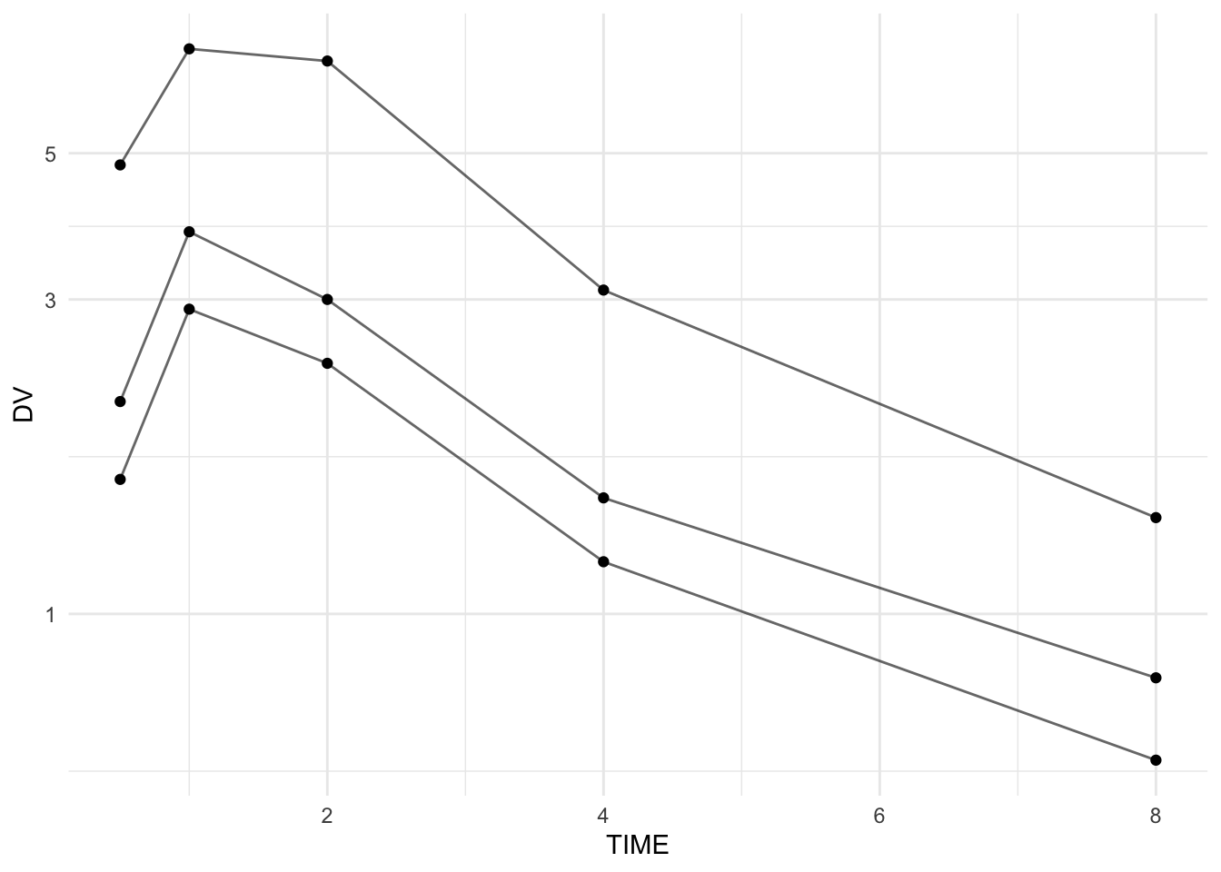
Note
This is a simple demo plot.
Detailed visualization techniques with ggplot2 will be covered in the Data Visualization section next.
The Reusable Pattern
This workflow always follows the same structure:
- Import or create data
- Inspect
- Apply QC rules
- Create analysis subset
- Summarize
- Visualize
- (Later) Model
The specific tools may change — the structure does not.
Worked Example 2: Make the Workflow More “PMx-Like”
A common PMx habit is to keep the raw object untouched and create explicit workflow objects.
pk_raw <- pk %>% select(ID, TIME, DV)  # imagine this came from read_csv()
pk_flagged <- pk_raw %>% mutate(BLQ = DV < 0.5)
pk_clean2 <- pk_flagged %>% filter(!BLQ)

list(
  raw_rows = nrow(pk_raw),
  flagged_rows = nrow(pk_flagged),
  clean_rows = nrow(pk_clean2),
  n_blq = sum(pk_flagged$BLQ)
)
$raw_rows
[1] 15
$flagged_rows
[1] 15
$clean_rows
[1] 15
$n_blq
[1] 0This makes decisions auditable:
- raw data preserved
- flags visible
- filtering is transparent
- counts confirm what changed
Strategies
- Work in explicit stages: raw → inspected → flagged → clean/model-ready.
- Add at least one structural checkpoint (e.g.,
glimpse()) after major steps. - Prefer flagging first (
mutate()), then filtering (filter()) second. - Keep intermediate objects named clearly (
pk_raw,pk_flagged,pk_clean,pk_summary). - Make “default QC plots” early: individuals + correct grouping.
- Keep your decisions visible in the data (flags, reasons, counts).
Common Mistakes
- Overwriting the raw dataset without keeping a “raw” copy.
- Filtering before flagging (you lose the ability to count and explain exclusions).
- Forgetting
group = IDin profile plots. - Summarizing with missing data rules that are not explicit.
- Treating toy-workflow code as “production-ready” without adding checks.
Practice Problems
- Create a
pk_rawobject and keep it unchanged. - Add a flag column
is_high = DV > 5. - Create
pk_cleanthat excludes BLQ and excludesis_high. - Summarise by subject:
n_obs,min_DV,max_DV. - Plot profiles of the clean data with correct grouping.
- Add one simple assertion check: TIME must be non-negative.
TipStep-by-Step Solutions
# 1
pk_raw <- pk %>% select(ID, TIME, DV)

# 2
pk_flagged <- pk_raw %>%
  mutate(
    BLQ = DV < 0.5,
    is_high = DV > 5
  )

# 3
pk_clean <- pk_flagged %>%
  filter(!BLQ, !is_high)

# 4
pk_clean %>%
  group_by(ID) %>%
  summarise(
    n_obs = n(),
    min_DV = min(DV),
    max_DV = max(DV),
    .groups = "drop"
  )
# A tibble: 3 × 4
ID n_obs min_DV max_DV
<int> <int> <dbl> <dbl>
1 1 5 0.8 3.8
2 2 5 0.6 2.9
3 3 3 1.4 4.8# 5
pk_clean %>%
ggplot(aes(TIME, DV, group = ID)) +
geom_line(alpha = 0.6) +
geom_point() +
scale_y_log10() +
theme_minimal()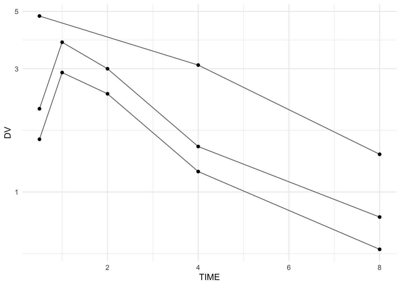
# 6
stopifnot(all(pk_clean$TIME >= 0))
Summary
You now see how individual R tools combine into a coherent PMx workflow:
- Create/import data
- Inspect
- Flag and QC
- Create analysis subset
- Summarize
- Visualize
The earlier lessons gave you tools.
This lesson shows you the pattern.
That pattern scales from toy examples to real clinical datasets.
TipQuick Tips
- Work in clear stages.
- Keep raw and clean objects separate.
- Flag first, filter second.
- Insert inspection checkpoints.
- Use a default QC plot with correct grouping.