library(tidyverse)
data(Theoph)

terminal_data <- Theoph %>%
filter(Time >= 4)A Minimal Modeling Workflow in R
Fit → Diagnose → Iterate
Learning Objectives
By the end of this lesson, you will be able to:
- Apply a structured modeling workflow in pharmacometrics
- Visualize the exact data you plan to model (before fitting)
- Fit a simple linear model and extract the most useful pieces from the fit object
- Use two high-value diagnostics (Residuals vs Fitted, Q–Q plot) to test assumptions
- Use
predict()for fitted values and for predictions on new data - Decide what a diagnostic pattern suggests you should do next
Key Ideas
- Modeling is a loop: fit → diagnose → refine.
- Before you fit anything, make sure you can see the subset you intend to model.
- A model object stores more than coefficients: fitted values, residuals, degrees of freedom, and more.
predict()is how you turn a fitted model into model-implied values for plotting and comparison.- Diagnostics are not “extra plots.” They are how you challenge your assumptions.
Worked Example 1: Define (and Visualize) the Data You Will Fit
We’ll use Theoph and focus on the terminal phase.
Before fitting, always look at the exact subset you’re about to model.
terminal_data %>%
  ggplot(aes(Time, log(conc), group = Subject)) +
  geom_line(alpha = 0.4) +
  geom_point() +
  labs(
    title = "Theoph — Terminal Phase (Log Scale)",
    x = "Time (h)",
    y = "log(Concentration)"
  )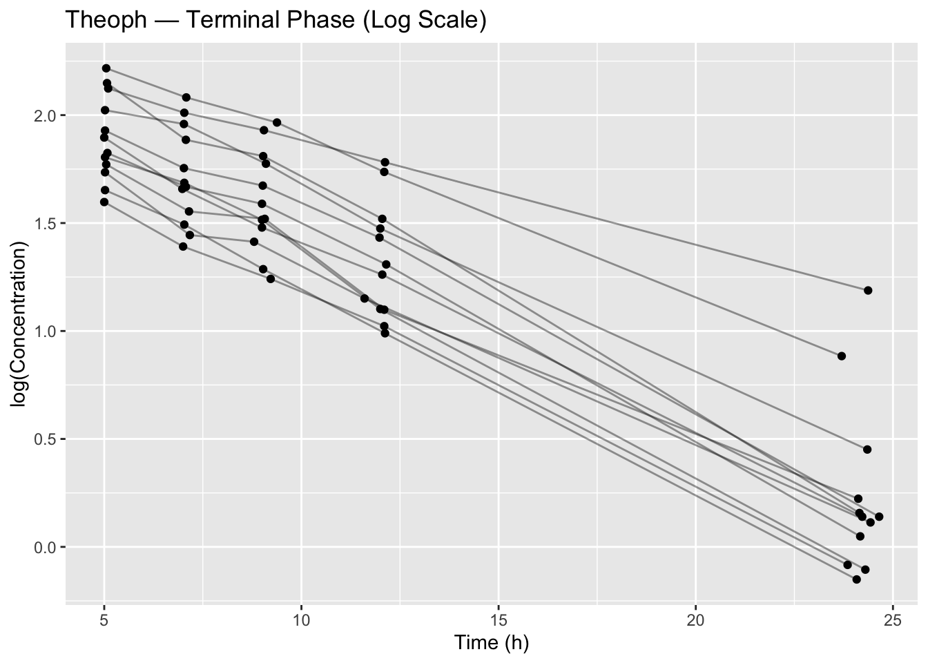
This plot is already a modeling decision:
- We chose a terminal window (Time ≥ 4)
- We chose a scale (log concentration)
- We are implicitly testing whether a log-linear structure is plausible
Worked Example 2: Fit the Simplest Model
lm_fit <- lm(log(conc) ~ Time, data = terminal_data)
summary(lm_fit)
Call:
lm(formula = log(conc) ~ Time, data = terminal_data)

Residuals:
    Min      1Q  Median      3Q     Max
-0.4230 -0.1975 -0.0535  0.2047  0.9406

Coefficients:
             Estimate Std. Error t value Pr(>|t|)
(Intercept)  2.343802   0.069087   33.92   <2e-16 ***
Time        -0.086031   0.005185  -16.59   <2e-16 ***
---
Signif. codes:  0 '***' 0.001 '**' 0.01 '*' 0.05 '.' 0.1 ' ' 1

Residual standard error: 0.2719 on 58 degrees of freedom
Multiple R-squared:  0.826, Adjusted R-squared:  0.823
F-statistic: 275.3 on 1 and 58 DF,  p-value: < 2.2e-16
What you should actually pull from summary()
At this stage, focus on structure:
- Intercept / slope (the structural relationship)
- Residual standard error (how much variability remains)
- R-squared (variance explained — not proof of adequacy)
Worked Example 3: Extract What You Need From the Fit Object
A model fit is an object with many useful pieces inside it. In practice, you usually want:
- coefficients
- fitted values
- residuals
- degrees of freedom
- a clean coefficient table
Coefficients
coef(lm_fit)(Intercept) Time
2.3438022 -0.0860309 Fitted values and residuals
head(fitted(lm_fit)) 1 2 3 4 5 6
1.905045 1.739005 1.565222 1.301108 0.247229 1.911927 head(resid(lm_fit)) 1 2 3 4 5 6
0.2184139 0.2718901 0.3648486 0.4806015 0.9406144 -0.1069223 Degrees of freedom
lm_fit$df.residual[1] 58A small coefficient table (tidy)
coef_table <- broom::tidy(lm_fit)
coef_table
# A tibble: 2 × 5
term estimate std.error statistic p.value
<chr> <dbl> <dbl> <dbl> <dbl>
1 (Intercept) 2.34 0.0691 33.9 6.00e-40
2 Time -0.0860 0.00519 -16.6 1.09e-23
Tip
In PMx-style workflows, you typically turn model outputs into small tibbles early.
That way you can join, plot, summarize, and report results reproducibly.
Worked Example 4: The Power of predict()
There are two common uses of predict():
- Get fitted values for the data you fit
- Predict values for new data (e.g., a smooth time grid)
1) Fitted values (on the training data)
terminal_data <- terminal_data %>%
  mutate(pred_log = predict(lm_fit))
Overlay observed vs predicted (log scale):
terminal_data %>%
  ggplot(aes(Time, log(conc), group = Subject)) +
  geom_point() +
  geom_line(aes(y = pred_log)) +
  labs(title = "Observed vs Model-Implied Fit (Log Scale)")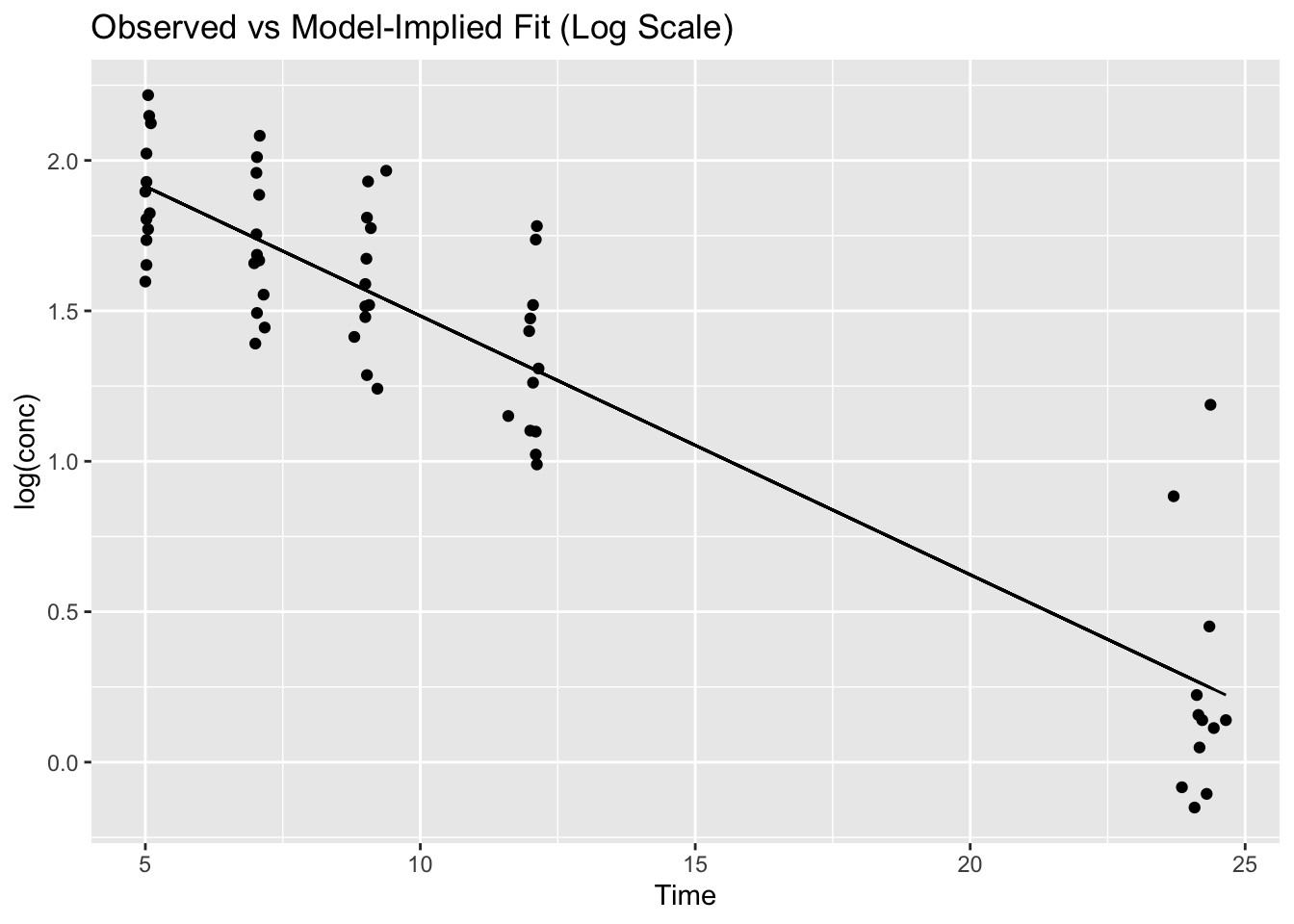
2) Predictions on new data (newdata=)
Create a smooth time grid and predict on it:
grid <- tibble(Time = seq(min(terminal_data$Time), max(terminal_data$Time), length.out = 100))

grid <- grid %>%
  mutate(pred_log = predict(lm_fit, newdata = grid))
grid
# A tibble: 100 × 2
Time pred_log
<dbl> <dbl>
1 5 1.91
2 5.20 1.90
3 5.40 1.88
4 5.60 1.86
5 5.79 1.85
6 5.99 1.83
7 6.19 1.81
8 6.39 1.79
9 6.59 1.78
10 6.79 1.76
# ℹ 90 more rowsNow you can overlay a smooth model-implied line:
ggplot(terminal_data, aes(Time, log(conc), group = Subject)) +
  geom_point() +
  geom_line(data = grid, aes(Time, pred_log), inherit.aes = FALSE, linewidth = 1) +
  labs(title = "Model-Implied Trend on a Smooth Grid")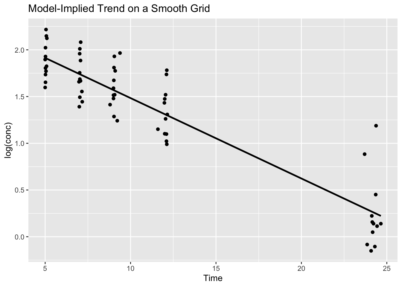
This pattern (grid + predict + overlay) is one of the most reusable ideas in the entire Modeling module.
Worked Example 5: Two High-Value Diagnostics
Base R gives convenient diagnostic plots via plot(lm_fit, which = ...).
In day-to-day work, two are especially helpful:
1) Residuals vs Fitted (pattern check)
plot(lm_fit, which = 1)
Look for:
- curvature (wrong structure)
- funneling (wrong error model)
- clusters (missing hierarchy)
2) Normal Q–Q Plot (residual distribution check)
plot(lm_fit, which = 2)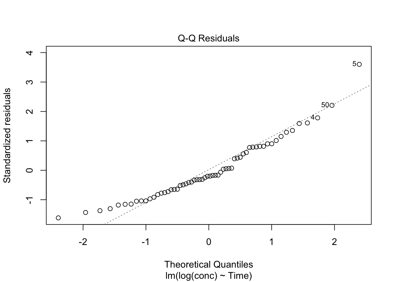
Look for:
- strong departures in the tails (outliers / heavy tails)
- systematic deviation (model mismatch)
Warning
These diagnostics are not “pass/fail.”
They are clues about what your model is missing.
Strategies
Always show the data you plan to fit before fitting.
Extract results into a small table you can reuse downstream.
Start with two diagnostics you’ll use constantly:
- Residuals vs Fitted
- Q–Q plot
- Residuals vs Fitted
Use
predict()to create overlays on the data and to generate predictions on a grid.
Common Mistakes
- Fitting before visualizing the subset
- Forgetting to use the same scale in fitting and plotting
- Interpreting high R-squared as proof the model is correct
- Ignoring residual diagnostics
- Using
predict()with mismatchednewdata
Practice Problems
- Verify you are fitting the terminal phase by plotting
terminal_dataon the log scale. - Extract coefficients, fitted values, and residuals from
lm_fit. - Use
predict()to compute model-implied values on a smooth grid. - Generate diagnostic plots 1 and 2 and describe one pattern you notice.
TipStep-by-Step Solutions
Problem 1
terminal_data %>%
  ggplot(aes(Time, log(conc), group = Subject)) +
  geom_line(alpha = 0.4) +
  geom_point()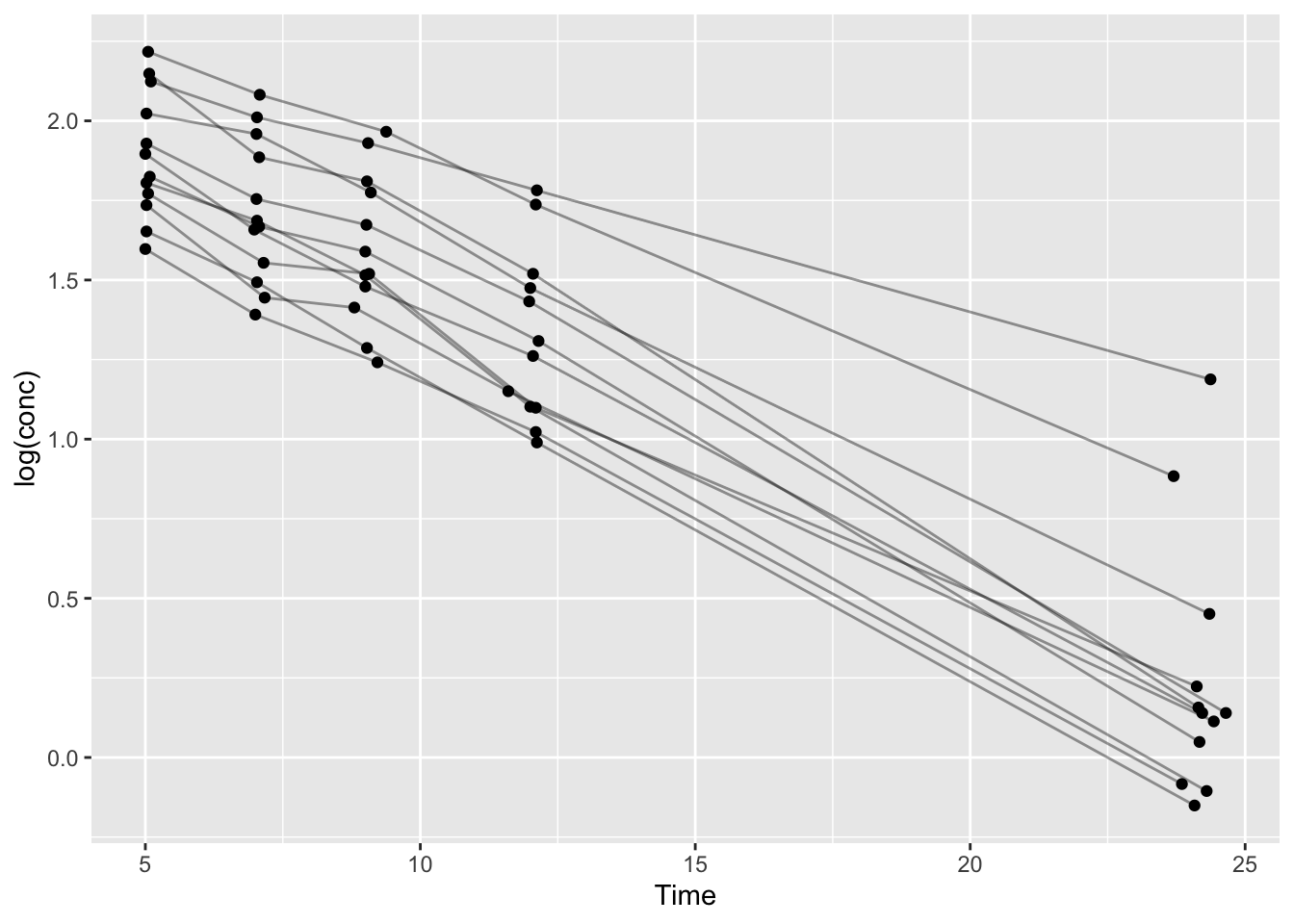
Problem 2
coef(lm_fit)(Intercept) Time
2.3438022 -0.0860309 head(fitted(lm_fit)) 1 2 3 4 5 6
1.905045 1.739005 1.565222 1.301108 0.247229 1.911927 head(resid(lm_fit)) 1 2 3 4 5 6
0.2184139 0.2718901 0.3648486 0.4806015 0.9406144 -0.1069223 lm_fit$df.residual[1] 58Problem 3
grid <- tibble(Time = seq(min(terminal_data$Time), max(terminal_data$Time), length.out = 100)) %>%
  mutate(pred_log = predict(lm_fit, newdata = .))
grid
# A tibble: 100 × 2
Time pred_log
<dbl> <dbl>
1 5 1.91
2 5.20 1.90
3 5.40 1.88
4 5.60 1.86
5 5.79 1.85
6 5.99 1.83
7 6.19 1.81
8 6.39 1.79
9 6.59 1.78
10 6.79 1.76
# ℹ 90 more rowsProblem 4
plot(lm_fit, which = 1)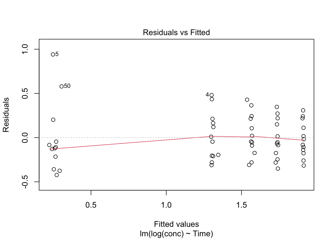
plot(lm_fit, which = 2)
Describe what you see (curvature, funneling, tail departures, etc.).
Summary
- Modeling starts by confirming the data subset you will fit.
- A model object contains reusable components (coefficients, fitted values, residuals).
predict()is the bridge between a fitted model and model-implied values for plotting.- Two diagnostics (Residuals vs Fitted, Q–Q) catch many common problems early.
- Iteration is part of the workflow.
TipQuick Tips
- Plot the subset before you fit.
- Turn model output into small tables early.
- Use
grid + predict + overlayas a default pattern. - Start diagnostics with plots 1 and 2.