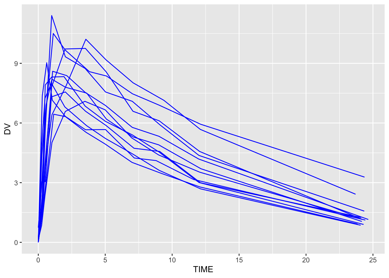
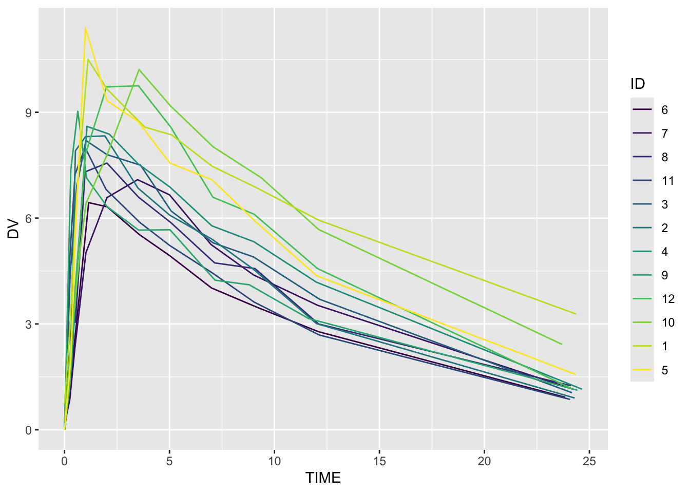
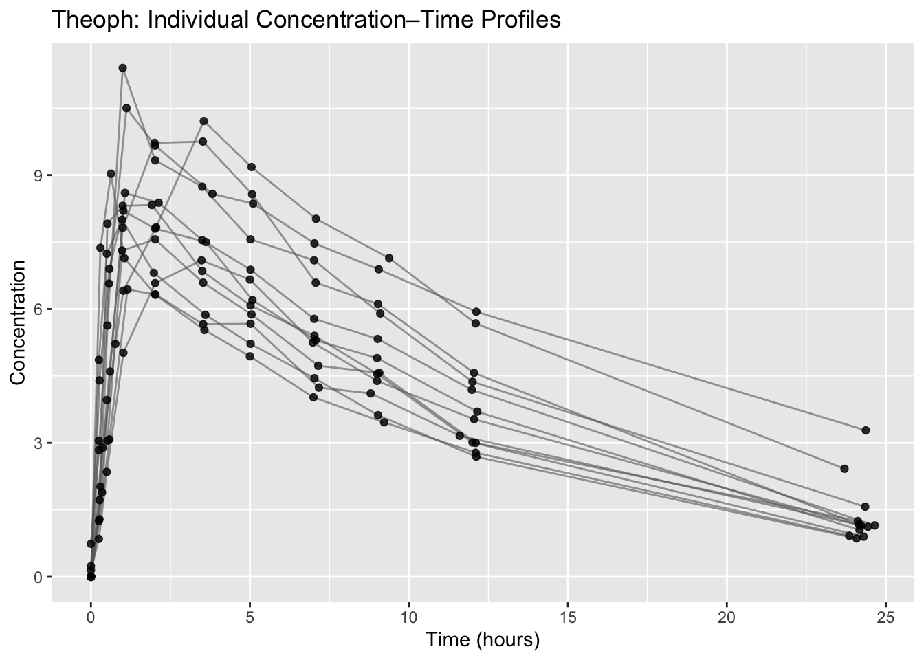
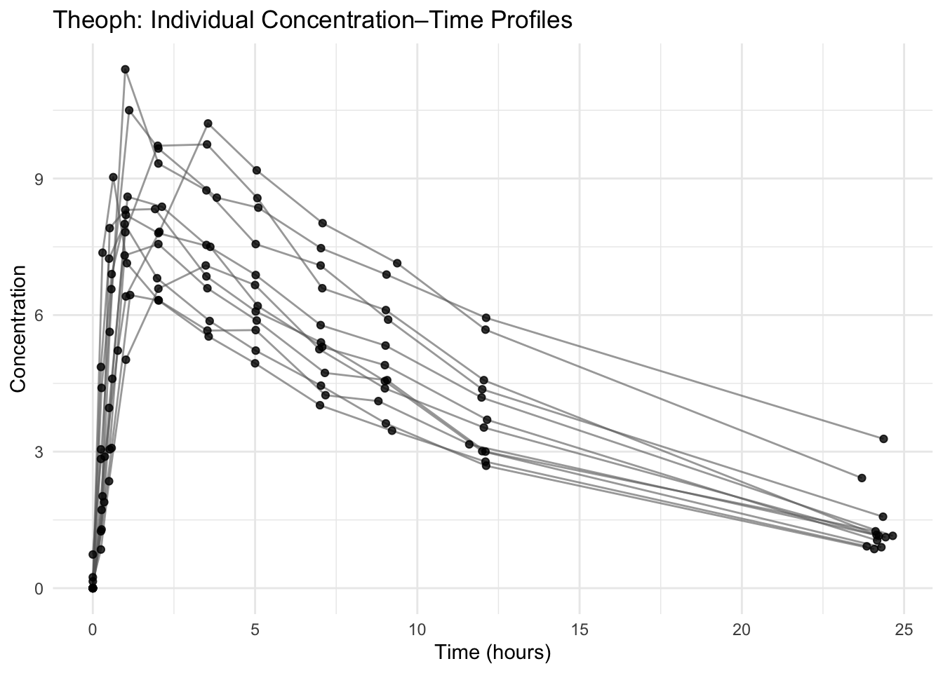
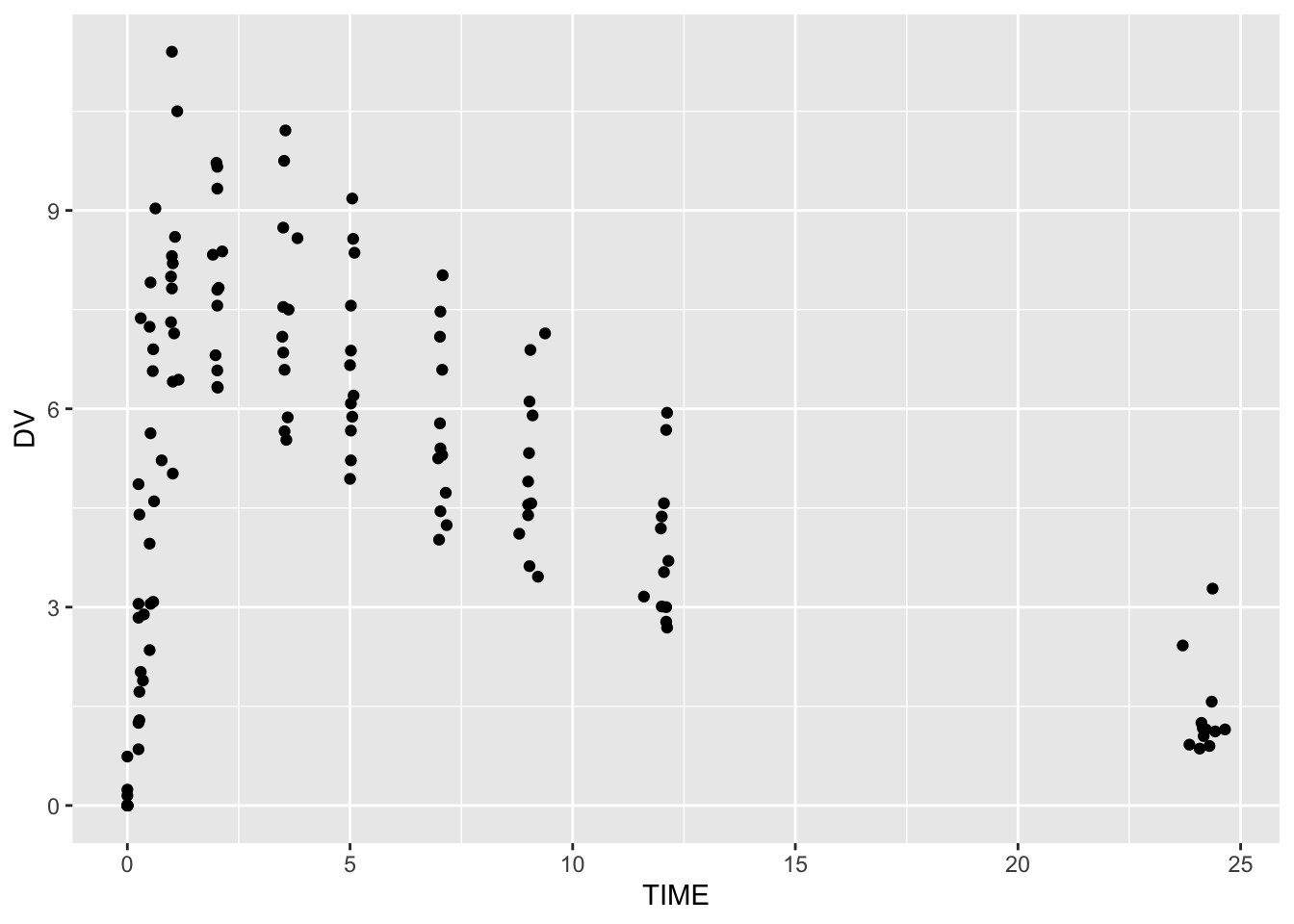
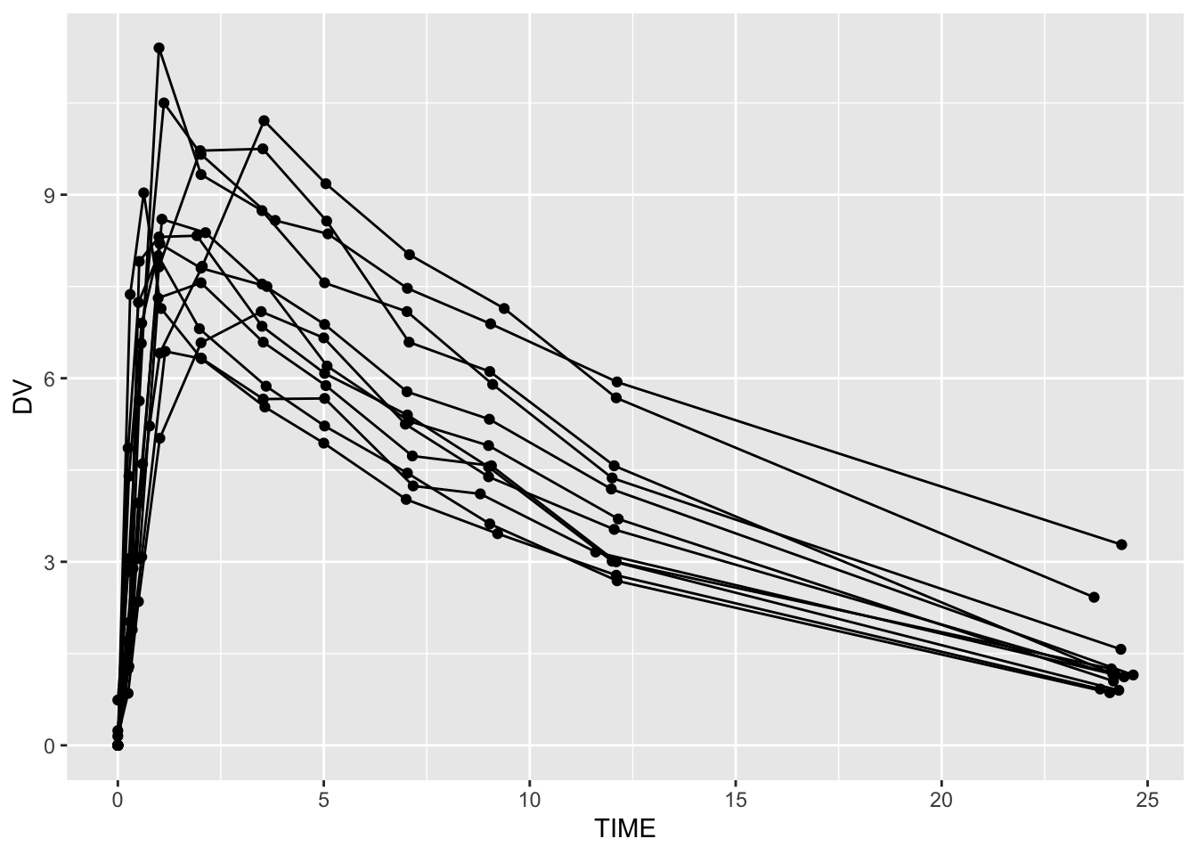
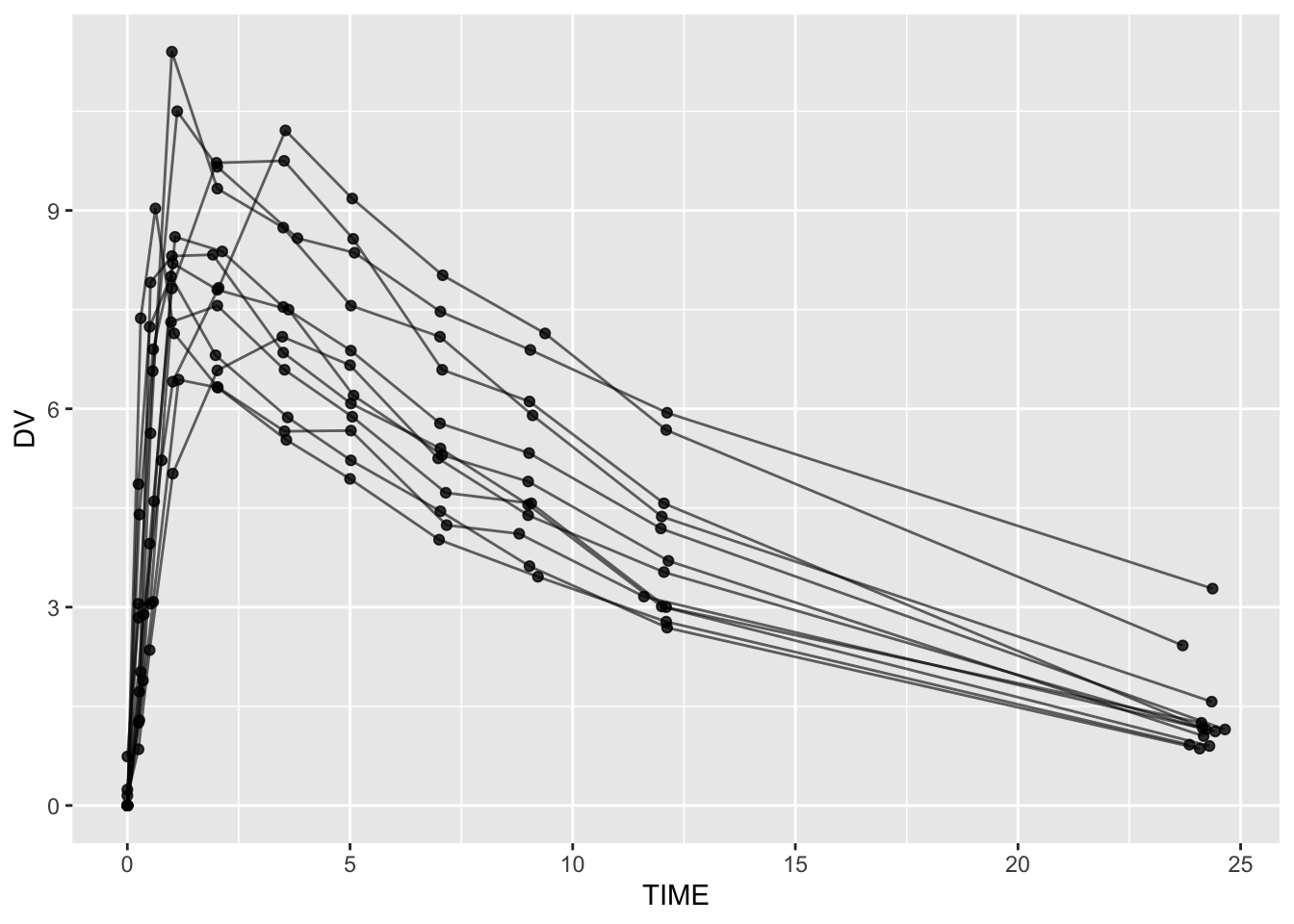
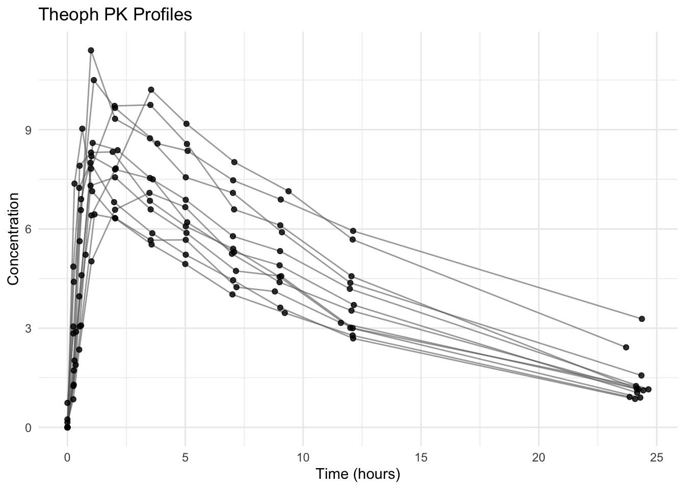
Plot Construction and Layering

Understand ggplot2 as a layered system: start with a blank canvas and build structurally correct PK plots step by step.
Tip

Core idea of this lesson: A ggplot is not a single command — it is a stack of layers built on a blank canvas. You start simple. You add structure. You add meaning. You add polish.

Learning Objectives

By the end of this lesson, you will be able to:

  • Explain ggplot2 as a layered system.
  • Build PK plots incrementally from a blank canvas.
  • Add geometric, structural, and annotation layers deliberately.
  • Control grouping correctly using group = ID.
  • Verify structural correctness before styling.

Key Ideas

  • A plot is built layer by layer, not created in a single step.
  • ggplot separates structure (data, mappings, grouping) from styling (colors, themes).
  • Early layers define correctness; later layers only improve clarity and presentation.
  • Grouping (group = ID) is essential for representing individual trajectories.
  • A visually appealing plot is not necessarily a correct plot.
  • In PMx, plots are diagnostic tools used to verify data integrity and model assumptions.

The Layered Mental Model

Think of ggplot as:

  1. A blank canvas
  2. A dataset placed on that canvas
  3. Aesthetic mappings defining how variables connect to axes
  4. Layers added one at a time (points, lines, labels, scales, themes)

You never “make a plot.”
You build it layer by layer.

Note

If something looks wrong, remove layers mentally and ask: Which layer introduced the problem?


Setup

library(tidyverse)

data(Theoph, package = "datasets")

theoph <- Theoph %>%
  rename(
    ID   = Subject,
    TIME = Time,
    DV   = conc,
    AMT  = Dose
  ) %>%
  arrange(ID, TIME)

glimpse(theoph)
Rows: 132
Columns: 5
$ ID   <ord> 6, 6, 6, 6, 6, 6, 6, 6, 6, 6, 6, 7, 7, 7, 7, 7, 7, 7, 7, 7, 7, 7,…
$ Wt   <dbl> 80.0, 80.0, 80.0, 80.0, 80.0, 80.0, 80.0, 80.0, 80.0, 80.0, 80.0,…
$ AMT  <dbl> 4.00, 4.00, 4.00, 4.00, 4.00, 4.00, 4.00, 4.00, 4.00, 4.00, 4.00,…
$ TIME <dbl> 0.00, 0.27, 0.58, 1.15, 2.03, 3.57, 5.00, 7.00, 9.22, 12.10, 23.8…
$ DV   <dbl> 0.00, 1.29, 3.08, 6.44, 6.32, 5.53, 4.94, 4.02, 3.46, 2.78, 0.92,…

Layer 0: The Blank Canvas

ggplot(theoph)

This does nothing visually — because we have not added mappings or layers.

The canvas exists, but nothing is drawn yet.


Layer 1: Define Aesthetic Mappings

ggplot(theoph, aes(x = TIME, y = DV))

Now ggplot knows:

  • What variable belongs on the x-axis
  • What variable belongs on the y-axis

But still, nothing is drawn.

Mappings define rules.
Geoms draw objects.


Layer 2: Add Points

ggplot(theoph, aes(TIME, DV)) +
  geom_point()

We added our first visible layer: points.

This layer shows individual observations, but no trajectories yet.


Layer 3: Add Lines (Structure Layer)

ggplot(theoph, aes(TIME, DV, group = ID)) +
  geom_line() +
  geom_point()

Here we added:

  • A line layer
  • Correct grouping

Without group = ID, lines connect across subjects — a structural error.

Warning

Grouping is a structural layer. If it is wrong, everything built on top of it is misleading.

ImportantMapping vs. setting aesthetics

Now that structure is correct, we can link aesthetics to structure.

If you want to connect a variable in your dataset to an aesthetic (like color, fill, size, shape, or linetype), it must go inside aes().

  • Inside aes(color = ID) → color varies by subject
  • Outside aes() (e.g., color = "blue") → everything is the same color

Inside aes() = mapping to data (structural)
Outside aes() = fixed styling (cosmetic)

If your colors or fills aren’t changing, check whether the variable is inside aes().

# Constant color (not linked to data)
ggplot(theoph, aes(TIME, DV, group = ID)) +
  geom_line(color = "blue")

# Color mapped to subject (linked to data)
ggplot(theoph, aes(TIME, DV, group = ID, color = ID)) +
  geom_line()


Layer 4: Add Transparency (Clarity Layer)

ggplot(theoph, aes(TIME, DV, group = ID)) +
  geom_line(alpha = 0.6) +
  geom_point(alpha = 0.8)

This layer improves readability without changing structure.

Clarity adjustments should always come after structural correctness.


Layer 5: Add Labels (Communication Layer)

ggplot(theoph, aes(TIME, DV, group = ID)) +
  geom_line(alpha = 0.6, color = "grey40") +
  geom_point(alpha = 0.8) +
  labs(
    title = "Theoph: Individual Concentration–Time Profiles",
    x = "Time (hours)",
    y = "Concentration"
  )

Labels do not change the data. They change interpretation and communication.


Layer 6: Add Theme (Presentation Layer)

ggplot(theoph, aes(TIME, DV, group = ID)) +
  geom_line(alpha = 0.6, color = "grey40") +
  geom_point(alpha = 0.8) +
  labs(
    title = "Theoph: Individual Concentration–Time Profiles",
    x = "Time (hours)",
    y = "Concentration"
  ) +
  theme_minimal()

Theme layers adjust visual appearance only.

Never use themes to hide structural problems.


Strategies

  • Start with canvas → mappings → points
  • Add one layer at a time
  • After each layer, verify structure
  • Use plots for QC, not decoration

Common Mistakes

  • Forgetting group = ID
  • Adding styling before structure is correct
  • Mapping constants inside aes()
  • Changing multiple things at once instead of layering

Practice Problems

  1. Create a blank canvas with mappings but no geoms.
  2. Add only points.
  3. Add lines with correct grouping.
  4. Add transparency.
  5. Add labels and a theme to produce a clean QC plot.

# 1
ggplot(theoph, aes(TIME, DV))

# 2
ggplot(theoph, aes(TIME, DV)) +
  geom_point()

# 3
ggplot(theoph, aes(TIME, DV, group = ID)) +
  geom_line() +
  geom_point()

# 4
ggplot(theoph, aes(TIME, DV, group = ID)) +
  geom_line(alpha = 0.6) +
  geom_point(alpha = 0.8)

# 5
ggplot(theoph, aes(TIME, DV, group = ID)) +
  geom_line(alpha = 0.6, color = "grey40") +
  geom_point(alpha = 0.8) +
  labs(
    title = "Theoph PK Profiles",
    x = "Time (hours)",
    y = "Concentration"
  ) +
  theme_minimal()


Summary

You now understand ggplot as a layered system:

  • Canvas
  • Mappings
  • Geoms
  • Structural layers
  • Communication layers
  • Presentation layers

When plots look wrong, remove complexity mentally and rebuild layer by layer.


  • Each + adds a layer.
  • Structure before styling.
  • Grouping is structural, not cosmetic.
  • Mapping inside aes() links aesthetics to data.
  • Build plots incrementally, not all at once.