library(tidyverse)
library(nlme)

data(Remifentanil, package = "nlme")

remi <- as_tibble(Remifentanil) %>%
  rename(
    ID   = ID,
    TIME = Time,     # minutes
    DV   = conc,     # ng/mL
    SEX  = Sex
  ) %>%
  filter(!is.na(DV)) %>%
arrange(ID, TIME)Publication-Ready PMx Figures
Turn diagnostic plots into clear, publication- and report-ready PMx figures: themes, labels, annotations, and layout.
Tip
Core idea of this lesson: Publication-ready figures are not “more decoration.”
They are better communication layers: clear labels, consistent scales, readable typography, and intentional layout.
Learning Objectives
By the end of this lesson, you will be able to:
- Diagnose why a plot is hard to read (even if it is “correct”).
- Add communication layers: titles, subtitles, units, captions, and legends.
- Use theme and scale choices consistently across figures.
- Add lightweight annotations that support interpretation (not storytelling).
- Create multi-panel layouts for PMx reporting.
Key Ideas
- Reporting plots are designed as coordinated panels, not standalone figures.
- Each panel should answer a specific question while remaining visually consistent.
- Consistent axes, scales, and styling are essential for meaningful comparison.
- Multi-panel layouts allow comparison of overall structure and stratified views.
- Plot composition (layout, titles, annotations) is part of analysis, not just presentation.
- Clear labeling should avoid redundancy between panel titles and global annotations.
What “Publication-Ready” Means in PMx
In PMx, “publication-ready” usually means:
- clear axes with units
- clear legend and grouping explanation
- readable text at report size
- minimal chart junk
- consistent styling across figures in a deck/report
- export settings that preserve clarity
Note
A publication-ready plot should survive being copied into a report and still make sense on its own.
Setup
Build a Reusable Figure Theme
This is a lightweight theme you can reuse across lessons and figures.
theme_pmx <- function(base_size = 12) {
  theme_minimal(base_size = base_size) +
    theme(
      plot.title.position = "plot",
      legend.position = "right",
      panel.grid.minor = element_blank()
    )
}
Note
This is not the only “correct” theme.
The point is to define a consistent baseline you can reuse.
Worked Example 1: A Clean Individual-Profile Figure
Start with a structurally correct plot, then add communication layers.
p1 <- ggplot(remi, aes(TIME, DV, group = ID)) +
  geom_line(alpha = 0.08, color = "grey35") +
  scale_y_log10() +
  labs(
    title = "Remifentanil Concentration–Time Profiles",
    subtitle = "65 patients (log scale); each line is one patient",
    x = "Time since infusion start (min)",
    y = "Concentration (ng/mL, log10 scale)",
    caption = "Data: nlme::Remifentanil"
  ) +
  theme_pmx()

p1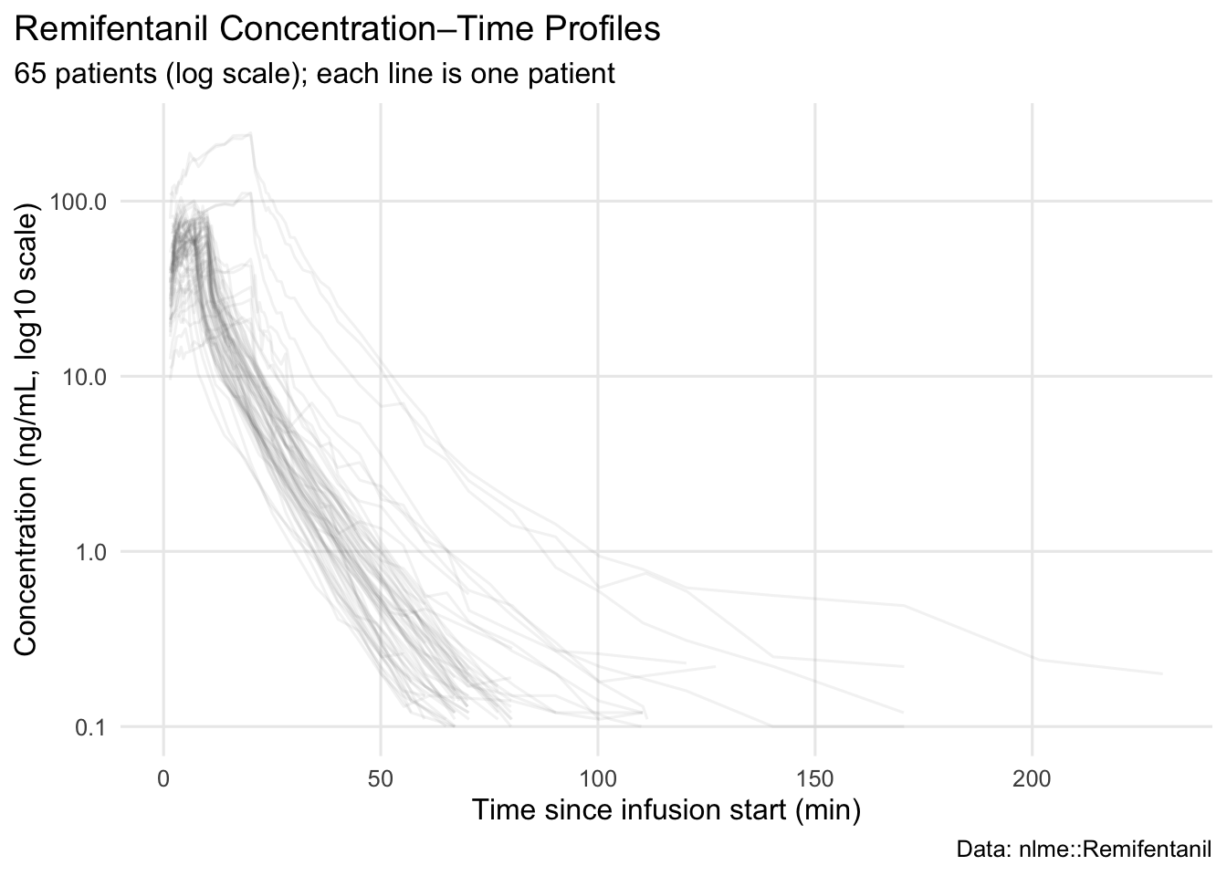
Notice what is now explicit:
- time origin and unit (minutes)
- concentration unit
- log scale in the label (no ambiguity)
- caption documenting the data source
Worked Example 2: Make Grouping Self-Documenting
If you facet or color by a covariate, the plot should tell the reader what it means.
p2 <- ggplot(remi, aes(TIME, DV, group = ID)) +
  geom_line(alpha = 0.10, color = "grey35") +
  facet_wrap(~ SEX) +
  scale_y_log10() +
  labs(
    title = "Profiles Stratified by Sex",
    subtitle = "Faceting makes group comparison easier than color in large-N spaghetti plots",
    x = "Time since infusion start (min)",
    y = "Concentration (ng/mL, log10 scale)",
    caption = "Each panel contains a different set of patients; compare patterns, not individual identities."
  ) +
  theme_pmx()

p2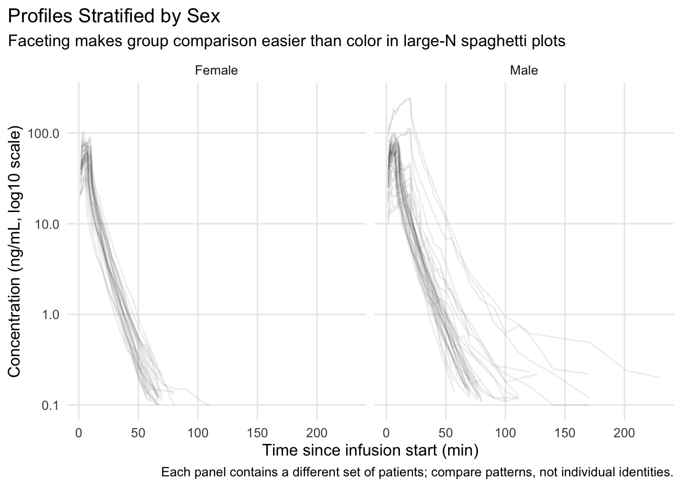
Warning
Facets can look “different” simply because they contain different people.
Prefer interpretation statements like “patterns appear…” rather than “group A is higher.”
Worked Example 3: Add Light Annotations (Only When Helpful)
Annotations should be minimal and factual. One common PMx annotation is marking a time window of interest.
p3 <- ggplot(remi, aes(TIME, DV, group = ID)) +
  geom_line(alpha = 0.08, color = "grey35") +
  scale_y_log10() +
  annotate("rect", xmin = 0, xmax = 20, ymin = -Inf, ymax = Inf, alpha = 0.08) +
  labs(
    title = "Profiles with a Highlighted Early Window",
    subtitle = "Shaded region: 0–20 min (early distribution / infusion phase)",
    x = "Time since infusion start (min)",
    y = "Concentration (ng/mL, log10 scale)"
  ) +
  theme_pmx()

p3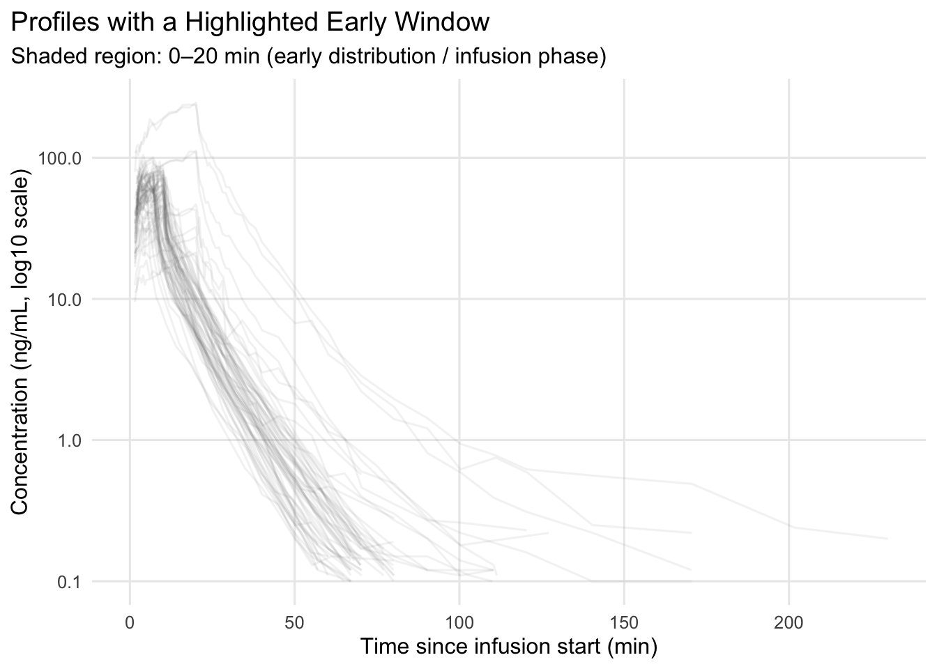
Note
The annotation is not “analysis.”
It is a communication cue: “look here first.”
Note
For report-ready figures, don’t rely on color alone.
Use linetype or shape to encode groups when plots are dense or may be printed in grayscale.
Clear encoding is part of good figure design — not just styling.
Worked Example 4: Multi-Panel Layout for Reporting
Reports often need a small set of coordinated figures. We’ll build two plots and place them in a simple layout.
library(patchwork)

p_left <- p1 +
  labs(
    title = NULL,
    subtitle = "Overall",
    caption = NULL
  )

p_right <- p2 +
  labs(
    title = NULL,
    subtitle = "By sex",
    caption = NULL
  )

(p_left | p_right) +
  plot_annotation(
    title = "Remifentanil Concentration–Time Profiles",
    caption = "Each panel contains a different set of patients; compare patterns, not individuals.\nConsistent axes, scale, and styling across panels."
  )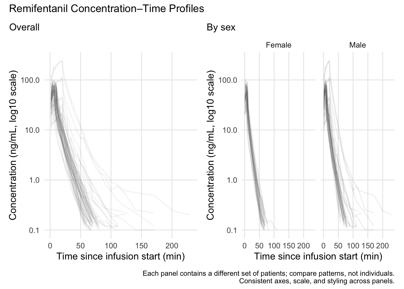
Strategies
- Treat titles/subtitles as part of the figure, not optional.
- Label units everywhere (time, concentration, dose).
- If you transform an axis, label it explicitly.
- Use a reusable theme function (
theme_pmx()). - Prefer faceting over color when lines overlap heavily.
- If you use color for groups, consider also using
linetypeorshapefor print-friendly redundancy. - Use annotations sparingly and factually.
- Build multi-panel figures with consistent scales and styling.
Common Mistakes
- Repeating the same information in multiple places (panel titles, subtitles, and global title).
- Using inconsistent scales or axes across panels, making comparisons misleading.
- Overloading panels with too many elements instead of keeping each panel focused.
- Combining plots that answer unrelated questions in the same layout.
- Not distinguishing between panel-level labels and overall figure annotations.
- Letting layout decisions obscure the comparison you are trying to highlight.
Practice Problems
- Modify
theme_pmx()to move the legend to the bottom. - Create a plot colored by
SEXinstead of faceting. When is that readable? - Create a version that uses both
colorandlinetypeforSEX. When does that help? - Add a caption that includes both dataset name and units.
- Create a 2×1 vertical layout (stacked) using patchwork.
- Identify one annotation you think is helpful and one that would be too much.
TipStep-by-Step Solutions
# 1) Theme with legend at bottom
theme_pmx2 <- function(base_size = 12) {
  theme_minimal(base_size = base_size) +
    theme(
      plot.title.position = "plot",
      legend.position = "bottom",
      panel.grid.minor = element_blank()
    )
}

# 3) Color + linetype for a categorical covariate
p2b <- ggplot(remi, aes(TIME, DV, group = ID, color = SEX, linetype = SEX)) +
  geom_line(alpha = 0.10) +
  scale_y_log10() +
  labs(
    title = "Profiles Grouped by Sex",
    subtitle = "Color and linetype encode the same categorical covariate",
    x = "Time since infusion start (min)",
    y = "Concentration (ng/mL, log10 scale)",
    color = "Sex",
    linetype = "Sex"
  ) +
  theme_pmx2()

p2b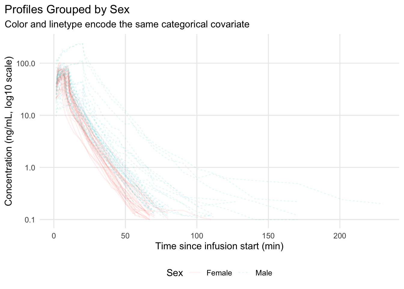
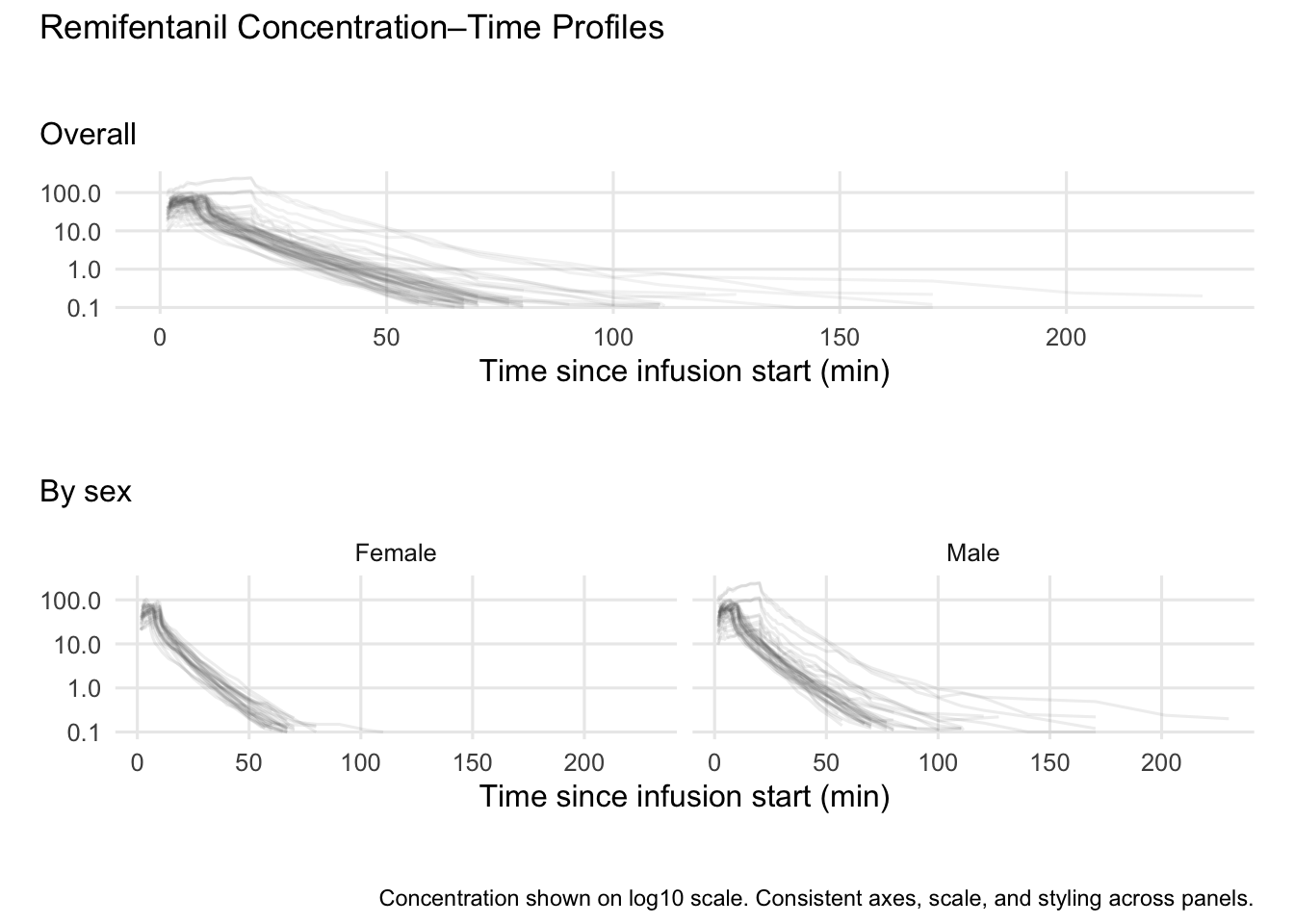
# 5) Stacked layout
# Remove plot-level titles/captions before combining panels
p1_clean <- p1 +
  labs(
    title = NULL,
    subtitle = "Overall",
    caption = NULL,
    y = NULL
  ) +
  theme(
    plot.subtitle = element_text(margin = margin(b = 8)),
    plot.margin = margin(18, 10, 18, 10)
  )

p2_clean <- p2 +
  labs(
    title = NULL,
    subtitle = "By sex",
    caption = NULL,
    y = NULL
  ) +
  theme(
    plot.subtitle = element_text(margin = margin(b = 8)),
    plot.margin = margin(18, 10, 18, 10)
  )

(p1_clean / p2_clean) +
  plot_layout(heights = c(1, 1.15)) +
  plot_annotation(
    title = "Remifentanil Concentration–Time Profiles",
    caption = "Concentration shown on log10 scale. Consistent axes, scale, and styling across panels."
  ) &
  theme(
    plot.title = element_text(margin = margin(b = 12)),
    plot.caption = element_text(margin = margin(t = 12))
  )
Summary
In this lesson, you turned correct plots into communication-ready figures:
- Added explicit titles, subtitles, captions, and units.
- Used consistent theme and scale choices.
- Made grouping self-documenting.
- Added minimal annotations to guide attention.
- Built simple multi-panel layouts for PMx reporting.
A good PMx figure is not “pretty.”
It is clear, honest, and reusable.
TipQuick Tips
- If you can’t interpret the plot without reading your code, add labels.
- Always include units and scale transformations in axis labels.
- Use a reusable theme function for consistent styling.
- Don’t rely on color alone when group identity matters;
linetypeandshapecan help. - Prefer fewer, clearer annotations over many small notes.
- Think “report embedding”: can this figure stand alone on a slide?