library(tidyverse)

data(Theoph, package = "datasets")

theoph <- Theoph %>%
  rename(
    ID   = Subject,
    TIME = Time,
    DV   = conc,
    AMT  = Dose
  ) %>%
arrange(ID, TIME)Individual Profiles and Structural QC
Learn how pharmacometricians interpret layered concentration–time plots to assess structural integrity and modeling readiness.
Tip
Core idea of this lesson: Once a PK plot is built correctly layer by layer, the next skill is learning how to read those layers like a pharmacometrician.
Learning Objectives
By the end of this lesson, you will be able to:
- Interpret absorption and elimination phases from layered PK plots.
- Detect structural data issues visually.
- Distinguish biological variability from data errors.
- Use faceting and layering strategically for inspection.
- Decide whether a dataset is ready for modeling.
Key Ideas
- A correctly built plot must be interpreted layer by layer.
- Structural correctness (grouping, ordering, mapping) determines whether interpretation is valid.
- Visual patterns must always be questioned, not trusted blindly.
- Individual profiles reveal both biological variability and potential data issues.
- In PMx, plots are used to assess modeling readiness, not just to visualize data.
From Construction to Interpretation
In the previous lesson, you learned how to build plots layer by layer:
- Canvas
- Mappings
- Geoms
- Structural layers
- Communication layers
Now we ask a deeper question:
What does each layer tell us about the data?
A plot is not just a picture — it is a diagnostic tool.
Note
Good plotting builds structure.
Good interpretation builds judgment.
Setup
Layered QC Default View
We begin with the structurally correct layered plot:
ggplot(theoph, aes(TIME, DV, group = ID)) +
  geom_line(alpha = 0.5, color = "grey40") +
  geom_point(alpha = 0.8) +
  labs(
    title = "Theoph: Individual Concentration–Time Profiles",
    x = "Time (hours)",
    y = "Concentration"
  ) +
  theme_minimal()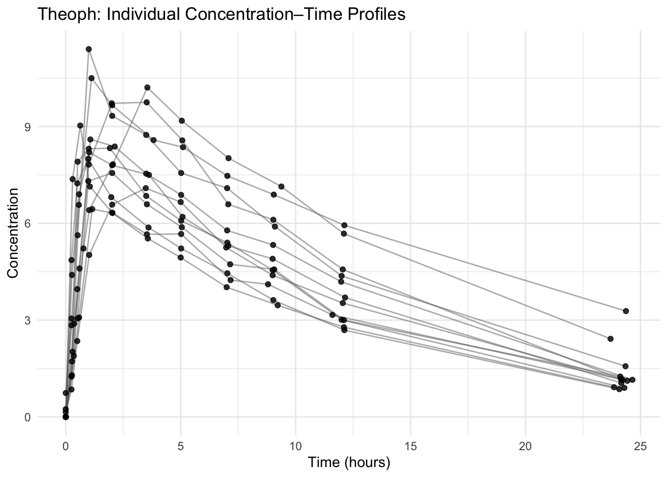
This is your default structural QC layer stack.
Now we interpret it.
Using Additional Aesthetic Channels for Inspection
In the previous lesson, you learned that aesthetics can be mapped inside aes().
Beyond color, common aesthetics include:
linetypeshapesize
These are especially useful during QC when you want to highlight or distinguish structure without changing the data.
For example, we can emphasize one subject using a different linetype:
theoph %>%
  mutate(HIGHLIGHT = if_else(ID == 1, "Focus", "Other")) %>%
  ggplot(aes(TIME, DV, group = ID, linetype = HIGHLIGHT)) +
  geom_line() +
  geom_point(alpha = 0.7) +
  theme_minimal()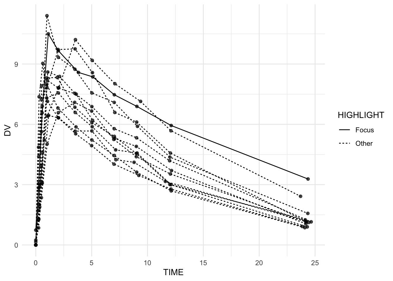
Or distinguish groups of points using shape:
theoph %>%
  mutate(EARLY = if_else(TIME <= 2, "Early", "Late")) %>%
  ggplot(aes(TIME, DV, group = ID, shape = EARLY)) +
  geom_line(alpha = 0.5, color = "grey40") +
  geom_point(size = 2) +
  theme_minimal()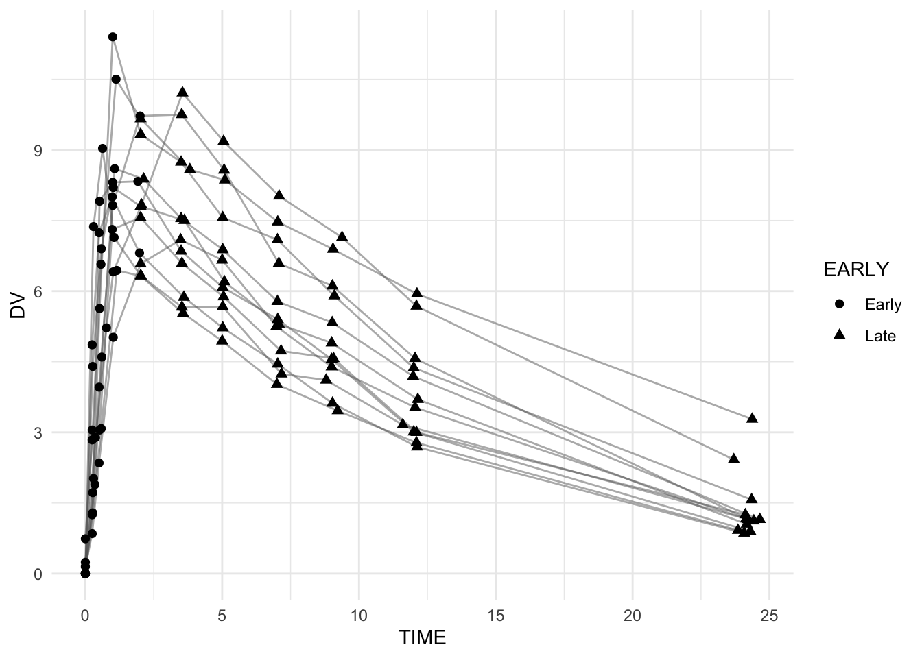
These mappings do not alter structure — they enhance interpretability.
Note
Mapping aesthetics like linetype or shape can help you see structure more clearly, but they should never compensate for structural errors.
Reading the Shape: Absorption and Elimination
In oral PK data, layered lines should typically show:
- An upward rise (absorption phase)
- A peak (Cmax)
- A gradual downward slope (elimination phase)
Ask:
- Do all subjects show a peak?
- Is the decline smooth or erratic?
- Do any lines move backward unexpectedly?
Irregular or jagged lines often signal structural issues.
Detecting Structural Issues from Layers
Example: Missing or Disordered Time
If time were unordered within subject, lines would zig-zag.
Because we sorted by ID and TIME, this structure is reliable.
Example: Duplicate Observations
theoph %>%
  count(ID, TIME) %>%
  filter(n > 1)
[1] ID TIME n
<0 rows> (or 0-length row.names)If duplicates appear in real data, layered lines may appear flat or oddly thick.
Warning
Structural problems must be fixed before modeling. Models cannot rescue corrupted structure.
Between-Subject Variability
Look at the vertical separation of lines.
Questions to ask:
- Are peaks similar across subjects?
- Does elimination slope vary widely?
- Are some subjects systematically higher?
Variability here informs whether mixed-effects modeling may be necessary later.
This is how visualization connects to modeling decisions.
Layer for Inspection: Faceting
Sometimes overlapping layers hide important details.
Add a faceting layer:
ggplot(theoph, aes(TIME, DV, group = ID)) +
  geom_line(alpha = 0.7, color = "grey40") +
  geom_point(alpha = 0.9) +
  facet_wrap(~ ID) +
  theme_minimal()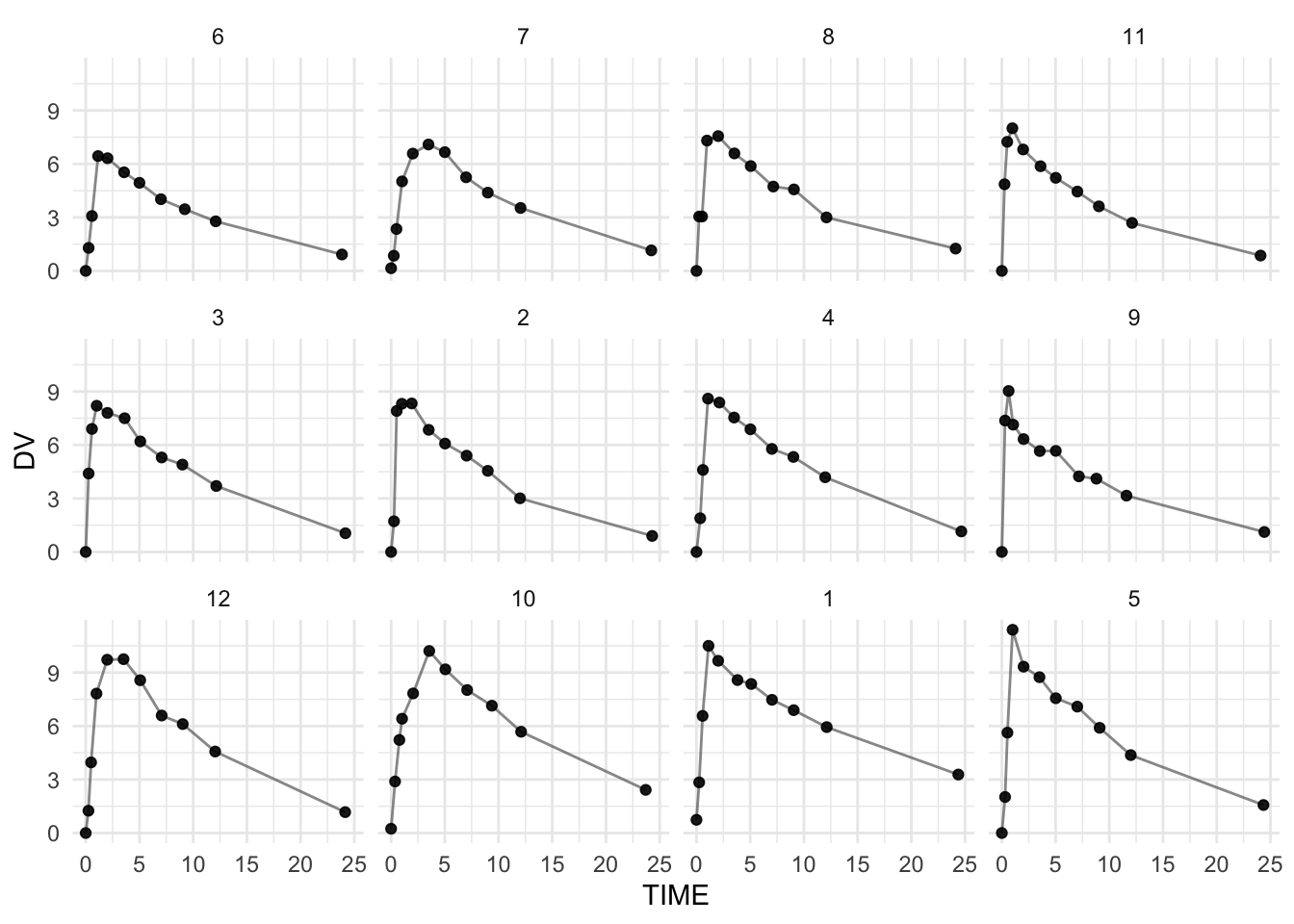
Faceting separates subjects into panels.
Use this layer when:
- Investigating suspected outliers
- Checking sampling schedules
- Comparing curve shapes carefully
When a Plot Signals “Not Ready”
Warning signs:
- Lines that cross implausibly
- Flat segments suggesting repeated values
- Sudden vertical jumps
- Negative concentrations
- Missing early-time data
These suggest structural review before modeling.
Note
Visualization is your first model diagnostic — even before a model exists.
Strategies
- Start with layered QC default plot.
- Scan for overall shape consistency.
- Zoom in with faceting if needed.
- Investigate anomalies immediately.
- Only proceed to modeling once structural confidence is high.
Common Mistakes
- Trusting visual appearance without checking structure.
- Skipping data checks (e.g., duplicates, ordering) before interpretation.
- Not using faceting when overlap hides issues.
- Overusing aesthetics instead of investigating the data.
- Ignoring unusual shapes instead of inspecting them.
Practice Problems
- Create the layered QC default plot.
- Identify which subject appears to have the highest peak.
- Modify the plot to highlight one subject using
linetype. - Use faceting to inspect one subject more closely.
- Run a duplicate time check.
- Write two sentences describing the overall variability pattern.
TipStep-by-Step Solutions
# 1
ggplot(theoph, aes(TIME, DV, group = ID)) +
  geom_line(alpha = 0.5, color = "grey40") +
  geom_point(alpha = 0.8) +
  theme_minimal()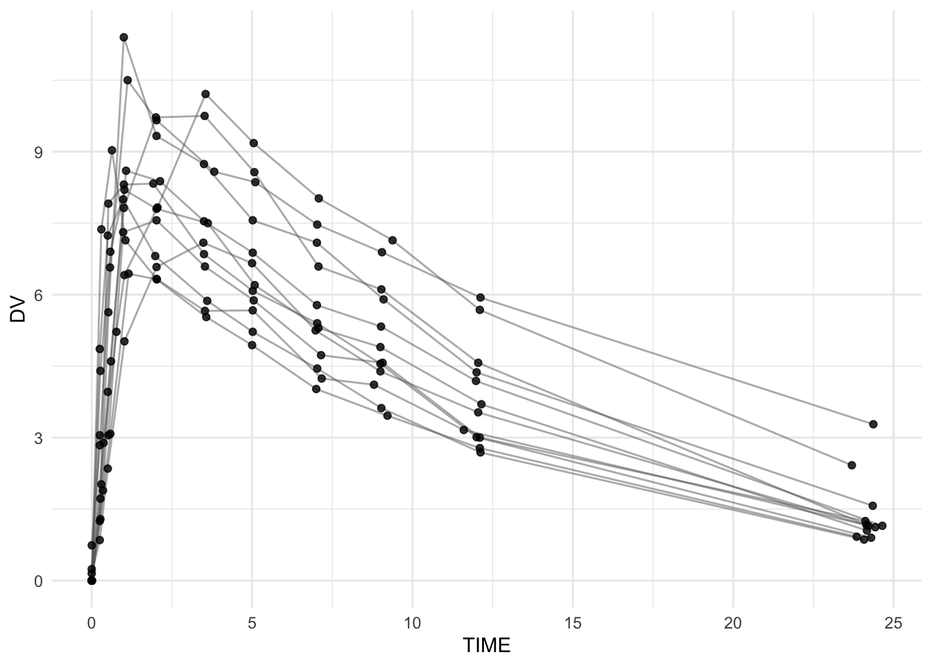
# 3
theoph %>%
  mutate(HIGHLIGHT = if_else(ID == 1, "Focus", "Other")) %>%
  ggplot(aes(TIME, DV, group = ID, linetype = HIGHLIGHT)) +
  geom_line() +
  geom_point(alpha = 0.7) +
  theme_minimal()
# 4
ggplot(theoph, aes(TIME, DV, group = ID)) +
  geom_line(alpha = 0.7, color = "grey40") +
  geom_point(alpha = 0.9) +
  facet_wrap(~ ID) +
  theme_minimal()
# 5
theoph %>%
  count(ID, TIME) %>%
  filter(n > 1)
[1] ID TIME n
<0 rows> (or 0-length row.names)Summary
In this lesson, you learned to:
- Read layered PK plots systematically.
- Identify absorption and elimination phases.
- Detect structural irregularities.
- Use additional aesthetic mappings (
linetype,shape) to enhance inspection. - Assess between-subject variability.
- Determine modeling readiness.
You now understand both how to build layered PK plots — and how to interpret them.
TipQuick Tips
- Does each subject rise then decline?
- Are peaks plausible and distinct?
- Is elimination smooth?
- Can aesthetic mappings help highlight structure?
- Is the dataset modeling-ready?