library(tidyverse)

data(Theoph, package = "datasets")

theoph <- Theoph %>%
  rename(
    ID   = Subject,
    TIME = Time,
    DV   = conc,
    AMT  = Dose
  ) %>%
  arrange(ID, TIME)
Linear and Log Scales
Use linear vs log views to reveal elimination structure, interpret slopes, and connect visualization to first-order PK intuition.
Tip
Core idea of this lesson: Scale is not cosmetic.
When you add a log-scale layer, you change what PK behavior becomes visible — especially in the elimination phase.
Learning Objectives
By the end of this lesson, you will be able to:
- Explain why PK data are often visualized on a log scale.
- Add a log-scale layer using
scale_y_log10()(without transforming the data manually). - Interpret elimination phase behavior on linear vs log scales.
- Use log-scale slopes to reason qualitatively about elimination rate variability.
- Recognize common pitfalls (zeros/BLQ, labeling, misinterpretation).
Key Ideas
- Scale is a layer that changes how data are displayed, not the data itself.
- Linear and log scales emphasize different parts of the PK profile.
- Log scale reveals multiplicative and exponential behavior more clearly.
- Elimination phase structure is best interpreted on a log scale.
- Visual patterns on a log scale support qualitative reasoning, not parameter estimation.
- In PMx, scale choice directly affects interpretation and modeling intuition.
The Scale Layer: What It Does (and What It Does Not Do)
A scale layer does not change your dataset.
It changes how values are displayed on the axes.
That matters because many PK relationships are multiplicative and exponential.
Note
Changing the scale can reveal structure that was always present — but not easily visible on a linear axis.
Setup
Linear Scale: Default View
ggplot(theoph, aes(TIME, DV, group = ID)) +
  geom_line(alpha = 0.6, color = "grey40") +
  geom_point(alpha = 0.8) +
  labs(
    title = "Theoph: Linear Scale",
    x = "Time (hours)",
    y = "Concentration"
  ) +
  theme_minimal()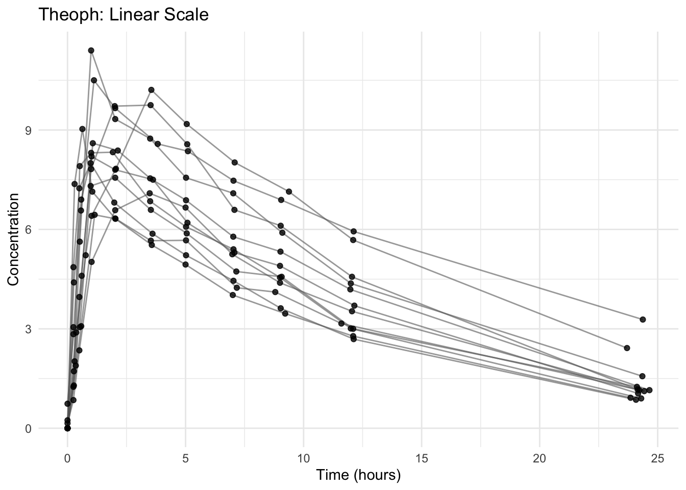
On a linear scale:
- Early high concentrations dominate visually.
- Late elimination can appear compressed.
- Small differences at low concentrations are hard to see.
Add the Log-Scale Layer
ggplot(theoph, aes(TIME, DV, group = ID)) +
  geom_line(alpha = 0.6, color = "grey40") +
  geom_point(alpha = 0.8) +
  scale_y_log10() +
  labs(
    title = "Theoph: Log Scale (Base 10)",
    x = "Time (hours)",
    y = "Concentration (log scale)"
  ) +
  theme_minimal()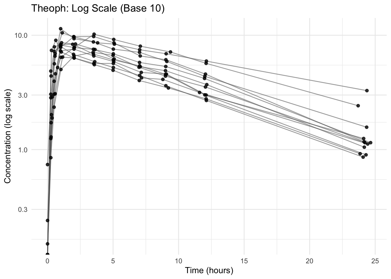
Notice what changed:
- Elimination phase appears more linear.
- Differences at low concentrations become visible.
- Multiplicative differences become easier to interpret.
Why Log Scale Matters in PK
For many drugs, elimination is approximately first-order:
\[ C(t) = C_0 e^{-kt} \]
Where:
- \(C(t)\) = concentration at time \(t\)
- \(C_0\) = concentration at the start of the elimination phase
- \(k\) = elimination rate constant (how quickly the drug is removed)
- \(t\) = time
Taking logs:
\[ \log C(t) = \log C_0 - kt \]
So in log space, exponential decay becomes approximately linear.
Note
On a log scale, a straight (downward) line during elimination suggests first-order behavior.
The slope is proportional to the elimination rate constant \(k\).
Interpreting the Elimination Slope (Qualitative)
On a log scale:
- Steeper downward slope → larger \(k\) → faster elimination.
- Flatter slope → smaller \(k\) → slower elimination.
- Similar/parallel slopes across subjects → similar \(k\) values.
Note
Slope differences suggest possible variability in elimination.
They guide modeling hypotheses — they do not replace quantitative estimation.
Worked Example 1: Compare Linear vs Log Views Side-by-Side
# Linear
p_linear <- ggplot(theoph, aes(TIME, DV, group = ID)) +
  geom_line(alpha = 0.6, color = "grey40") +
  geom_point(alpha = 0.8) +
  labs(title = "Linear Scale") +
  theme_minimal()

# Log
p_log <- ggplot(theoph, aes(TIME, DV, group = ID)) +
  geom_line(alpha = 0.6, color = "grey40") +
  geom_point(alpha = 0.8) +
  scale_y_log10() +
  labs(title = "Log Scale") +
  theme_minimal()

p_linear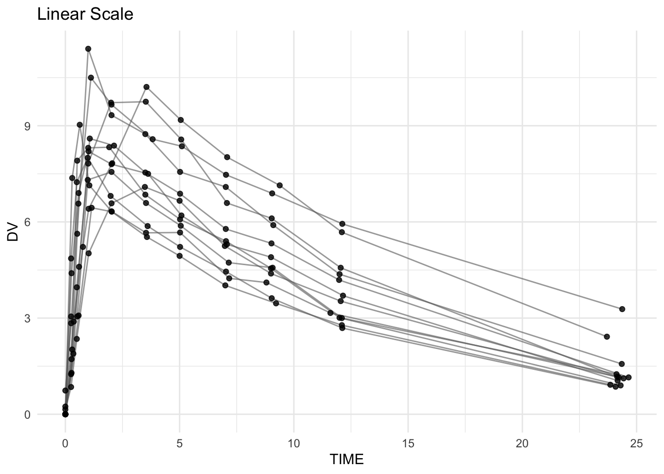
p_log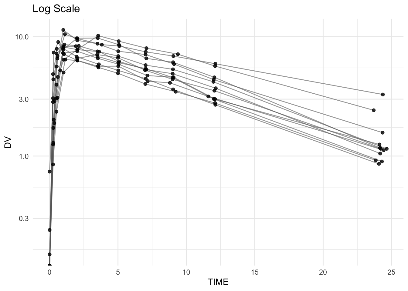
Use this comparison to ask:
- Does elimination appear straighter on log scale?
- Are later time points more informative on log scale?
- Do profiles look “more parallel” on log scale (similar \(k\))?
Worked Example 2: Facet by Subject to Inspect Slopes
Overlapping lines can hide slope differences. Faceting separates subjects.
ggplot(theoph, aes(TIME, DV)) +
  geom_line(aes(group = ID), alpha = 0.7, color = "grey40") +
  geom_point(alpha = 0.9) +
  scale_y_log10() +
  facet_wrap(~ ID) +
  labs(
    title = "Individual Profiles on Log Scale",
    x = "Time (hours)",
    y = "Concentration (log scale)"
  ) +
  theme_minimal()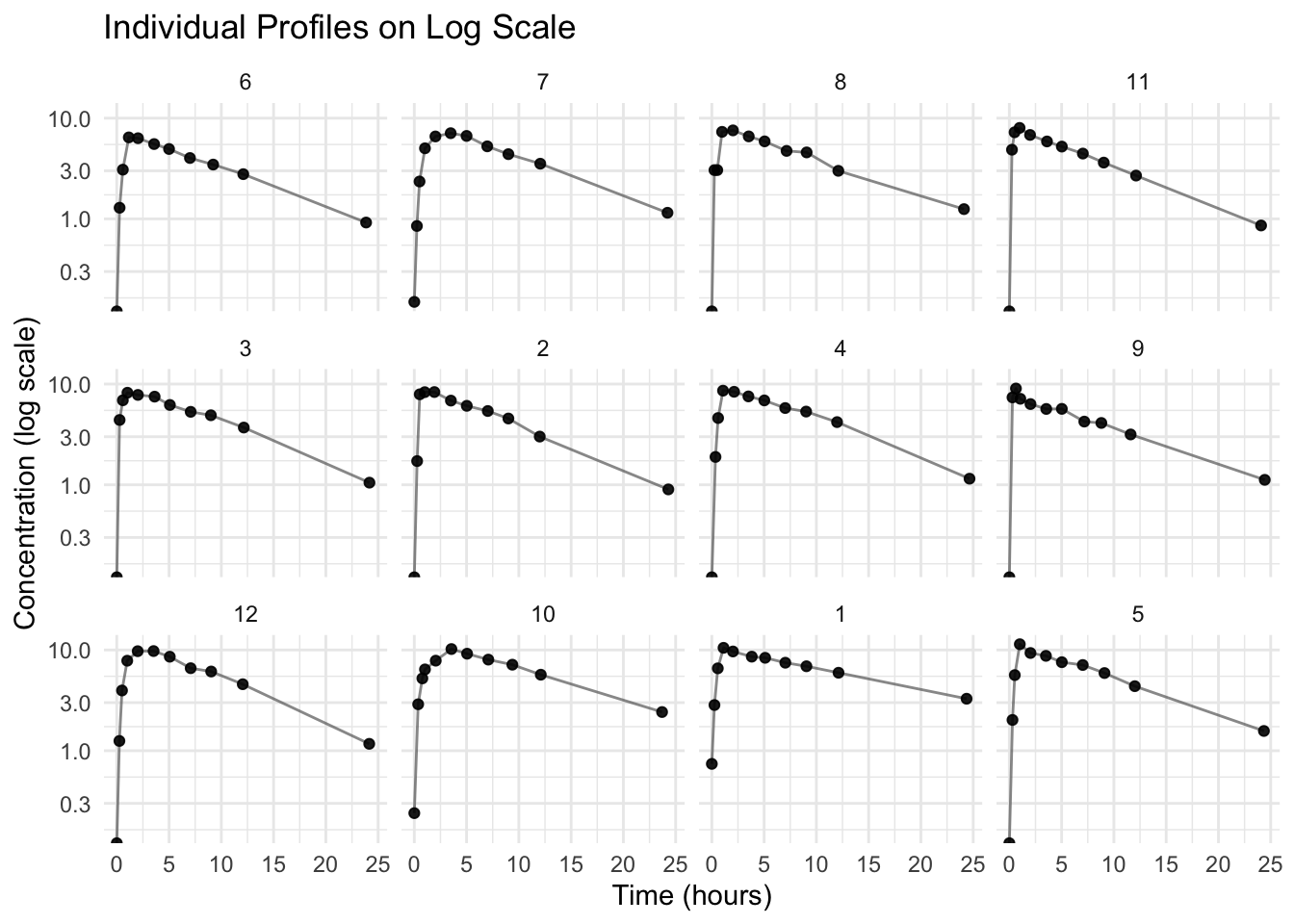
Worked Example 3: Linear Trend Overlay on Log Scale (Optional)
This is a visual aid — not an analysis.
A common mistake is to fit a straight line across the entire concentration–time profile. Even on a log scale, the early portion of an oral profile includes absorption and the peak, so a single line across all time points becomes a “compromise” that is not interpretable as an elimination slope.
Step 1: What happens if we fit across the full profile? (Awkward on purpose)
ggplot(theoph, aes(TIME, DV, group = ID)) +
  geom_line(alpha = 0.4, color = "grey40") +
  geom_point(alpha = 0.7) +
  scale_y_log10() +
  geom_smooth(aes(group = ID), method = "lm", se = FALSE) +
  labs(
    title = "Full Profile (Log Scale) with Linear Fits",
    subtitle = "Fits across absorption + peak + elimination are not interpretable as terminal slopes",
    x = "Time (hours)",
    y = "Concentration (log scale)"
  ) +
  theme_minimal()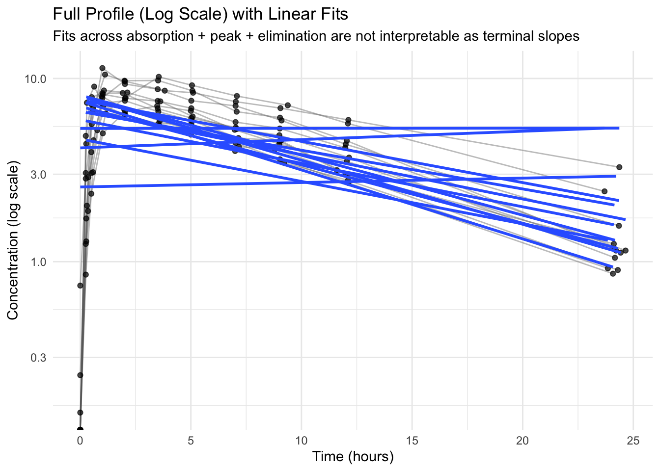
You will often see trend lines that look awkward or inconsistent here — that is expected.
Note
A linear fit on a log scale is only interpretable as an elimination slope in the terminal phase.
If you fit across absorption + peak + elimination, the line becomes a compromise and is not meaningful as an elimination rate.
We therefore restrict the fit to later time points to illustrate terminal-phase behavior. In real analyses, the terminal phase is selected more carefully (diagnostics + domain knowledge).
Step 2: Fit only the terminal phase (simple demo rule)
elimination_start <- 5  # hours (simple choice for Theoph demo)

ggplot(theoph %>% filter(TIME >= elimination_start),
       aes(TIME, DV, group = ID)) +
  geom_line(alpha = 0.4, color = "grey40") +
  geom_point(alpha = 0.7) +
  scale_y_log10() +
  geom_smooth(aes(group = ID), method = "lm", se = FALSE) +
  labs(
    title = "Terminal Phase (Log Scale) with Subject-Specific Linear Fits",
    subtitle = paste0("Linear fits shown for TIME ≥ ", elimination_start, " h"),
    x = "Time (hours)",
    y = "Concentration (log scale)"
  ) +
  theme_minimal()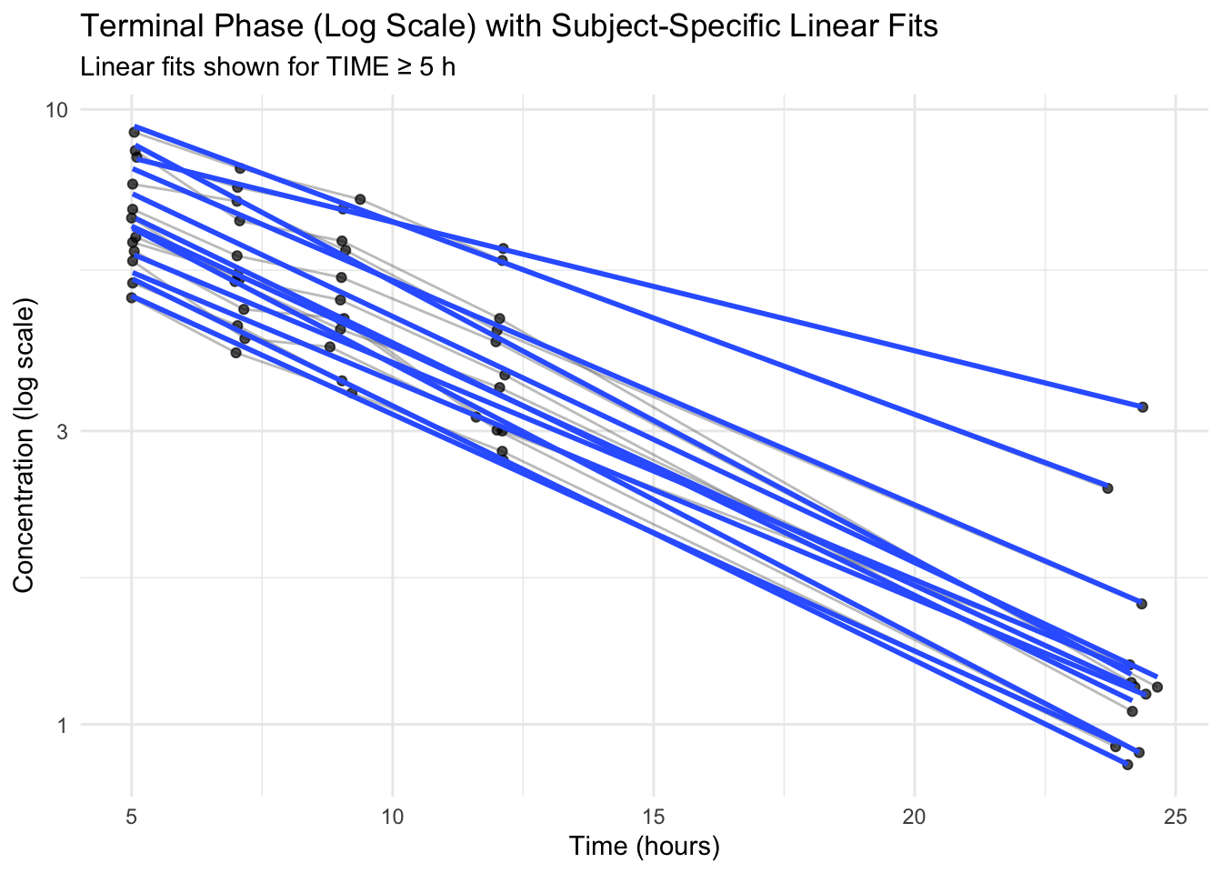
If the trend lines are roughly straight in the later phase, that supports first-order elimination intuition.
Warning
This overlay is a visual check, not a parameter estimate.
Do not interpret the slope as “the elimination slope” unless you have intentionally selected a terminal phase region. In real PMx workflows, terminal phase selection is a modeling decision.
When Log Scale Signals Deeper Insight
If profiles are approximately straight during elimination on log scale:
- first-order elimination may be a reasonable assumption
- slope differences suggest variability in \(k\) (and potentially clearance)
If profiles curve substantially on log scale:
- kinetics may be more complex (distribution phases, nonlinear elimination, etc.)
- model assumptions should be examined carefully
Strategies
- Use linear scale to understand overall profile shape and early behavior.
- Use log scale to inspect the elimination phase and compare slopes.
- Label log axes clearly.
- If you have BLQ/zeros in real datasets, decide on a handling strategy before plotting on log scale.
- Treat slope comparisons as hypotheses to test with a model.
Common Mistakes
- Manually transforming data (e.g.,
log(DV)) instead of using a scale layer. - Interpreting slopes on a linear scale as elimination rates.
- Forgetting that log scale cannot display zero or negative values.
- Not labeling axes clearly when using log scale.
- Interpreting slopes across the full profile (including absorption) as elimination behavior.
- Treating visual slope differences as quantitative conclusions instead of hypotheses.
Practice Problems
- Create the layered QC plot on linear scale.
- Add a log-scale layer with
scale_y_log10(). - Compare elimination shape between linear and log views.
- Facet by
IDand compare elimination slopes qualitatively. - Write 2–3 sentences describing what log scale reveals that linear scale hides.
TipStep-by-Step Solutions
# 1
ggplot(theoph, aes(TIME, DV, group = ID)) +
  geom_line(alpha = 0.6, color = "grey40") +
  geom_point(alpha = 0.8)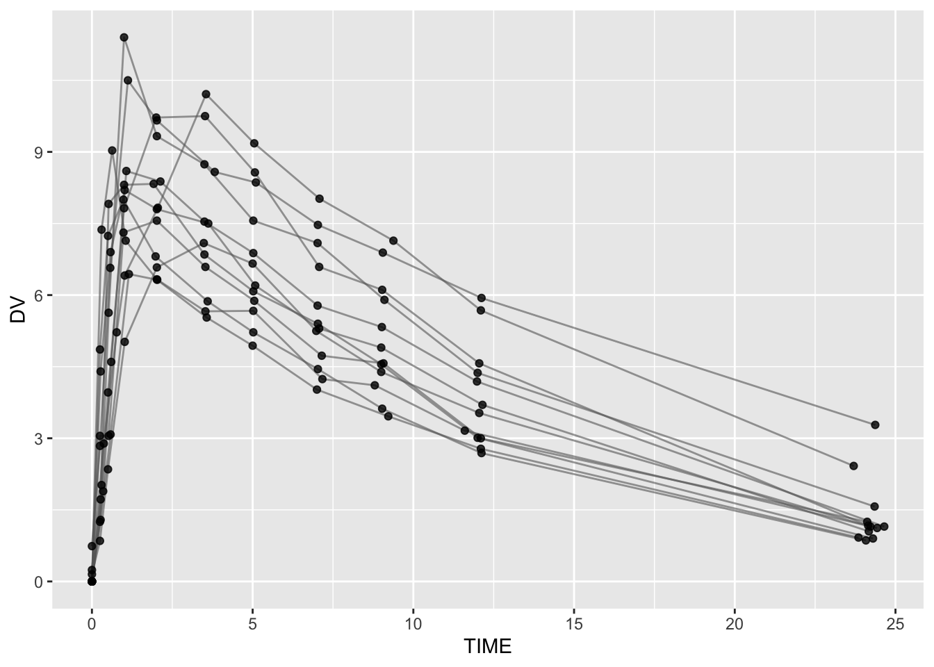
# 2
ggplot(theoph, aes(TIME, DV, group = ID)) +
  geom_line(alpha = 0.6, color = "grey40") +
  geom_point(alpha = 0.8) +
  scale_y_log10()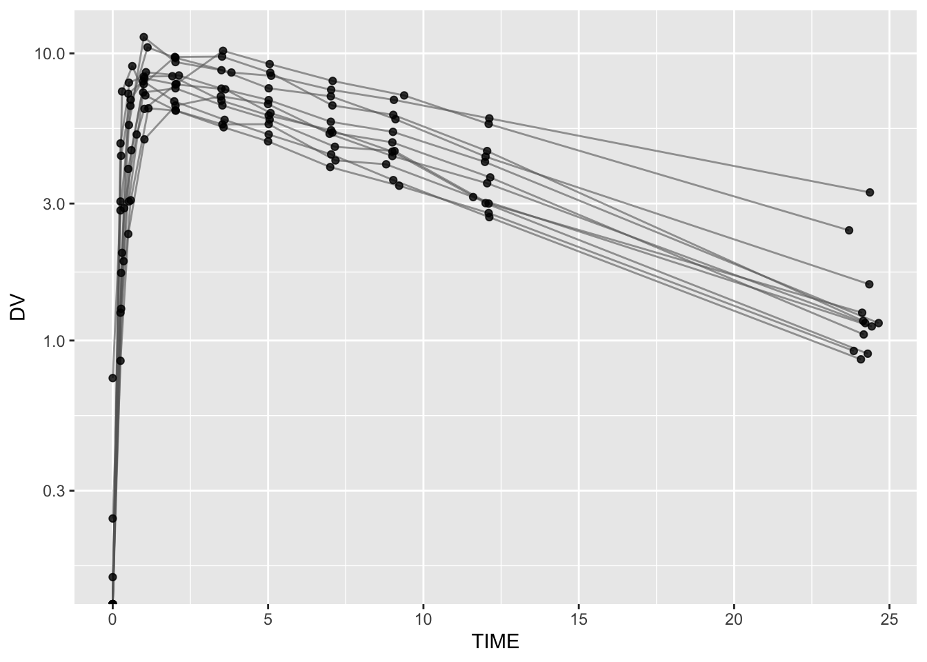
# 4
ggplot(theoph, aes(TIME, DV)) +
  geom_line(aes(group = ID), alpha = 0.7, color = "grey40") +
  geom_point(alpha = 0.9) +
  scale_y_log10() +
  facet_wrap(~ ID)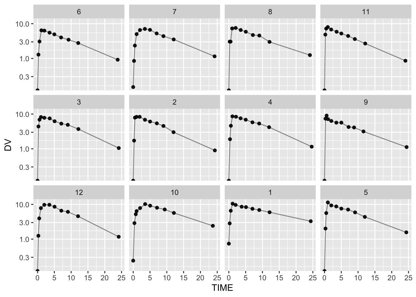
Summary
In this lesson, you learned that:
- Scale is a powerful layer that transforms interpretation.
- Log scale makes elimination behavior easier to see and compare.
- Exponential decay becomes approximately linear in log space.
- Log-scale slopes support qualitative reasoning about elimination rate variability.
TipQuick Tips
- If late-time behavior looks compressed, try log scale.
- Avoid manual
log(DV)unless you have a clear reason. - Log axes require positive values (plan BLQ/zero handling in real data).
- Use slope comparisons to guide modeling questions — not to replace modeling.