library(tidyverse)
library(nlme)
library(GGally)   # for ggpairs()

data(Remifentanil, package = "nlme")Stratification and Covariates
Use stratification layers (color, faceting, distribution plots, and pairs plots) to explore real covariates in the Remifentanil dataset from nlme.
Tip
Core idea of this lesson: Stratification is a layer that helps you compare meaningful groups.
Instead of looking at everyone at once, you intentionally separate or color by covariates that may matter for PK.
Learning Objectives
By the end of this lesson, you will be able to:
- Build a subject-level covariate table from repeated-measures PK data.
- Use histograms, density plots, and scatterplots to understand covariate distributions and relationships.
- Use a pairs plot to scan multiple continuous covariates at once.
- Visualize continuous vs categorical covariate relationships.
- Stratify concentration–time plots using color, facet_wrap, and facet_grid.
- Recognize when covariates are correlated (potential confounding).
- Translate stratified visual patterns into disciplined modeling hypotheses.
Key Ideas
- Stratification is a layer used to compare meaningful covariate-defined groups.
- Covariate distributions must be understood before interpreting stratified plots.
- Covariates can be correlated (confounding), which can mislead interpretation.
- Larger datasets introduce overplotting, requiring transparency and careful design.
- Stratified plots are used to generate hypotheses, not confirm effects.
Why Use a Real Covariate-Rich Dataset?
In many teaching demos, we “invent” a covariate (e.g., SEX) to practice stratification.
That works, but a real PMx dataset is better when you want to practice the full workflow:
- repeated concentration measurements per subject
- many covariates (age, sex, weight, body size measures)
- large N (overplotting becomes real)
In this lesson we use Remifentanil from {nlme}, which includes 65 patients and several covariates.
Note
We are not trying to “discover the true covariate model” here.
We are practicing how to look and how to avoid over-interpreting what we see.
Setup
Remifentanil is a groupedData object. We’ll convert it to a plain tibble and standardize column names.
remi <- as_tibble(Remifentanil) %>%
  rename(
    ID   = ID,
    TIME = Time,     # minutes from start of infusion
    DV   = conc,
    RATE = Rate,
    AMT  = Amt,
    AGE  = Age,
    SEX  = Sex,
    HT   = Ht,
    WT   = Wt,
    BSA  = BSA,
    LBM  = LBM
  )
Some rows have missing concentrations (e.g., at time 0). For plotting, we typically drop missing DV.
remi_obs <- remi %>%
  filter(!is.na(DV)) %>%
  arrange(ID, TIME)
Create a Subject-Level Covariate Table
Repeated-measures datasets contain many rows per subject. For covariate distributions, we want one row per subject.
subj <- remi %>%
  distinct(ID, AGE, SEX, HT, WT, BSA, LBM)
Worked Example 1: Weight Distribution
ggplot(subj, aes(WT)) +
  geom_histogram(bins = 20) +
  labs(
    title = "Distribution of Weight (WT)",
    x = "Weight (kg)",
    y = "Count"
  ) +
  theme_minimal()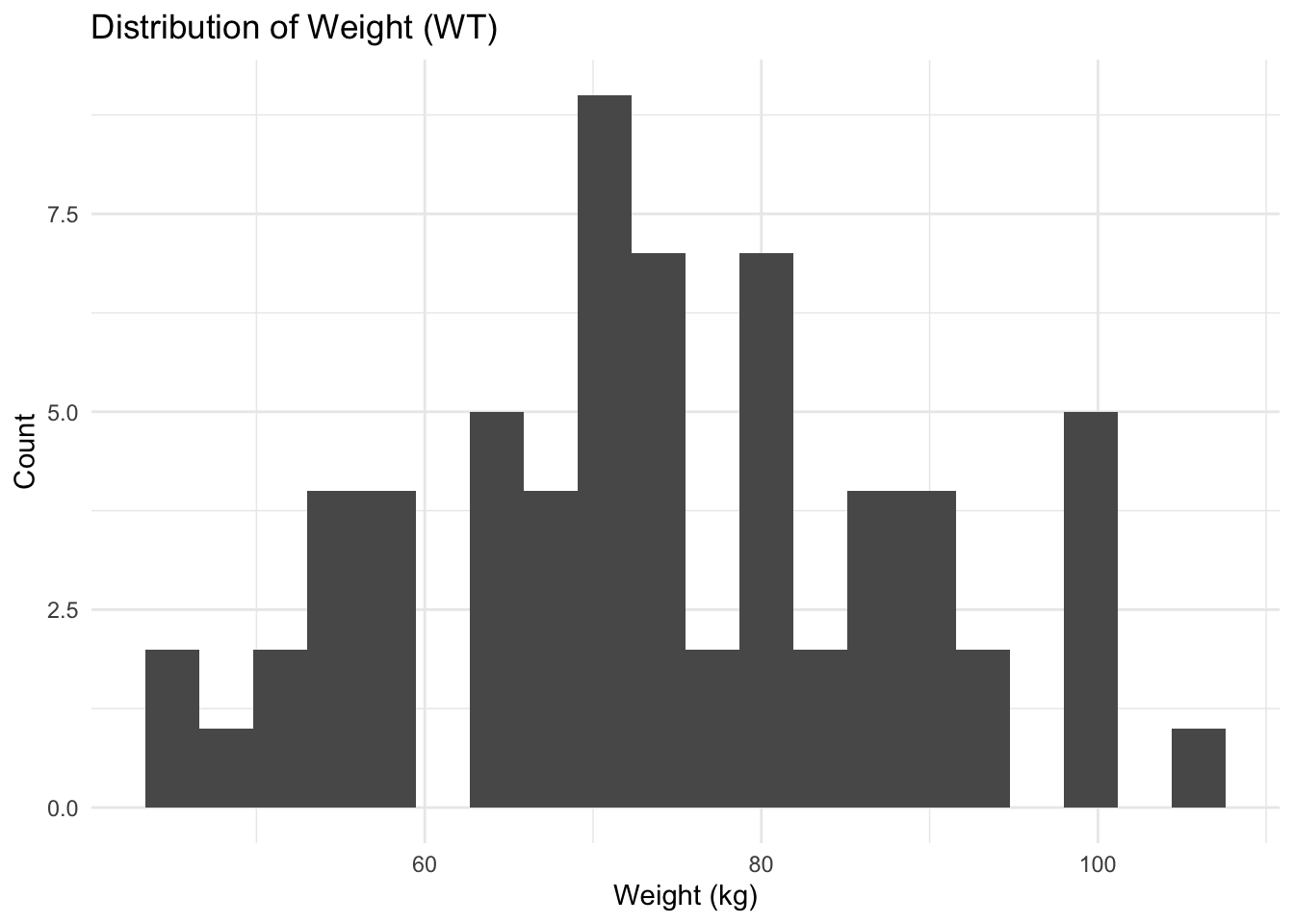
Worked Example 2: Weight by Sex (Density)
ggplot(subj, aes(WT, fill = SEX)) +
  geom_density(alpha = 0.4) +
  labs(
    title = "Weight Distribution by Sex",
    x = "Weight (kg)",
    y = "Density"
  ) +
  theme_minimal()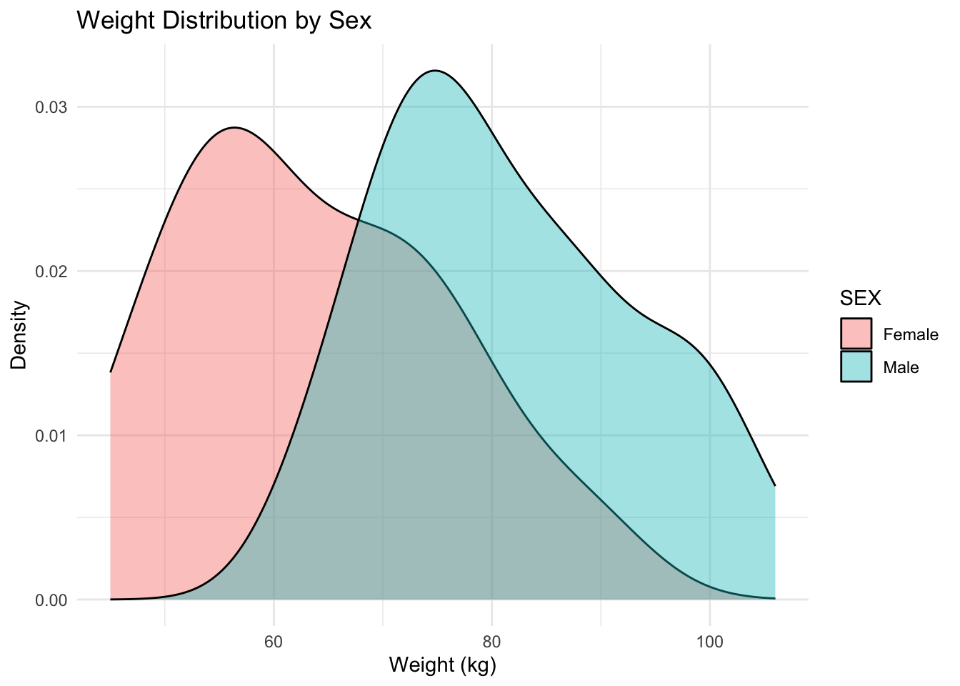
Notice how fill helps compare distribution shapes across groups.
Worked Example 3: Continuous vs Categorical Covariate (WT by Sex)
Before interpreting stratified PK plots, it helps to ask whether a categorical covariate is systematically associated with a continuous one.
ggplot(subj, aes(SEX, WT)) +
  geom_boxplot(outlier.shape = NA, alpha = 0.5) +
  geom_jitter(width = 0.12, height = 0, alpha = 0.7) +
  labs(
    title = "Continuous vs Categorical: WT by Sex",
    x = "Sex",
    y = "Weight (kg)"
  ) +
  theme_minimal()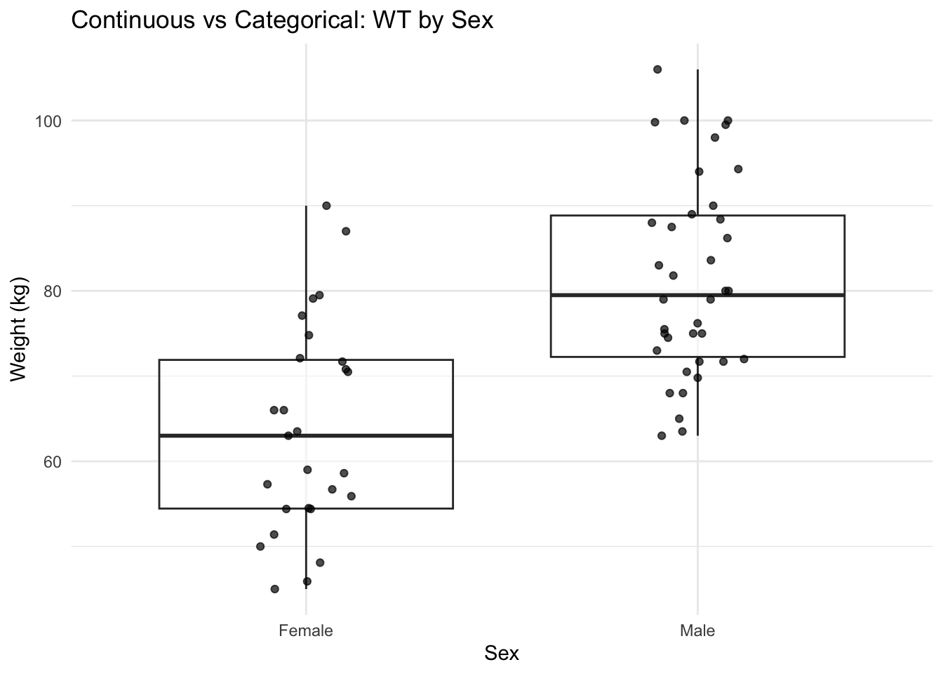
Note
If WT differs by sex, then a “sex effect” in PK could reflect WT (or another body-size covariate). This is the visual version of confounding awareness.
Worked Example 4: Check Covariate Relationships (Scatter)
Body-size covariates are often correlated. Here’s a simple example: WT vs BSA.
ggplot(subj, aes(WT, BSA)) +
  geom_point(alpha = 0.7) +
  labs(
    title = "Covariate Relationship: WT vs BSA",
    x = "WT (kg)",
    y = "BSA"
  ) +
  theme_minimal()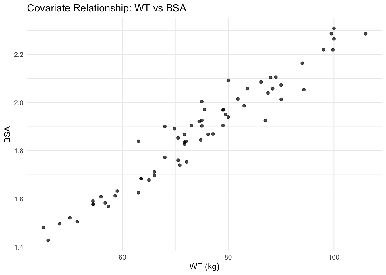
Worked Example 5: Pairs Plot for Continuous Covariates (Scan Many at Once)
When you have multiple continuous covariates, a pairs plot helps you quickly scan:
- distributions (diagonal)
- relationships (off-diagonal)
- potential redundancy (very strong correlations)
We’ll include the most common body-size covariates plus age.
subj_cont <- subj %>%
  select(AGE, HT, WT, BSA, LBM)

GGally::ggpairs(subj_cont)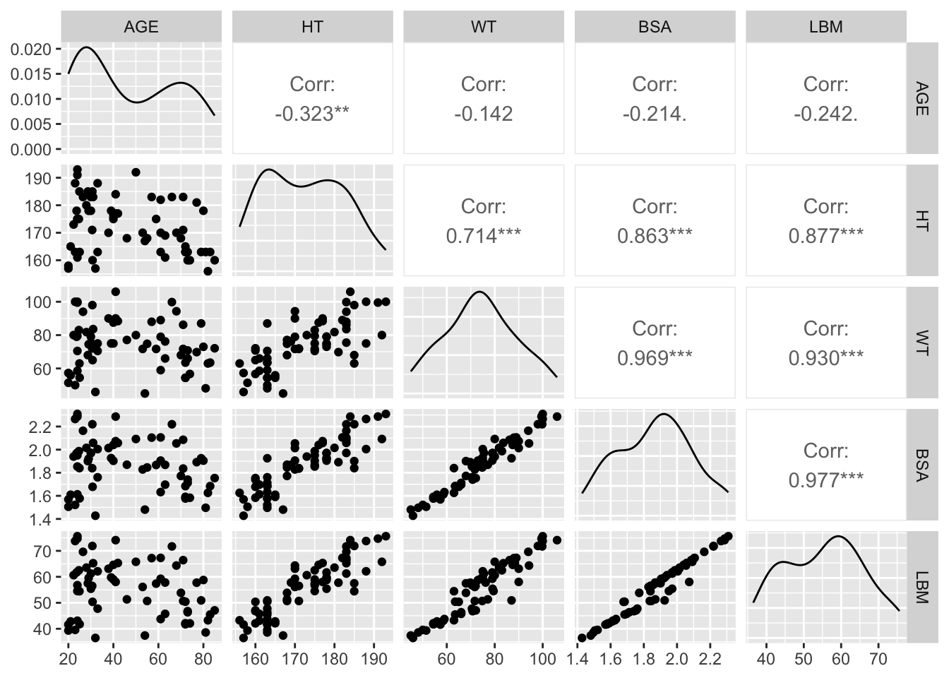
Warning
Pairs plots are great for screening, but they can encourage over-interpretation. Use them to generate questions like “Which covariates are basically the same information?” Then follow up with targeted plots and modeling decisions.
Create Practical Groups for Stratification
We’ll make:
- WT quartiles (more informative than a median split when N is moderate)
- AGE groups (simple bins)
subj <- subj %>%
  mutate(
    WT_Q = ntile(WT, 4),
    WT_GROUP = factor(WT_Q,
                      levels = 1:4,
                      labels = c("WT Q1 (lowest)", "WT Q2", "WT Q3", "WT Q4 (highest)")),
    AGE_GROUP = cut(
      AGE,
      breaks = c(0, 40, 60, Inf),
      labels = c("< 40", "40–60", "> 60"),
      right = FALSE
    )
  )

remi_obs <- remi_obs %>%
  left_join(subj %>% select(ID, WT_GROUP, AGE_GROUP), by = "ID")
Worked Example 6: Stratify Profiles by Sex (Facet)
ggplot(remi_obs, aes(TIME, DV, group = ID)) +
  geom_line(alpha = 0.15, color = "grey40") +
  geom_point(alpha = 0.15) +
  facet_wrap(~ SEX) +
  labs(
    title = "Remifentanil Concentration–Time Profiles by Sex",
    x = "Time (minutes)",
    y = "Concentration (ng/mL)"
  ) +
  theme_minimal()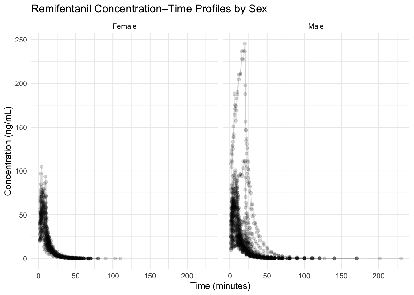
With 65 subjects, transparency is your friend.
Worked Example 7: Stratify by Weight Quartile (Color)
ggplot(remi_obs, aes(TIME, DV, group = ID, color = WT_GROUP)) +
  geom_line(alpha = 0.20) +
  labs(
    title = "Profiles Colored by Weight Quartile",
    x = "Time (minutes)",
    y = "Concentration (ng/mL)"
  ) +
  theme_minimal()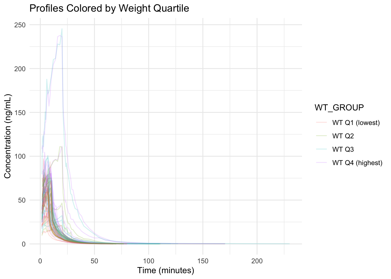
This answers: Do higher-weight subjects show systematically different profiles?
Worked Example 8: Two-Way Stratification with facet_grid (Sex × Weight Group)
ggplot(remi_obs, aes(TIME, DV, group = ID)) +
  geom_line(alpha = 0.18, color = "grey40") +
  facet_grid(SEX ~ WT_GROUP) +
  labs(
    title = "Two-Way Stratification: Sex × Weight Quartile",
    x = "Time (minutes)",
    y = "Concentration (ng/mL)"
  ) +
  theme_minimal()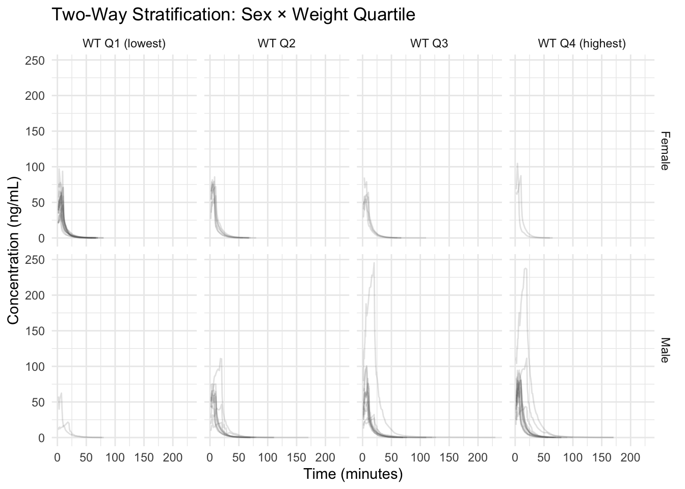
Warning
A faceted plot can look “different” simply because panels contain different subjects. Always ask: are you seeing a consistent pattern across individuals, or just different mixtures?
Note
Aesthetic channels are interchangeable tools.
If color is already used (or the plot will be printed in grayscale), you can stratify using linetype or shape for categorical covariates.
The rule is the same: map variables inside aes() to make the aesthetic data-driven.
Worked Example 9: When Color Is Not Enough (Use Linetype or Shape)
If you already used color for one covariate, you can encode another categorical covariate with linetype or shape.
Here is the same weight-quartile plot, but we add linetype for AGE_GROUP:
ggplot(remi_obs, aes(TIME, DV, group = ID, color = WT_GROUP, linetype = AGE_GROUP)) +
  geom_line(alpha = 0.20) +
  labs(
    title = "Profiles: Weight Quartile (Color) + Age Group (Linetype)",
    x = "Time (minutes)",
    y = "Concentration (ng/mL)"
  ) +
  theme_minimal()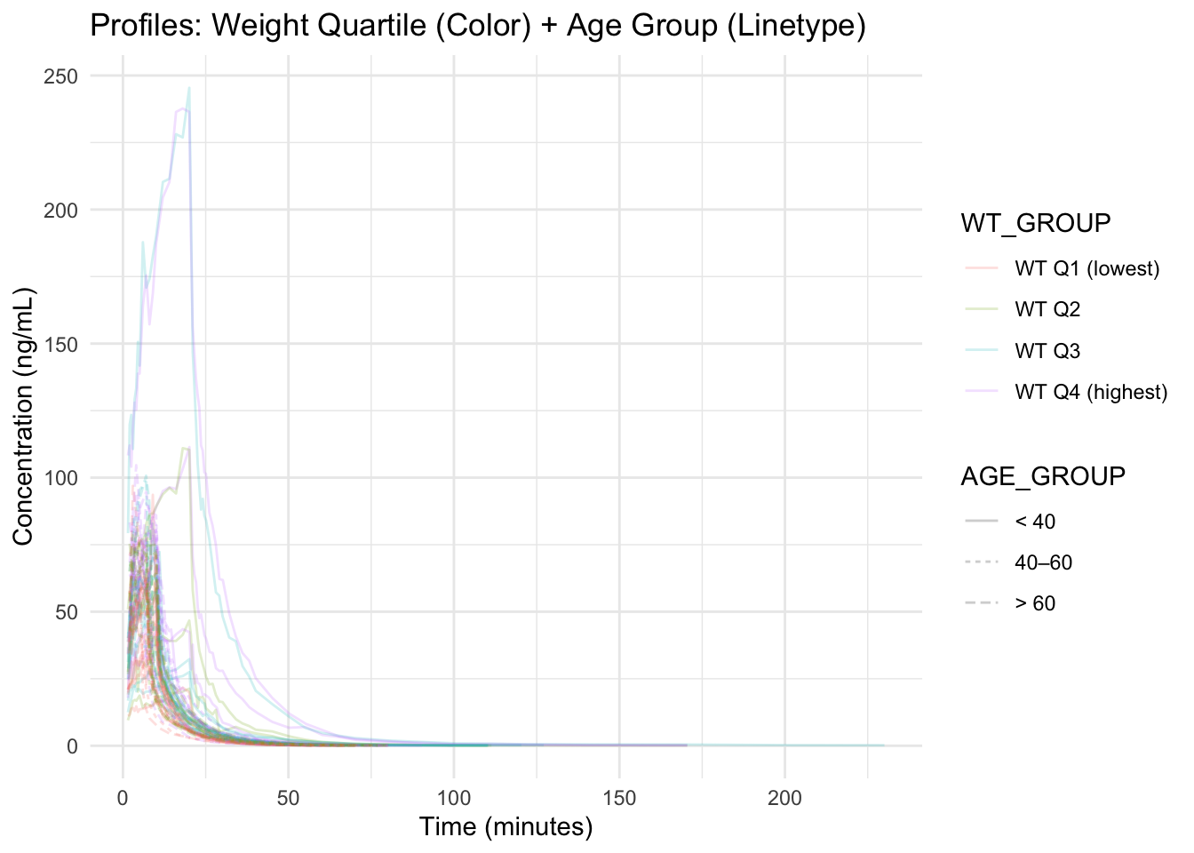
Note
In dense spaghetti plots, too many aesthetics can overwhelm the reader.
Use extra channels only when they answer a specific question.
Interpretation Guidelines
When comparing groups, ask:
- Are differences consistent across subjects or driven by a few profiles?
- Are covariates correlated (potential confounding)?
- Do differences appear in shape (phase timing/slopes) or just level?
- Would a log scale make interpretation clearer for later-time behavior?
- Is the observed pattern large relative to within-group variability?
Strategies
- Start with covariate distributions (hist/density).
- Add continuous vs categorical checks (e.g., WT by SEX).
- Use a pairs plot to screen continuous covariates for redundancy.
- Use transparency and faceting to handle large N.
- Treat stratified plots as hypothesis generators, not proofs.
- Write down both a hypothesis and a potential confounder.
Common Mistakes
- Not creating a subject-level covariate table before plotting (using repeated rows instead).
- Defining groups inconsistently or opaquely (e.g., unclear cut points for bins).
- Changing multiple aesthetics or stratification choices at once, making plots hard to interpret.
- Overloading a single plot with too many visual encodings (color, linetype, shape).
- Not labeling groups clearly, making stratified comparisons confusing.
- Skipping simple plots (e.g., histograms, scatterplots) and jumping directly to complex stratification.
- Not stating the question or comparison before building a stratified plot.
Practice Problems
- Plot the distribution of
AGEandLBM(subject-level). - Make
AGE_GROUPbins that are different from the lesson (your choice) and re-run the stratification. - Create a scatterplot of
WTvsLBM. What do you notice? - Create a pairs plot for
HT,WT,BSA, andLBM. - Make a continuous-vs-categorical plot of
AGEbySEX. - Stratify profiles by
AGE_GROUPusingfacet_wrap(). - Create a plot that uses color for one covariate and linetype or shape for another.
- Write one modeling hypothesis and one confounding concern suggested by your plots.
TipStep-by-Step Solutions
# 1) AGE distribution
ggplot(subj, aes(AGE)) +
  geom_histogram(bins = 20) +
  theme_minimal()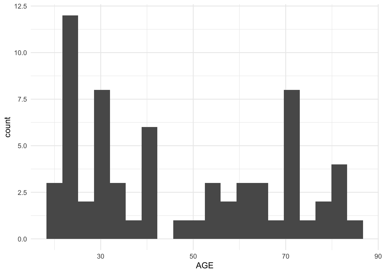
# LBM distribution
ggplot(subj, aes(LBM)) +
  geom_histogram(bins = 20) +
  theme_minimal()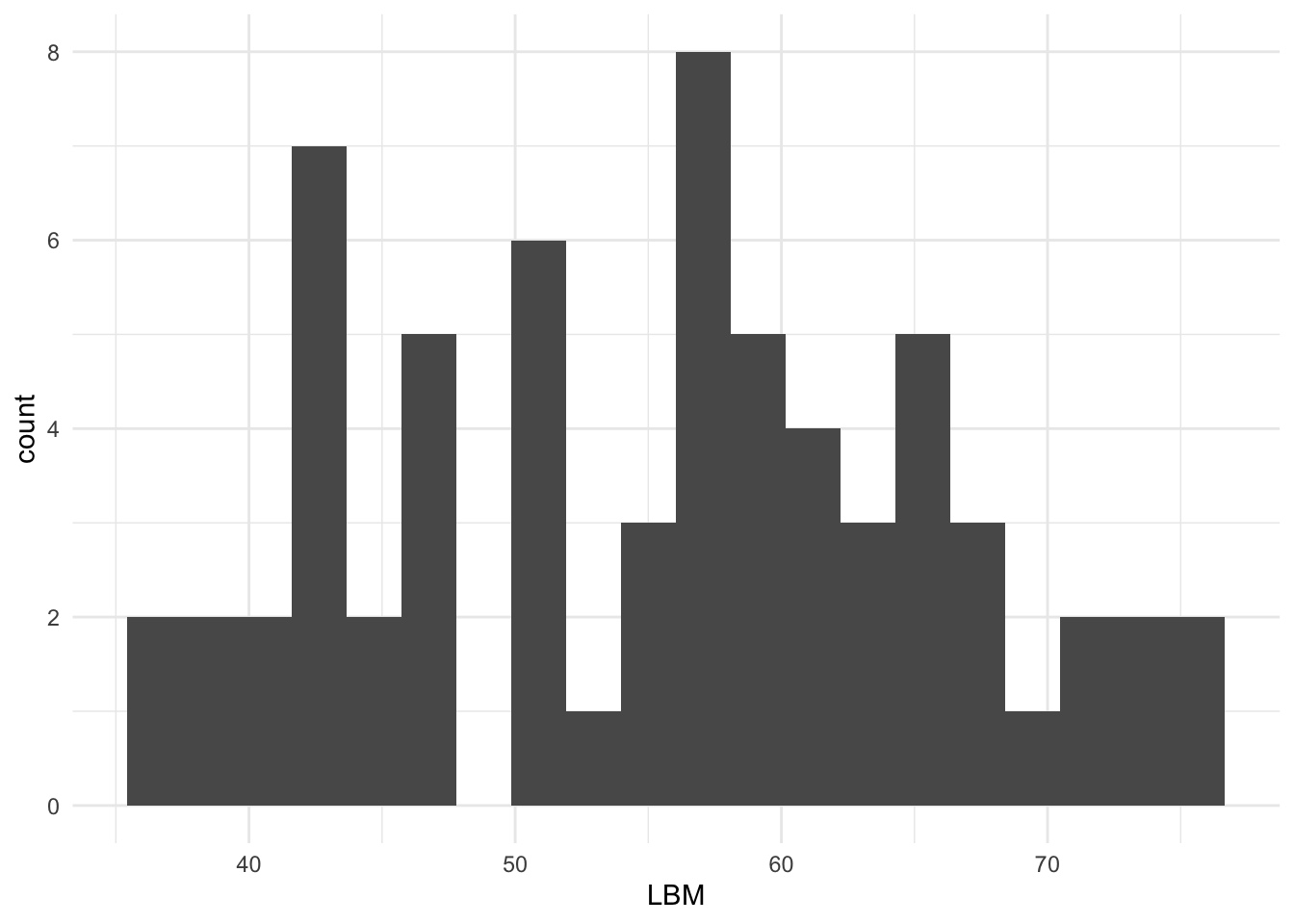
# 4) Pairs plot (example subset)
GGally::ggpairs(subj %>% select(HT, WT, BSA, LBM))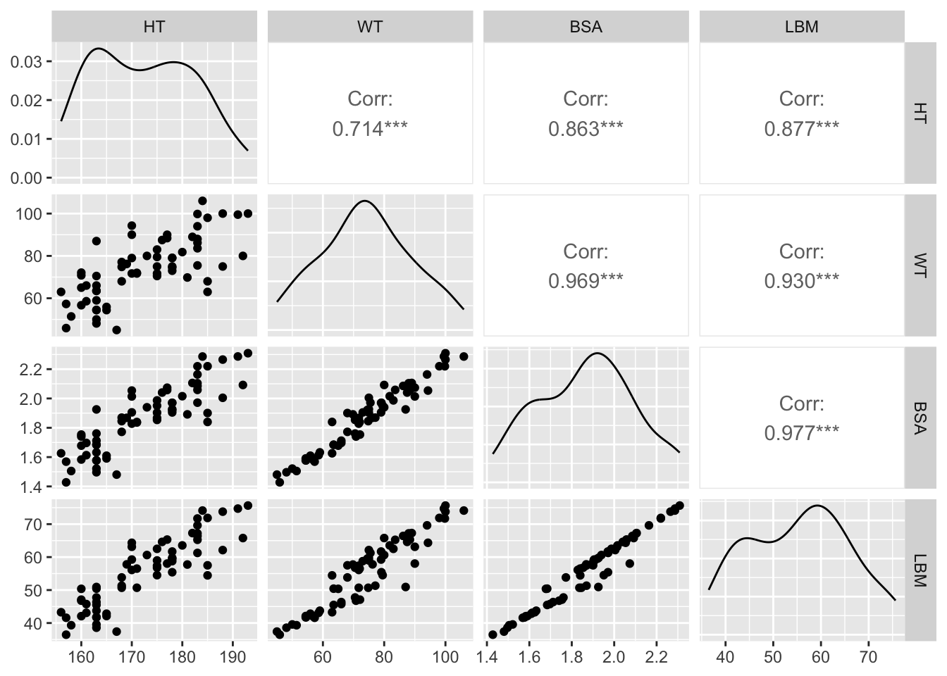
# 5) AGE by SEX
ggplot(subj, aes(SEX, AGE)) +
  geom_boxplot(outlier.shape = NA, alpha = 0.5) +
  geom_jitter(width = 0.12, height = 0, alpha = 0.7) +
  theme_minimal()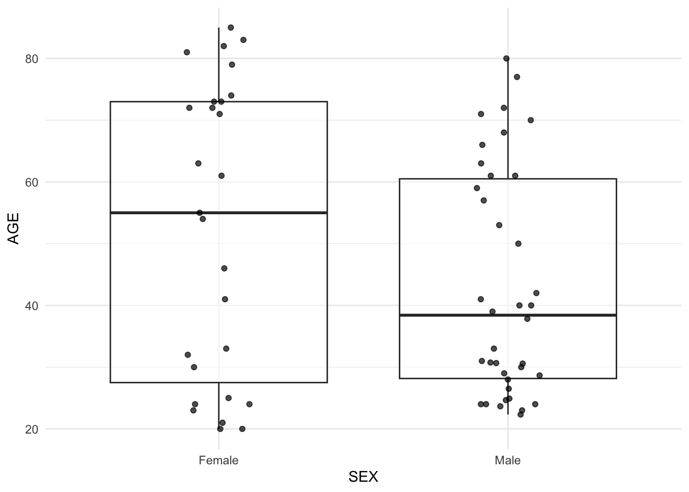
# 6) Facet by AGE_GROUP
ggplot(remi_obs, aes(TIME, DV, group = ID)) +
  geom_line(alpha = 0.18, color = "grey40") +
  facet_wrap(~ AGE_GROUP) +
  theme_minimal()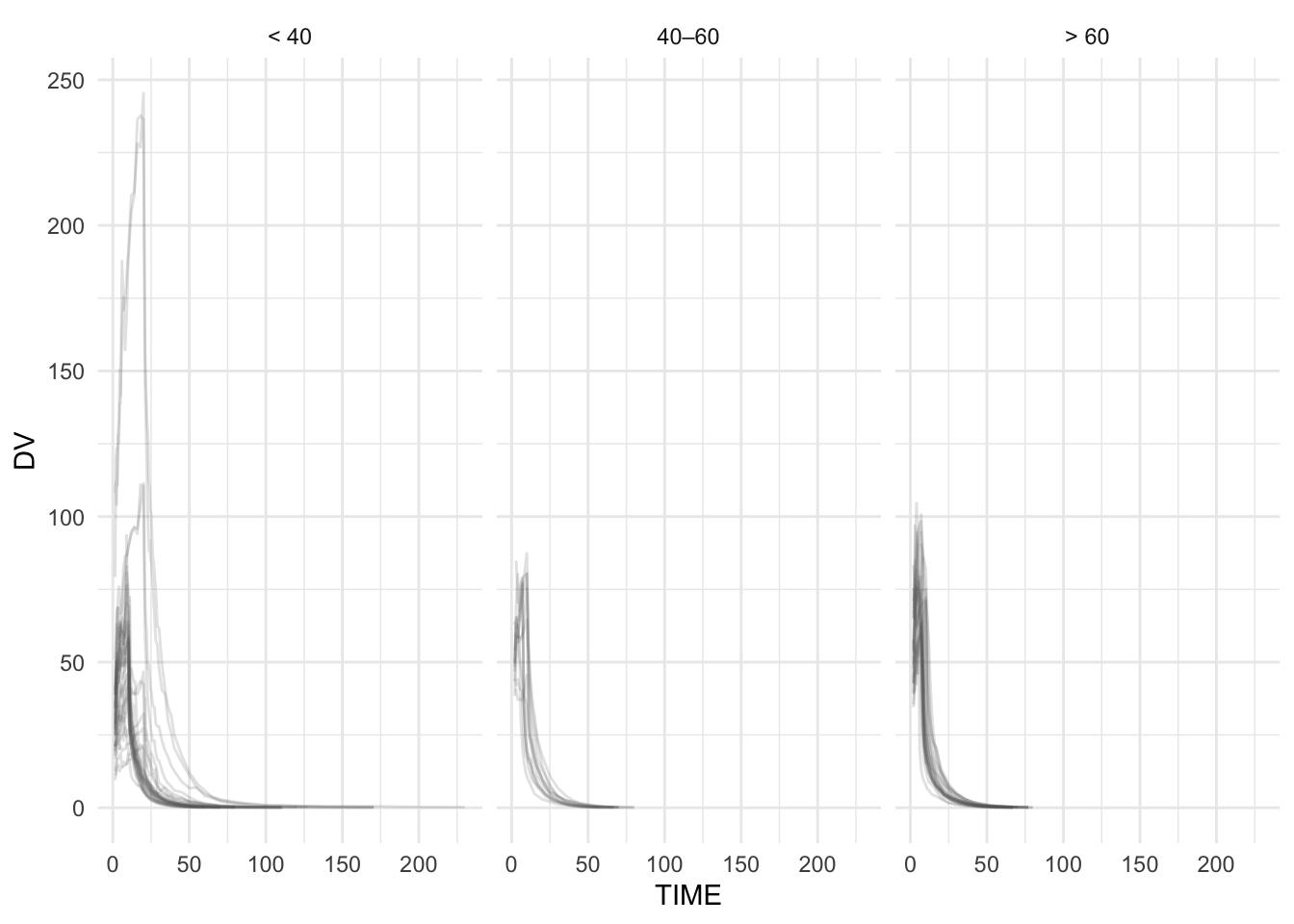
# 7) Two covariates via two aesthetic channels
ggplot(remi_obs, aes(TIME, DV, group = ID, color = WT_GROUP, linetype = AGE_GROUP)) +
  geom_line(alpha = 0.20) +
  theme_minimal()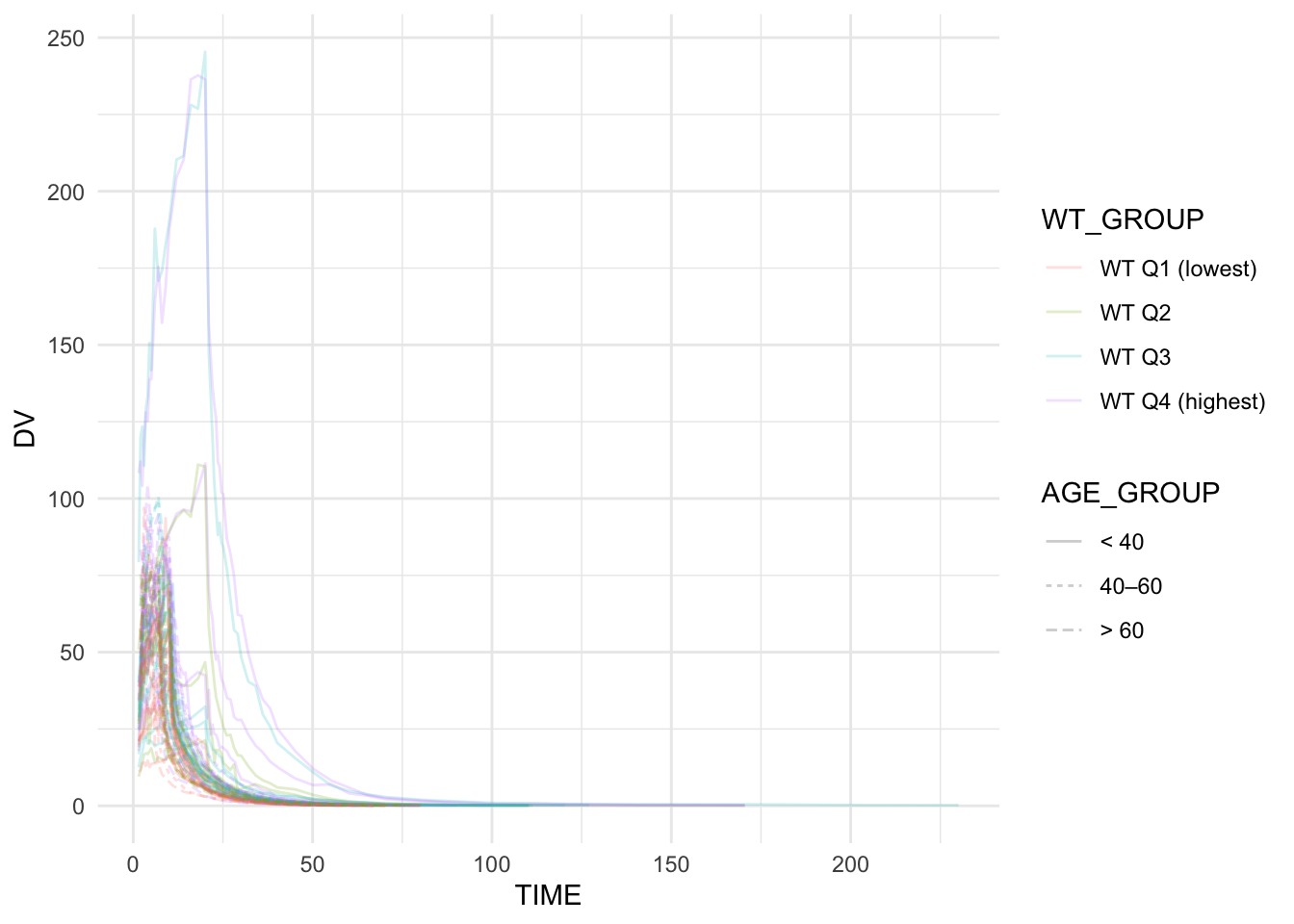
Summary
In this lesson, you practiced stratification as an interpretive layer using a real covariate-rich PMx dataset:
- You built a subject-level covariate table (
subj). - You explored covariate distributions with histograms and densities.
- You checked covariate relationships (including a pairs plot) to guard against confounding.
- You visualized continuous-vs-categorical relationships (e.g., WT by SEX).
- You stratified concentration–time profiles using color, facet_wrap, and facet_grid.
The key PMx habit is not “make more plots.”
It is: use plots to generate hypotheses — and check covariates for correlation before you believe the story.
TipQuick Tips
- Plot covariates before stratifying profiles.
- Use pairs plots to screen continuous covariates for redundancy.
- Use boxplots + jitter for continuous-vs-categorical checks.
- With large N, use transparency (alpha) aggressively.
- If covariates are correlated, interpret group differences cautiously.
- Write down: “What would I test?” and “What could confound this?”