QC Case Study: Detecting Data Issues with Visualization
Use layered visualization to detect structural data issues in a real PK dataset (Theoph) with intentionally injected problems.
Tip
Core idea of this lesson: QC plots are not decoration — they are structural diagnostics.
With a small dataset like Theoph, you can facet by subject and see anomalies clearly before modeling begins.
Learning Objectives
By the end of this lesson, you will be able to:
Use individual profile plots to detect structural inconsistencies.
Identify common PK data problems visually (duplicates, unit errors, time issues, impossible values).
Use log scale strategically for QC.
Separate true variability from data errors.
Build a disciplined QC plotting workflow you can reuse.
Key Ideas
QC plots are used to detect structural problems, not to tell a story.
Visual anomalies (e.g., spikes, outliers, zig-zags) are signals that require investigation.
Different plot layers reveal different types of issues (magnitude, shape, ordering, duplication).
Small datasets allow direct inspection using faceting by subject.
Log scale can expose multiplicative errors but requires careful handling of non-positive values.
Visual inspection generates suspicion — confirmation requires direct data checks.
Why a Dedicated QC Lesson?
Many lessons in this module included QC thinking.
But here, the goal is different:
We are not exploring covariates.
We are not building summaries.
We are actively trying to find problems.
This mindset shift is important.
Warning
If the data structure is wrong, no model can fix it.
QC always comes before modeling.
Setup
We’ll use the classic Theoph dataset and standardize names.
To practice QC detection, we will inject four artificial issues:
Duplicate records (exact duplicates)
A unit error (concentration multiplied by 100 for one subject)
A time-order issue (times shuffled within one subject)
An impossible value (negative concentration)
set.seed(123)theoph_qc <- theoph# 1) Duplicate a few rows (exact duplicates)dup_rows <- theoph_qc %>%slice_sample(n =6)theoph_qc <-bind_rows(theoph_qc, dup_rows)# 2) Unit error for one subjectproblem_id <-sample(unique(theoph_qc$ID), 1)theoph_qc <- theoph_qc %>%mutate(DV =if_else(ID == problem_id, DV *100, DV))# 3) Time disorder for one subject (shuffle TIME within ID)shuffle_id <-sample(setdiff(unique(theoph_qc$ID), problem_id), 1)theoph_qc <- theoph_qc %>%group_by(ID) %>%mutate(TIME =if_else(ID == shuffle_id, sample(TIME), TIME)) %>%ungroup()# 4) Insert an impossible negative value (one record)neg_row <- theoph_qc %>%slice_sample(n =1)theoph_qc <- theoph_qc %>%mutate(DV =if_else( ID == neg_row$ID[1] & TIME == neg_row$TIME[1],-abs(DV), DV ))
Note
These manipulations are purely for teaching QC detection skills.
In real projects, your job is to find issues — not to “fix plots”.
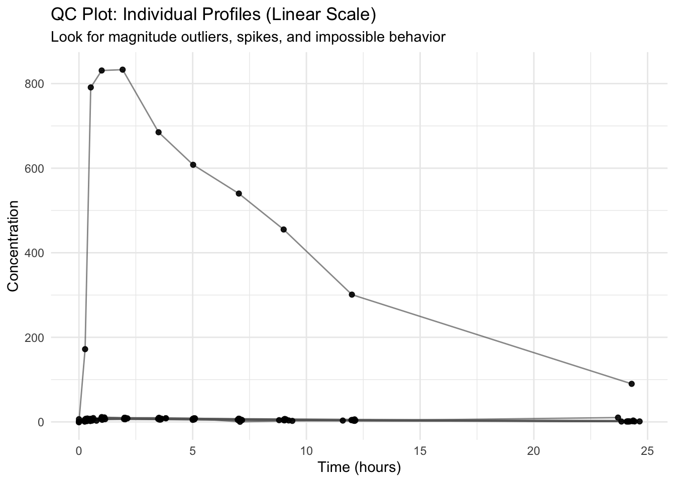
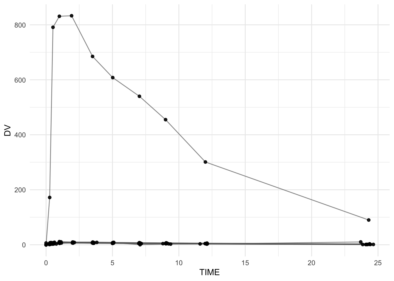
Worked Example 1: Baseline Individual Profiles (Linear Scale)
Start with the simplest view: profiles by subject.
ggplot(theoph_qc, aes(TIME, DV, group = ID)) +geom_line(alpha =0.7, color ="grey40") +geom_point(alpha =0.9) +labs(title ="QC Plot: Individual Profiles (Linear Scale)",subtitle ="Look for magnitude outliers, spikes, and impossible behavior",x ="Time (hours)",y ="Concentration" ) +theme_minimal()
Questions to ask
Does any subject have concentrations that are orders of magnitude higher than the rest?
Do you see vertical “spikes” that look like repeated points?
Do any lines zig-zag in a way that suggests time ordering problems?
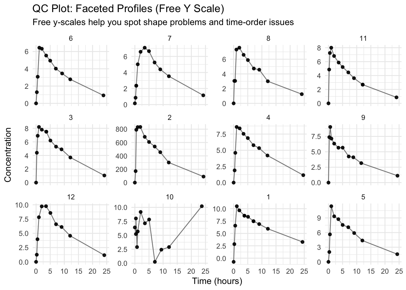
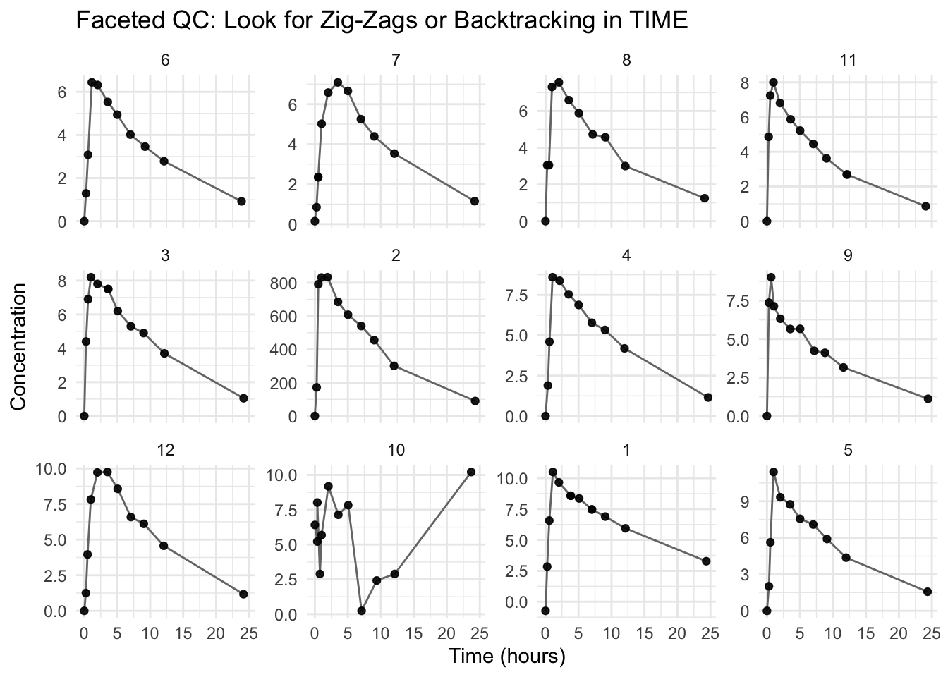
Worked Example 2: Facet by Subject (Small N Advantage)
Faceting makes it much easier to detect one-subject issues.
ggplot(theoph_qc, aes(TIME, DV)) +geom_line(aes(group = ID), alpha =0.8, color ="grey40") +geom_point(alpha =0.9) +facet_wrap(~ ID, scales ="free_y") +labs(title ="QC Plot: Faceted Profiles (Free Y Scale)",subtitle ="Free y-scales help you spot shape problems and time-order issues",x ="Time (hours)",y ="Concentration" ) +theme_minimal()
Warning
scales = "free_y" helps detect shape and ordering problems,
but it can hide magnitude differences across subjects.
So you usually want both:
one plot with shared y-scale (magnitude comparisons)
one plot faceted with free y-scale (shape diagnostics)
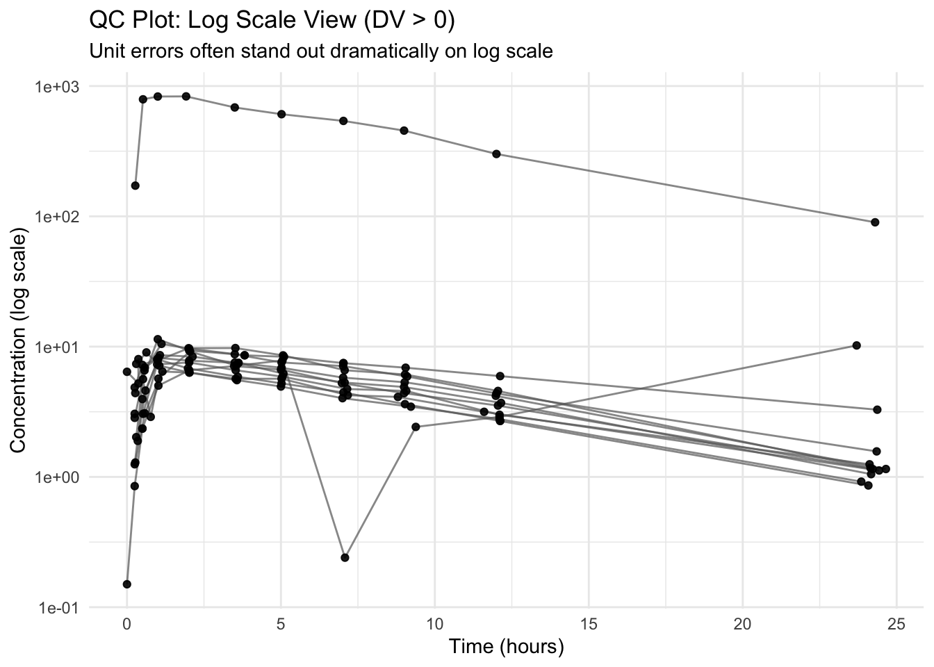
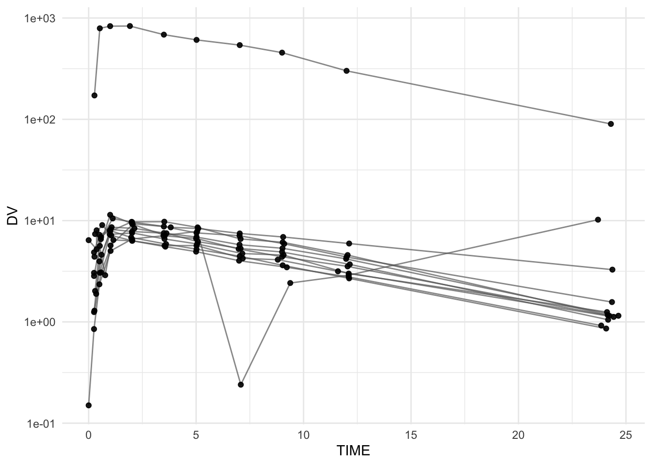
Worked Example 3: Log Scale Inspection (When Appropriate)
Log scale often makes multiplicative unit errors obvious.
Because log scale cannot handle non-positive values, we filter to DV > 0 for this view.
ggplot(theoph_qc %>%filter(DV >0),aes(TIME, DV, group = ID)) +geom_line(alpha =0.7, color ="grey40") +geom_point(alpha =0.9) +scale_y_log10() +labs(title ="QC Plot: Log Scale View (DV > 0)",subtitle ="Unit errors often stand out dramatically on log scale",x ="Time (hours)",y ="Concentration (log scale)" ) +theme_minimal()
Note
Filtering DV > 0 is a QC signal by itself: it reminds you to investigate why non-positive values exist.
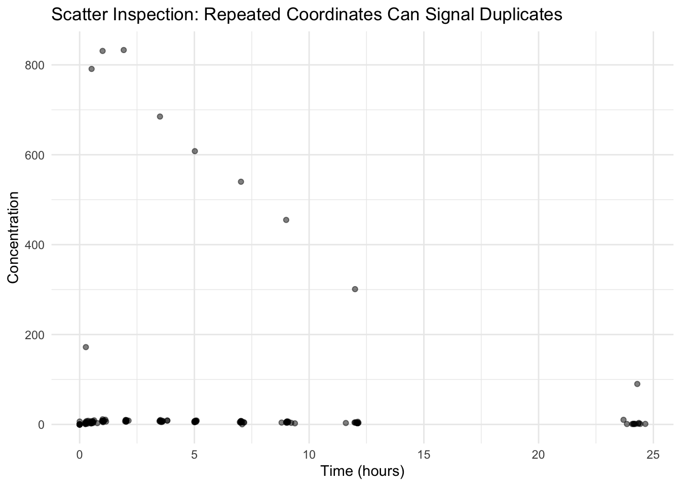
Worked Example 4: Detect Duplicates (Structural Clue)
Duplicates can show up as:
repeated points at exactly the same coordinates
vertical spikes (multiple records at the same TIME)
A simple “dot cloud” helps reveal repeated coordinates.
ggplot(theoph_qc, aes(TIME, DV)) +geom_point(alpha =0.5) +labs(title ="Scatter Inspection: Repeated Coordinates Can Signal Duplicates",x ="Time (hours)",y ="Concentration" ) +theme_minimal()
Note
Duplicate records were introduced in this dataset, but they may not be visually obvious.
This is because: - only a small number of duplicates were added, and
- larger structural issues (e.g., unit errors) dominate the visual scale.
In real datasets, duplicates are often subtle and should be confirmed with direct checks, not visual inspection alone.
If you suspect duplicates, a direct check is faster than guessing:
dup_check <- theoph_qc %>%count(ID, TIME, DV) %>%filter(n >1) %>%arrange(desc(n))dup_check
# A tibble: 5 × 4
  ID     TIME    DV     n
  <ord> <dbl> <dbl> <int>
1 7      0.5   2.35     2
2 11    12.1   2.69     2
3 3      3.62  7.5      2
4 1      3.82  8.58     2
5 1      7.03  7.47     2
Worked Example 5: Time Ordering Within Subject
Even if your plot code “runs,” time ordering problems can create misleading lines. This is especially important when you connect points with geom_line().
ggplot(theoph_qc, aes(TIME, DV, group = ID)) +geom_line(alpha =0.9, color ="grey40") +geom_point(alpha =0.9) +facet_wrap(~ ID, scales ="free_y") +labs(title ="Faceted QC: Look for Zig-Zags or Backtracking in TIME",x ="Time (hours)",y ="Concentration" ) +theme_minimal()
Warning
If a profile appears to “go backward in time,” it may be a sorting or time-recording issue.
A good habit: arrange(ID, TIME) before plotting.
Interpretation Discipline
When conducting QC visually, ask:
Does the magnitude look plausible?
Are there impossible values (negative, extreme)?
Are there artifacts suggesting duplicates?
Are shape features plausible (peak → decline), or is the line drawing nonsense?
Does log scale reveal hidden anomalies?
QC plots are about suspicion, not storytelling.
Common PK Data Issues Detectable by Plots
Unit conversion errors (e.g., ng/mL vs µg/mL)
Duplicate records
Time ordering problems
Impossible values (negative concentration)
BLQ coded as zero (important later when using log scale)
Sudden discontinuities that are not biologically plausible
Strategies
Plot individuals (shared scale) to compare magnitude.
Facet by subject (free y-scale) to detect shape and ordering issues.
Repeat on log scale (with careful handling of DV ≤ 0).
Use scatter views to detect duplicate coordinate clusters.
If something looks wrong, verify with counts / filters before fixing anything.
Common Mistakes
Trying to interpret PK behavior before verifying data structure.
Ignoring obvious anomalies instead of investigating them immediately.
Relying on a single plot instead of checking multiple views (e.g., faceted, log scale, scatter).
Treating plotting issues as visualization problems instead of data problems.
Filtering or modifying data before understanding the source of the issue.
Assuming the plotting code is correct without checking data ordering (e.g., TIME within ID).
Trusting visual impressions without confirming with direct checks (e.g., count(), summaries).
Practice Problems
Identify the subject with an apparent unit error (look for orders-of-magnitude differences).
Identify evidence of duplicates (both visually and with count(...)).
Create a clean version by sorting and removing duplicates with distinct().
Remove non-positive concentrations and re-check the log-scale view.
Write two sentences explaining why QC must precede modeling.