library(tidyverse)
library(nlmixr2)
library(nlmixr2data)
library(ggPMX)

data("theo_sd", package = "nlmixr2data")Goodness-of-Fit Plots
Create and interpret core pharmacometric goodness-of-fit plots using ggPMX and nlmixr2.
Tip
Big picture: Goodness-of-fit plots evaluate whether predictions behave reasonably after structural, variability, and covariate assumptions have been combined.
Learning Objectives
By the end of this lesson, you will be able to:
- explain the purpose of GOF plots
- distinguish population and individual predictions
- generate GOF plots using
ggPMX - interpret common diagnostic patterns
- recognize when diagnostics suggest model problems
Key Ideas
- diagnostics begin with predictions
- GOF evaluates agreement
- perfect agreement is not expected
- patterns matter more than points
Setup
Fit the model.
one_comp_model <- function(){

    ini({

        tka <- log(1)
        tcl <- log(3)
        tv <- log(30)

        eta.ka ~ 0.1
        eta.cl ~ 0.1
        eta.v ~ 0.1

        add.err <- 0.1

    })

    model({

        ka <- exp(tka + eta.ka)

        cl <- exp(tcl + eta.cl)

        v <- exp(tv + eta.v)

        linCmt() ~ add(add.err)

    })

}

fit <-
  nlmixr2(
    one_comp_model,
    theo_sd,
    est = "focei",
    control = list(print = 0)
  )

fit_tbl <-
  fit %>%
  as_tibble()
Note
Earlier modules focused on:
- structure
- variability
- covariates
GOF asks whether those assumptions produced reasonable predictions.
Preparing the Model for ggPMX
ggPMX does not plot directly from the raw nlmixr2 fit object.
Instead, we create a diagnostic object:
ctr <- pmx_nlmixr(fit)Interpretation:
nlmixr2 fit
↓
ggPMX diagnostic object
↓
Standardized diagnostic plots
pmx_nlmixr() extracts and organizes information needed for diagnostics such as:
- observations (
DV) - predictions (
PRED,IPRED) - residuals
- covariates
- individual information
We will pass ctr into plotting functions throughout this module.
Example:
pmx_plot_dv_pred(ctr)Think of ctr as:
Container of diagnostic informationYou only create it once per fitted model.
Optional: Built-In nlmixr2 Diagnostic Plots
nlmixr2 also provides built-in diagnostic plotting directly from the fit object.
plot(fit)This can generate many diagnostic views, including:
- observed vs predicted plots
- residual plots
- individual plots
- parameter trajectory plots
This is useful for quick exploration.
However, this course emphasizes:
ggPMX

↓

Standardized diagnostics
because the same workflow extends naturally to larger pharmacometric projects.
Parameter trajectory plots are mainly useful for understanding estimation behavior and are outside the focus of this module.
Why Goodness-of-Fit Plots Matter
GOF evaluates:
Observed Data

↓

Compared Against

↓

Model Predictions
We are not looking for perfect overlap.
We are evaluating:
- agreement
- bias
- spread
- structure
GOF evaluates the combined result of:
Structure + Variability + CovariatesWorked Example 1: Population Goodness-of-Fit
Inspect population predictions.
pmx_plot_dv_pred(ctr)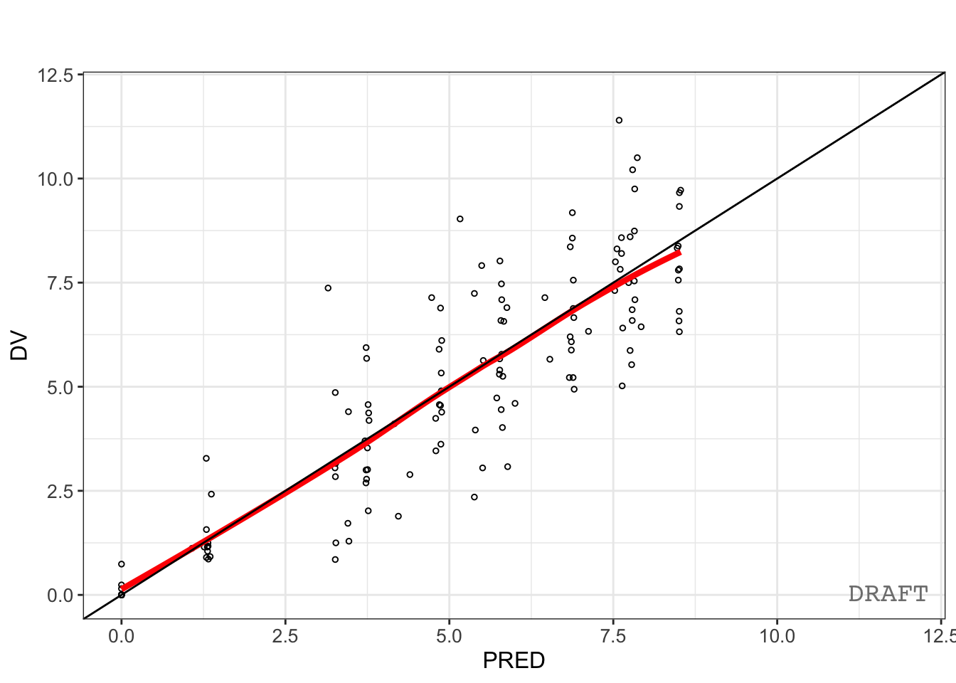
Interpretation:
Look for:
- points centered around identity
- no obvious trends
- reasonable spread
Question:
Can the typical subject explain the data?DV vs PRED evaluates population behavior.
Worked Example 2: Individual Goodness-of-Fit
Inspect individual predictions.
pmx_plot_dv_ipred(ctr)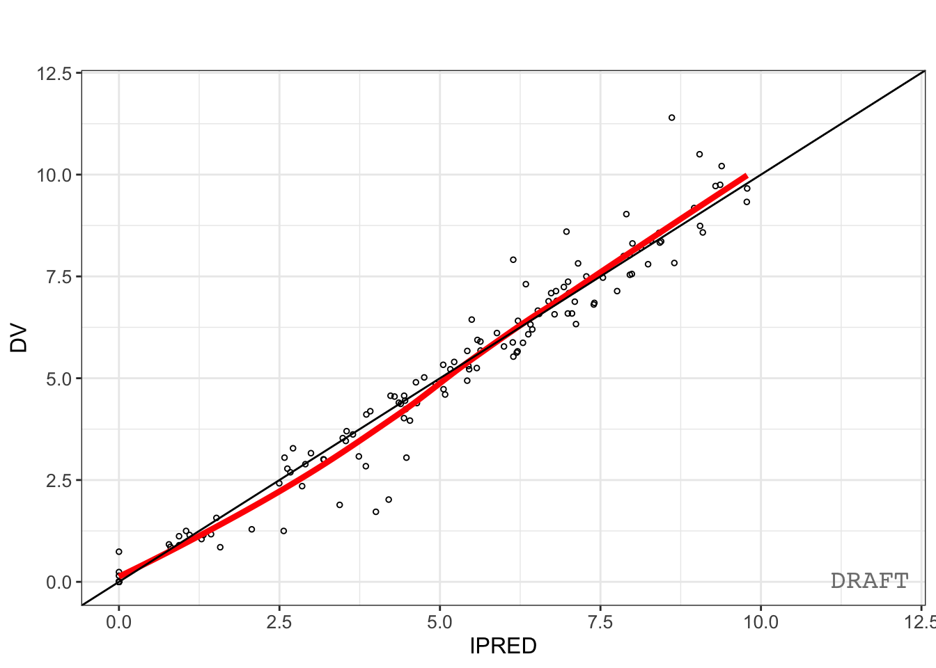
Interpretation:
Look for:
- improved agreement
- reduced systematic deviation
- remaining variability
Question:
After accounting for ETA, does agreement improve?DV vs IPRED evaluates subject-specific behavior.
Worked Example 3: Individual Prediction Plots
Goodness-of-fit plots compare observations and predictions.
Individual plots answer a different question:
Does the model reproduce the shape of each subject's profile?Instead of comparing isolated points, individual plots show trajectories across time.
First, inspect the built-in nlmixr2 individual view.
plot(
  augPred(fit)
)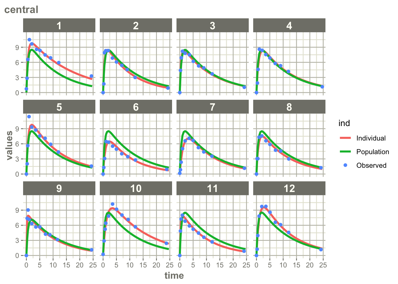
Interpretation:
Look for:
- agreement in overall profile shape
- agreement in peak timing and magnitude
- agreement in decline phase
- systematic mismatches
- differences across subjects
Question:
Can the model reproduce individual trajectories?augPred() means:
Augmented PredictionsThe model is evaluated not only at observed sampling times.
Additional prediction points are generated between observations to create smoother trajectories.
This allows us to visualize:
- observations
- augmented population predictions
- augmented individual predictions
The result is often easier to interpret than plotting only observed timepoints.
This provides an intuitive view of model behavior.
Now generate the standardized ggPMX version.
pmx_plot_individual(ctr)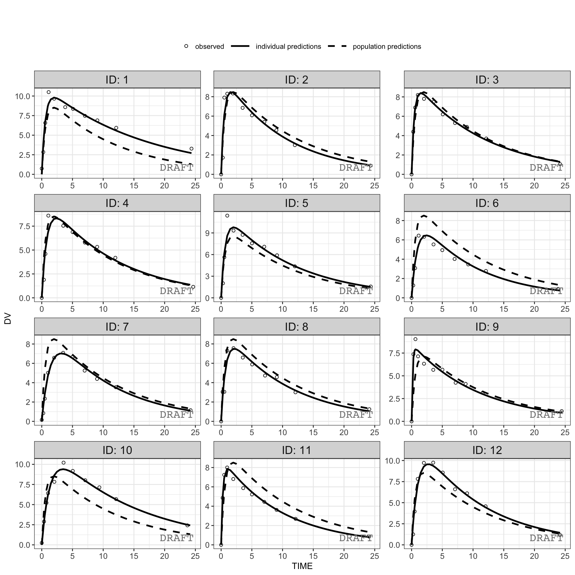
Interpretation:
Look for:
- agreement across subjects
- consistency of deviations
- repeated patterns
- subjects with systematically poor fit
- whether prediction intervals capture observations
- differences in fit quality across time
Question:
Do the same model weaknesses appear repeatedly across individuals?Unlike DV vs PRED or DV vs IPRED:
GOF

↓

Point Agreement
Individual plots emphasize:
Profiles

↓

Trajectory Agreement
Individual plots become especially useful when:
- residual diagnostics suggest problems
- variability is large
- population GOF appears acceptable
- individuals appear poorly described
- investigating whether model assumptions fail only for certain subjects
Worked Example 4: Compare PRED and IPRED
Inspect prediction variables.
fit_tbl %>%
  select(
    DV,
    PRED,
    IPRED
  ) %>%
  head()
# A tibble: 6 × 3
DV PRED IPRED
<dbl> <dbl> <dbl>
1 0.74 0 0
2 2.84 3.26 3.85
3 6.57 5.83 6.78
4 10.5 7.87 9.04
5 9.66 8.51 9.79
6 8.58 7.62 9.09Interpretation:
| Variable | Meaning |
|---|---|
| DV | observed value |
| PRED | population prediction |
| IPRED | subject-specific prediction |
Conceptually:
PRED → Typical Subject


IPRED → Individual Subject
This explains why:
DV vs IPRED → often tighterWorked Example 5: Build One Plot Manually
Although ggPMX provides standardized diagnostics, understanding the underlying variables improves interpretation.
ggplot(
  fit_tbl,
  aes(PRED, DV)
) +
geom_point(
  alpha = 0.35
) +
geom_abline(
  slope = 1,
  intercept = 0,
  linetype = 2
) +
labs(
  title = "Observed vs Population Prediction",
  x = "PRED",
  y = "DV"
)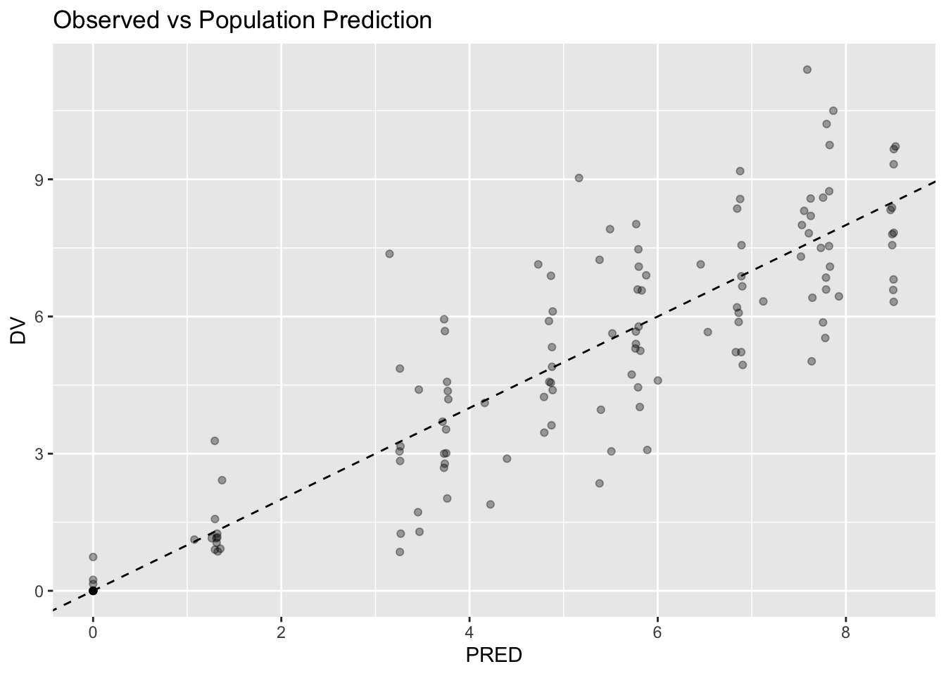
Interpretation:
The goal is not perfection.
The goal is reasonable behavior.
Worked Example 6: Diagnostic Thinking
Read GOF plots in order.
Centering

↓

Trend

↓

Spread

↓

Bias
Ask:
- systematic deviation?
- missing structure?
- missing covariates?
- variability issues?
Residual diagnostics come next.
GOF asks:
Prediction QualityResidual diagnostics ask:
Prediction ErrorsIndividual plots add another question:
Population Agreement

+

Subject Agreement
GOF plots may appear acceptable while individual profiles reveal model deficiencies.
Strategies
- inspect patterns first
- compare PRED and IPRED
- avoid judging isolated observations
Common Mistakes
- expecting perfect agreement
- interpreting one point
- confusing PRED and IPRED
Practice Problems
What does DV vs PRED evaluate?
Why is IPRED usually closer to observations than PRED?
Generate:
pmx_plot_dv_pred(ctr)Describe:
- overall agreement
- centering
- spread
- evidence of trends
- Generate:
plot(augPred(fit))Describe:
- profile agreement
- peak behavior
- decline phase
- systematic deviations
Question:
Does the model reproduce individual trajectories?- Generate:
pmx_plot_individual(ctr)Compare this with:
pmx_plot_dv_ipred(ctr)Question:
What additional information do individual plots provide?
TipStep-by-Step Solutions
Problem 1
DV vs PRED evaluates:
Observed

↓

Population Prediction
Question:
Can the typical subject explain the observations?Problem 2
IPRED incorporates subject-specific variability.
Conceptually:
Population Prediction

+

ETA

↓

Individual Prediction
This usually improves agreement.
Problem 3
Inspect:
- centering around identity
- spread
- systematic bias
- visible trends
Perfect agreement is not expected.
Problem 4
Inspect:
- shape of profiles
- peak timing
- elimination behavior
- repeated deviations across subjects
Question:
Do predicted trajectories resemble observed trajectories?Individual plots evaluate subject-level behavior.
Problem 5
DV vs IPRED evaluates:
Observed

↓

Individual Prediction
Individual plots evaluate:
Observed + Predicted Trajectory → Subject ProfilesIndividual plots may reveal problems that GOF plots do not.
Summary
- GOF compares observations and predictions
- individual plots evaluate profile behavior
- PRED and IPRED answer different questions
- patterns matter more than points
- diagnostics evaluate combined assumptions
TipQuick Tips
- Compare before concluding
- Patterns > points
- PRED ≠ IPRED