library(tidyverse)
library(rxode2)Individual and Population Simulation
Simulate typical individuals and virtual populations to understand variability and prediction.
Tip
Big picture: A single simulation represents one expected profile. Population simulation shows how individuals may differ.
Learning Objectives
By the end of this lesson, you will be able to:
- distinguish individual and population simulation
- explain why variability matters
- generate virtual populations
- interpret simulated variability
- compare typical and population predictions
Key Ideas
- individual simulation represents one expected profile
- population simulation introduces variability
- populations produce distributions rather than single curves
- uncertainty and variability are different concepts
Setup
This lesson uses simulated population PK examples.
No estimation is performed.
Why Simulate Populations?
A single profile can be useful.
But real patients differ.
Questions become:
- will everyone respond similarly?
- how much variability should we expect?
- are extreme responses possible?
Conceptually:
Typical Subject
↓
Many Virtual Subjects
↓
Distribution of Outcomes
Worked Example 1: Simulate a Typical Individual
Define a simple PK model.
pk_model <-
  rxode2({

    ka <- 1
    cl <- 3
    v <- 30

    d/dt(depot) = -ka * depot
    d/dt(center) = ka * depot - cl / v * center

    cp = center / v

  })
Create events.
ev <-
  et(amt = 100, cmt = "depot") %>%
  et(seq(0, 24, by = 0.25))
Simulate.
sim_typical <-
  rxSolve(pk_model, ev) %>%
  as_tibble()
Plot.
ggplot(sim_typical, aes(time, cp)) +
    geom_line() +
    labs(
        title = "Typical Individual",
        x = "Time",
        y = "Concentration"
        )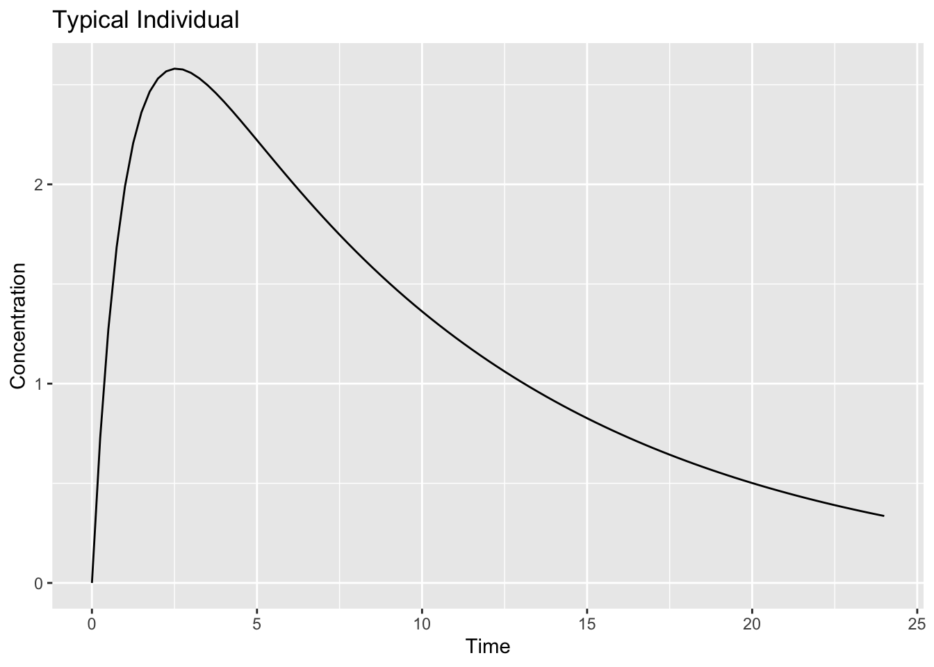
Interpretation:
This profile represents:
Expected Response
↓
No Between-Subject Variability
Worked Example 2: Add Population Variability
Now introduce variability.
pk_pop <-
  rxode2({

    ka <- exp(log(1) + eta.ka)
    cl <- exp(log(3) + eta.cl)
    v <- exp(log(30) + eta.v)

    d/dt(depot) = -ka * depot
    d/dt(center) = ka * depot - cl / v * center

    cp = center / v

  })
Specify variability.
omega <-
  lotri(
    eta.ka ~ 0.10,
    eta.cl ~ 0.20,
    eta.v ~ 0.10
  )

omega
eta.ka eta.cl eta.v
eta.ka 0.1 0.0 0.0
eta.cl 0.0 0.2 0.0
eta.v 0.0 0.0 0.1The object omega defines between-subject variability.
Each diagonal value represents the variance of a random effect.
Conceptually:
eta.ka → variability in absorption rate
eta.cl → variability in clearance
eta.v  → variability in volume
Larger values produce greater differences between virtual subjects.
In population PK models, this matrix is often called the Ω (omega) matrix.
Simulate multiple subjects.
sim_pop <-
  rxSolve(pk_pop, ev, nSub = 100, omega = omega) %>%
  as_tibble()
Unlike the previous lesson, the model is no longer generating a single concentration-time profile.
Instead, rxSolve() repeatedly samples random effects from the specified omega matrix and generates a profile for each virtual subject.
Inspect.
sim_pop %>%
  count(sim.id)
# A tibble: 100 × 2
sim.id n
<int> <int>
1 1 97
2 2 97
3 3 97
4 4 97
5 5 97
6 6 97
7 7 97
8 8 97
9 9 97
10 10 97
# ℹ 90 more rowsInterpretation:
Each sim.id represents one virtual subject.
sim_pop %>%
  distinct(sim.id) %>%
  nrow()
[1] 100The simulation generated 100 virtual subjects.
Each subject has a unique set of PK parameters sampled from the specified variability distribution.
Worked Example 3: Visualize Population Profiles
Plot all individuals.
ggplot(sim_pop, aes(time, cp, group = sim.id)) +
    geom_line(alpha = 0.15) +
    labs(
        title = "Population Simulation",
        x = "Time",
        y = "Concentration"
        )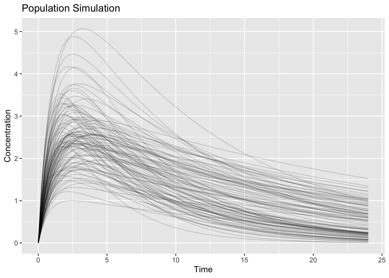
Interpretation:
Notice:
- profiles are no longer identical
- peaks differ
- decline rates differ
Question:
Does one line represent truth?No.
The collection represents possible outcomes.
Worked Example 4: Compare Individual and Population Simulation
Overlay typical and population summaries.
pop_summary <-
  sim_pop %>%
  group_by(time) %>%
  summarise(
    median = median(cp),
    low = quantile(cp, 0.05),
    high = quantile(cp, 0.95),
    .groups = "drop"
  )

ggplot() +
    geom_ribbon(data = pop_summary, aes(time, ymin = low, ymax = high), alpha = 0.2) +
    geom_line(data = pop_summary, aes(time, median)) +
    geom_line(data = sim_typical, aes(time, cp), linetype = 2) +
    labs(
        title = "Typical vs Population",
        x = "Time",
        y = "Concentration"
        )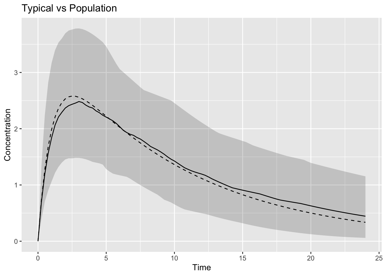
Interpretation:
Compare:
Single Prediction
↓
Range of Predictions
The dashed line represents:
Typical SubjectThe band represents:
Population VariabilityWorked Example 5: Variability versus Uncertainty
Students often confuse:
Variability ≠ UncertaintyInterpretation:
| Concept | Meaning |
|---|---|
| variability | individuals differ |
| uncertainty | estimates are imperfect |
Population simulation primarily introduces:
Variabilitynot parameter uncertainty.
Connecting to Decisions
Population simulation helps answer:
- what fraction exceeds exposure targets?
- how variable are outcomes?
- how sensitive are predictions?
Simulation supports decisions because real populations are heterogeneous.
Looking Ahead
So far we changed:
Who receives treatmentNext we change:
What treatment is givenWe will explore:
- dose changes
- dosing schedules
- exposure-response differences
Strategies
- inspect distributions
- compare individuals and populations
- summarize variability
Common Mistakes
- simulating too few subjects
- overinterpreting extremes
- assuming average equals everyone
Practice Problems
Why simulate populations?
What creates differences between subjects?
What does the dashed line represent?
Why simulate many subjects?
What is variability?
TipStep-by-Step Solutions
Problem 1
Real patients differ.
Problem 2
Random effects.
Problem 3
Typical prediction.
Problem 4
To evaluate distributions.
Problem 5
Biological differences across individuals.
Summary
- individual simulation produces one profile
- population simulation produces many profiles
- variability creates distributions
- simulation supports decisions
TipQuick Tips
- Typical ≠ population
- Variability ≠ uncertainty
- Simulate before deciding