library(tidyverse)
library(nlmixr2data)

data("theo_sd", package = "nlmixr2data")

theo <- theo_sd

obs <- theo %>%
filter(EVID == 0)Exploratory PK Visualization
Visualize concentration-time profiles and use exploratory plots to understand patterns before structural modeling.
Tip
Big picture: Visualization is not decoration. Exploratory PK plots help us understand the data and generate modeling hypotheses before fitting equations.
Learning Objectives
By the end of this lesson, you will be able to:
- Visualize concentration-time profiles.
- Create subject-level PK plots.
- Compare profiles across subjects.
- Use log-scale visualization.
- Generate early modeling hypotheses from visual patterns.
Key Ideas
- Visualization comes before estimation.
- Concentration-time profiles reveal structure.
- Subject variability becomes visible through overlays.
- Log scales can reveal patterns hidden on linear scales.
- Plots support scientific decisions.
Setup
Why Visualization Matters
Before fitting a model, ask:
- Does concentration decline smoothly?
- Do subjects behave similarly?
- Are there unusual profiles?
- Does variability change with concentration?
- Does elimination appear exponential?
Plots often reveal problems faster than estimation.
Worked Example 1: Subject-Level Profiles (Spaghetti Plot)
Start with all observed profiles.
p_spaghetti <-
obs %>%
  ggplot(aes(TIME, DV, group = ID)) +
  geom_line(alpha = 0.35) +
  geom_point(size = 0.8) +
  labs(
    title = "Observed Concentration–Time Profiles",
    x = "Time",
    y = "Concentration"
  )

p_spaghetti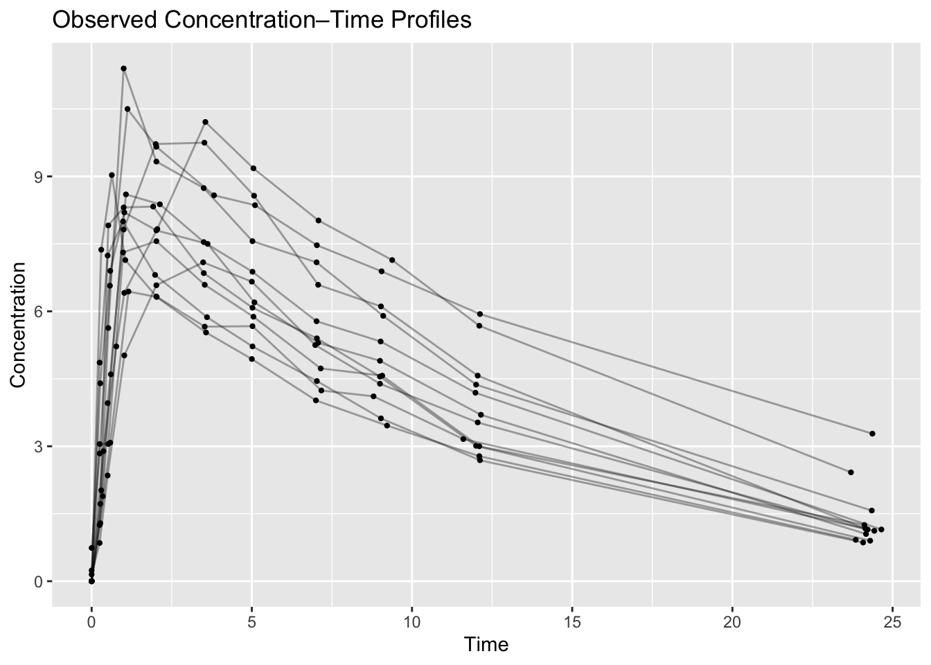
What to look for:
- peak concentrations
- elimination phase
- unusual subjects
- profile spread
Worked Example 2: Color by Subject
Visualize individual differences.
p_subject <-
obs %>%
  ggplot(aes(TIME, DV, group = ID, color = factor(ID))) +
  geom_line() +
  labs(
    title = "Profiles by Subject",
    x = "Time",
    y = "Concentration",
    color = "ID"
  )

p_subject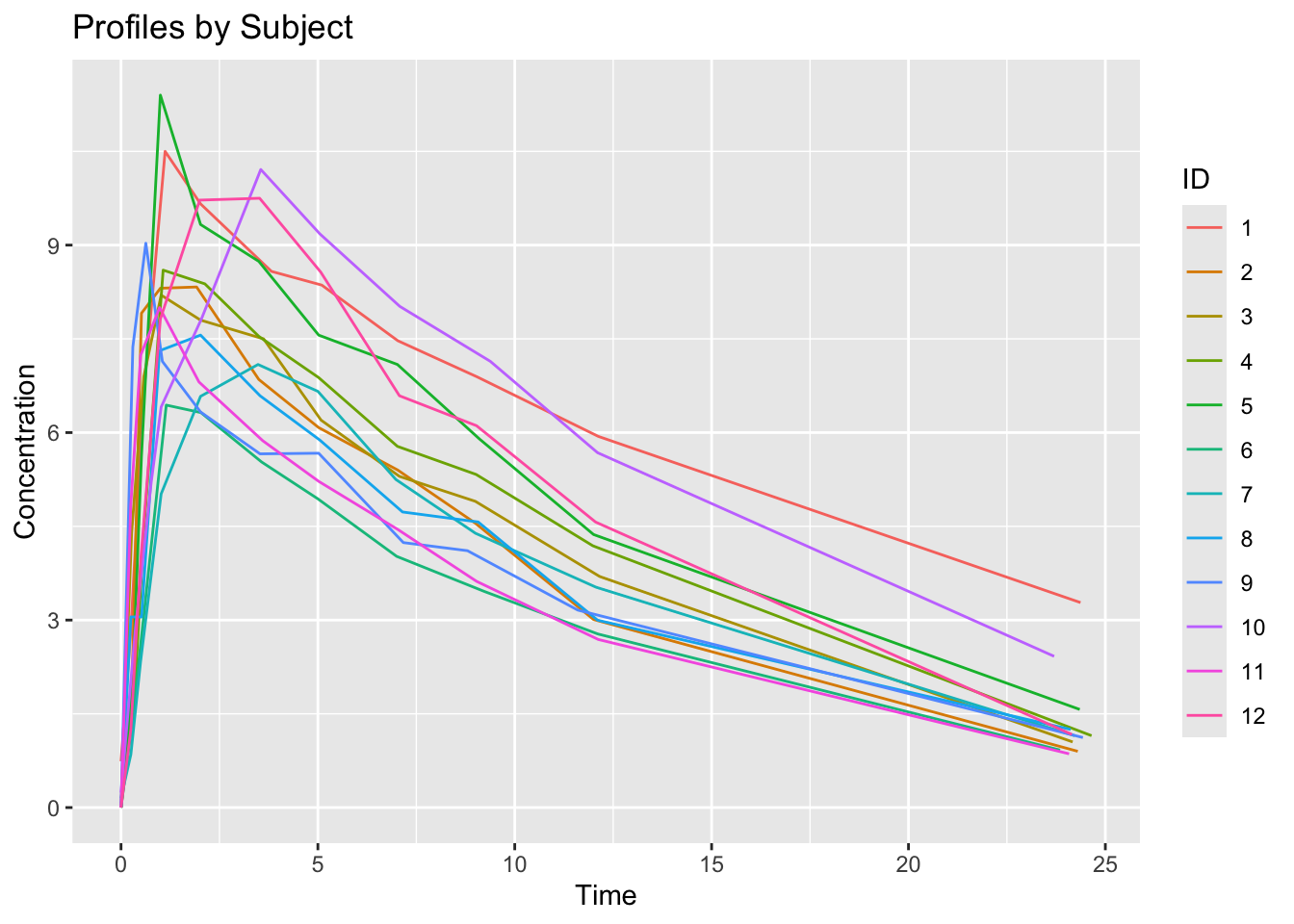
Interpretation:
Large separation may suggest variability.
Worked Example 3: Median Profile
Individual profiles show subject variability.
Sometimes it is useful to visualize a typical concentration trajectory.
Because observation times are not perfectly aligned across subjects, we first create approximate nominal times and retain only groups with sufficient observations.
median_profile <-
obs %>%
  mutate(
    NTIME = round(TIME, 0)
  ) %>%
  group_by(NTIME) %>%
  summarise(
    median_dv = median(DV),
    n = n(),
    .groups = "drop"
  ) %>%
  filter(n >= 3)

median_profile
# A tibble: 9 × 3
NTIME median_dv n
<dbl> <dbl> <int>
1 0 1.25 27
2 1 7.14 21
3 2 7.82 12
4 4 7.5 11
5 5 6.43 12
6 7 5.35 12
7 9 4.74 12
8 12 3.62 12
9 24 1.15 11Plot the median profile.
ggplot(median_profile, aes(NTIME, median_dv)) +
  geom_line(linewidth = 1) +
  geom_point() +
  labs(
    title = "Median Concentration Profile",
    x = "Nominal Time",
    y = "Median Concentration"
    )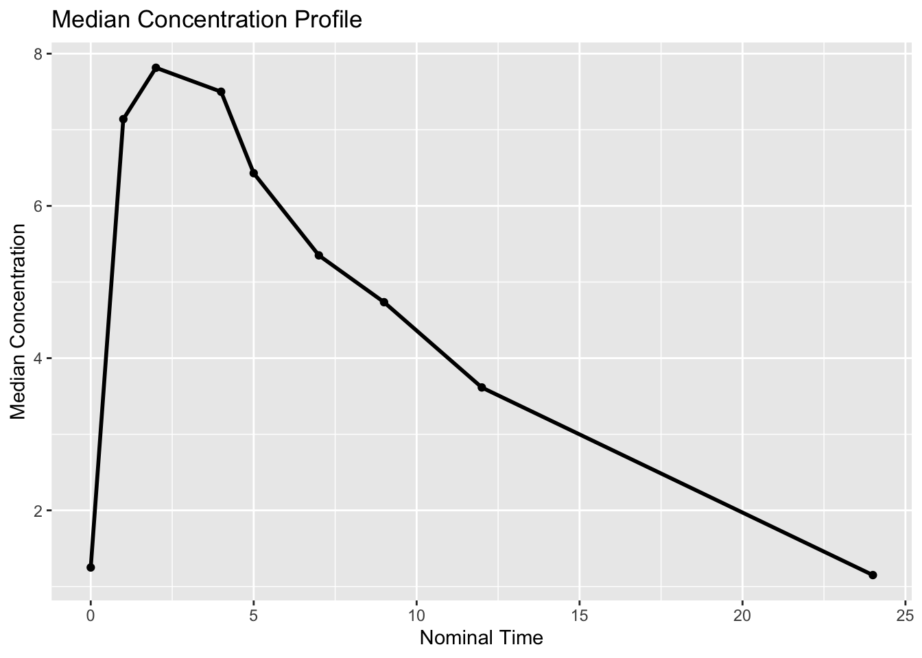
What to look for:
- absorption phase
- approximate peak timing
- elimination trend
This aggregation is only used for visualization.
Individual observation times remain unchanged for modeling.
Worked Example 4: Semi-Log Visualization
PK data are often easier to interpret on a log scale.
obs %>%
  filter(DV > 0) %>%
  ggplot(aes(TIME, DV, group = ID)) +
  geom_line(alpha = 0.35) +
  scale_y_log10() +
  labs(
    title = "Observed Profiles (Log Scale)",
    x = "Time",
    y = "Concentration (log scale)"
  )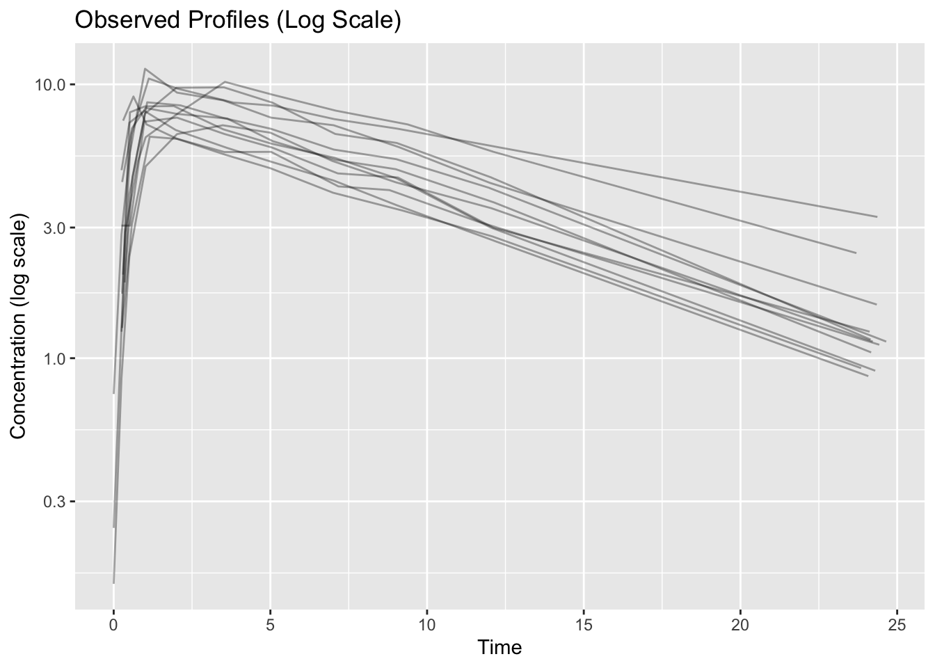
What to look for:
- linear terminal phase
- heteroscedasticity
- profile separation
A straighter terminal phase may suggest exponential decline.
Worked Example 5: Subject Variability
Summarize exposure visually.
obs %>%
  ggplot(aes(factor(ID), DV)) +
  geom_boxplot() +
  labs(
    title = "Concentration Distribution by Subject",
    x = "Subject",
    y = "Concentration"
  )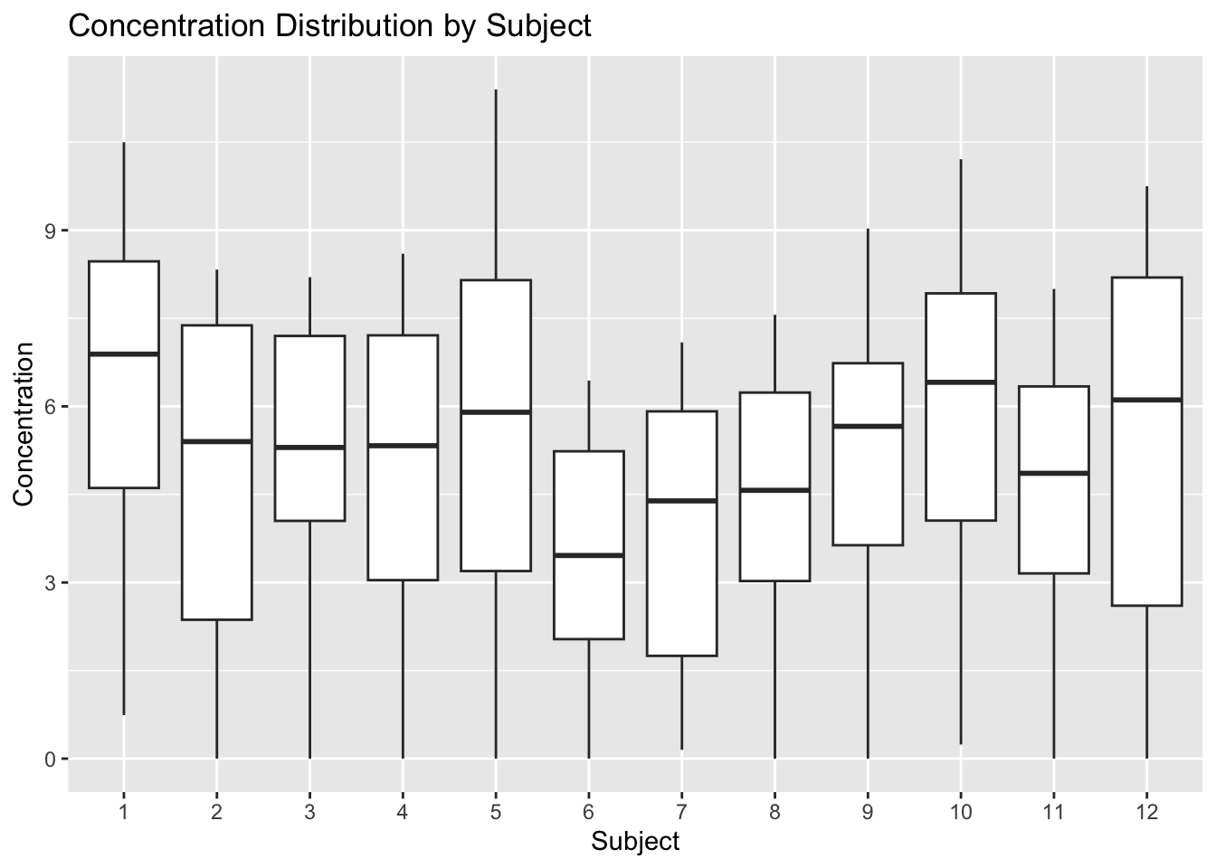
Interpretation:
Variation between subjects motivates population modeling.
Initial Modeling Questions
After visualization, ask:
- one compartment or two?
- evidence of variability?
- sparse sampling?
- unusual subjects?
- transformations needed?
Visualization should generate questions—not answers.
Strategies
- Start with individual profiles.
- Use summaries sparingly.
- Compare linear and log scales.
- Interpret scientifically.
Common Mistakes
- Jumping to model fitting.
- Hiding subject variability.
- Overinterpreting visual trends.
- Treating plots as diagnostics.
Practice Problems
- Create a spaghetti plot.
- Create a log-scale plot.
- Plot median concentration.
- Compare subject distributions.
- Write three observations.
TipStep-by-Step Solutions
Reuse the plotting code above.
Focus on interpretation rather than code changes.
Summary
- Visualization supports modeling.
- Subject-level plots reveal variability.
- Median profiles summarize trends.
- Log scales reveal additional structure.
TipQuick Tips
- Plot before modeling.
- Look at individuals first.
- Use log scale thoughtfully.
- Generate hypotheses—not conclusions.
NoteOptional EDA Tooling
The xgxr package provides pharmacometric helpers for exploratory analysis, including:
- semi-log concentration plots
- confidence interval summaries
- time formatting utilities
In this course, early exploratory plots are written directly with ggplot2 to keep plotting logic transparent.