library(tidyverse)
library(nlmixr2)
library(nlmixr2data)
library(nlmixr2plot)
library(ggPMX)

data("warfarin", package = "nlmixr2data")Joint PK/PD Modeling with Warfarin
Fit a joint PK/PD model with multiple endpoints, ODEs, diagnostics, and VPCs using the warfarin example.
Tip
Big picture: Joint PK/PD models connect exposure and response in one model. This lesson shows how ODEs, multiple endpoints, diagnostics, and VPCs come together.
Learning Objectives
By the end of this lesson, you will be able to:
- recognize multiple-endpoint PK/PD data
- explain how PK and PD endpoints are linked
- identify ODEs inside an
nlmixr2model - fit a joint warfarin PK/PD model
- inspect diagnostics and VPCs for a PK/PD model
Key Ideas
- one subject may contribute PK and PD observations
dvididentifies the endpoint- PK drives PD through concentration
- delayed response can be modeled with ODEs
- diagnostics still apply to PK/PD models
Setup
Why Joint PK/PD Modeling?
Population PK asks:
Dose → ConcentrationPK/PD asks:
Dose

↓

Concentration

↓

Response
The response may not happen immediately.
For warfarin, concentration affects a biological turnover process that changes the pharmacodynamic response over time.
Worked Example 1: Inspect Multiple Endpoints
Inspect endpoint counts.
warfarin %>%
  count(dvid)
dvid n
1 cp 283
2 pca 232Interpretation:
dvid |
Endpoint | Meaning |
|---|---|---|
cp |
PK | warfarin concentration |
pca |
PD | prothrombin complex activity |
Inspect the data.
glimpse(warfarin)Rows: 515
Columns: 9
$ id <int> 1, 1, 1, 1, 1, 1, 1, 1, 1, 1, 1, 1, 1, 1, 1, 1, 1, 1, 1, 2, 2, 2,…
$ time <dbl> 0.0, 0.5, 1.0, 2.0, 3.0, 6.0, 9.0, 12.0, 24.0, 24.0, 36.0, 36.0, …
$ amt <dbl> 100, 0, 0, 0, 0, 0, 0, 0, 0, 0, 0, 0, 0, 0, 0, 0, 0, 0, 0, 100, 0…
$ dv <dbl> 0.0, 0.0, 1.9, 3.3, 6.6, 9.1, 10.8, 8.6, 5.6, 44.0, 4.0, 27.0, 2.…
$ dvid <fct> cp, cp, cp, cp, cp, cp, cp, cp, cp, pca, cp, pca, cp, pca, cp, pc…
$ evid <int> 1, 0, 0, 0, 0, 0, 0, 0, 0, 0, 0, 0, 0, 0, 0, 0, 0, 0, 0, 1, 0, 0,…
$ wt <dbl> 66.7, 66.7, 66.7, 66.7, 66.7, 66.7, 66.7, 66.7, 66.7, 66.7, 66.7,…
$ age <int> 50, 50, 50, 50, 50, 50, 50, 50, 50, 50, 50, 50, 50, 50, 50, 50, 5…
$ sex <fct> male, male, male, male, male, male, male, male, male, male, male,…The dataset contains:
id, time, amt, dv, dvid, evid, wt, age, sexImportant variables:
| Variable | Meaning |
|---|---|
id |
subject identifier |
time |
observation time |
amt |
dose amount |
dv |
observed value |
dvid |
endpoint identifier |
evid |
event type |
wt |
weight |
age |
age |
sex |
sex |
Earlier PK examples used one endpoint.
Here:
one subject → concentration endpoint + response endpointThis introduces the idea of multiple endpoints.
Worked Example 1.5: Visualize PK and PD Observations
Before fitting the model, inspect the observed profiles.
warfarin %>%
  ggplot(
    aes(
      time,
      dv
    )
  ) +
geom_point(
  alpha = 0.5
) +
geom_line(
  aes(group = id),
  alpha = 0.15
) +
facet_wrap(
  ~ dvid,
  scales = "free_y"
) +
labs(
  title = "Observed PK and PD Profiles",
  x = "Time",
  y = "Observed Value"
)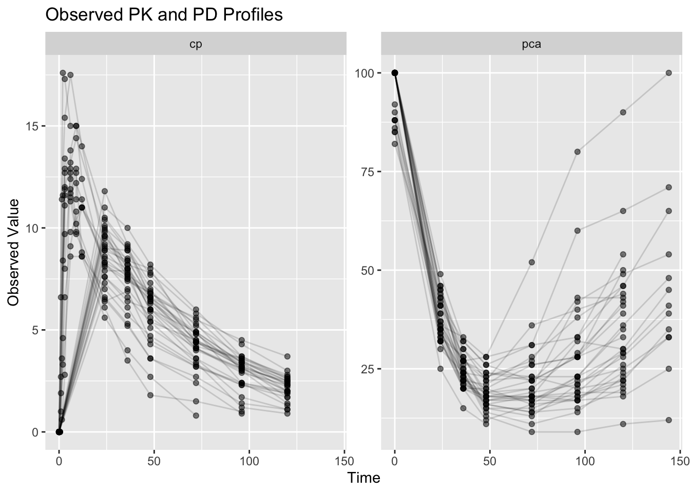
Interpretation:
Compare the endpoints.
PK (cp) often shows:
Dose

↓

Peak

↓

Decline
PD (pca) may show:
Exposure

↓

Delayed Response

↓

Recovery
Question:
Does the response appear to occur immediately?Notice that the PD response may evolve differently from concentration.
This motivates joint PK/PD modeling.
Worked Example 2: Define the Warfarin PK/PD Model
This lesson introduces a joint PK/PD model.
Compared with earlier population PK examples, this model adds pharmacodynamics.
Conceptually:
Dose

↓

Concentration

↓

Drug Effect

↓

Response
This model includes:
- transit absorption
- PK distribution
- concentration-driven inhibition of production
- indirect response dynamics
- separate observation models
Visual Intuition: Warfarin PK/PD Model
This diagram shows the model structure before reading the implementation.
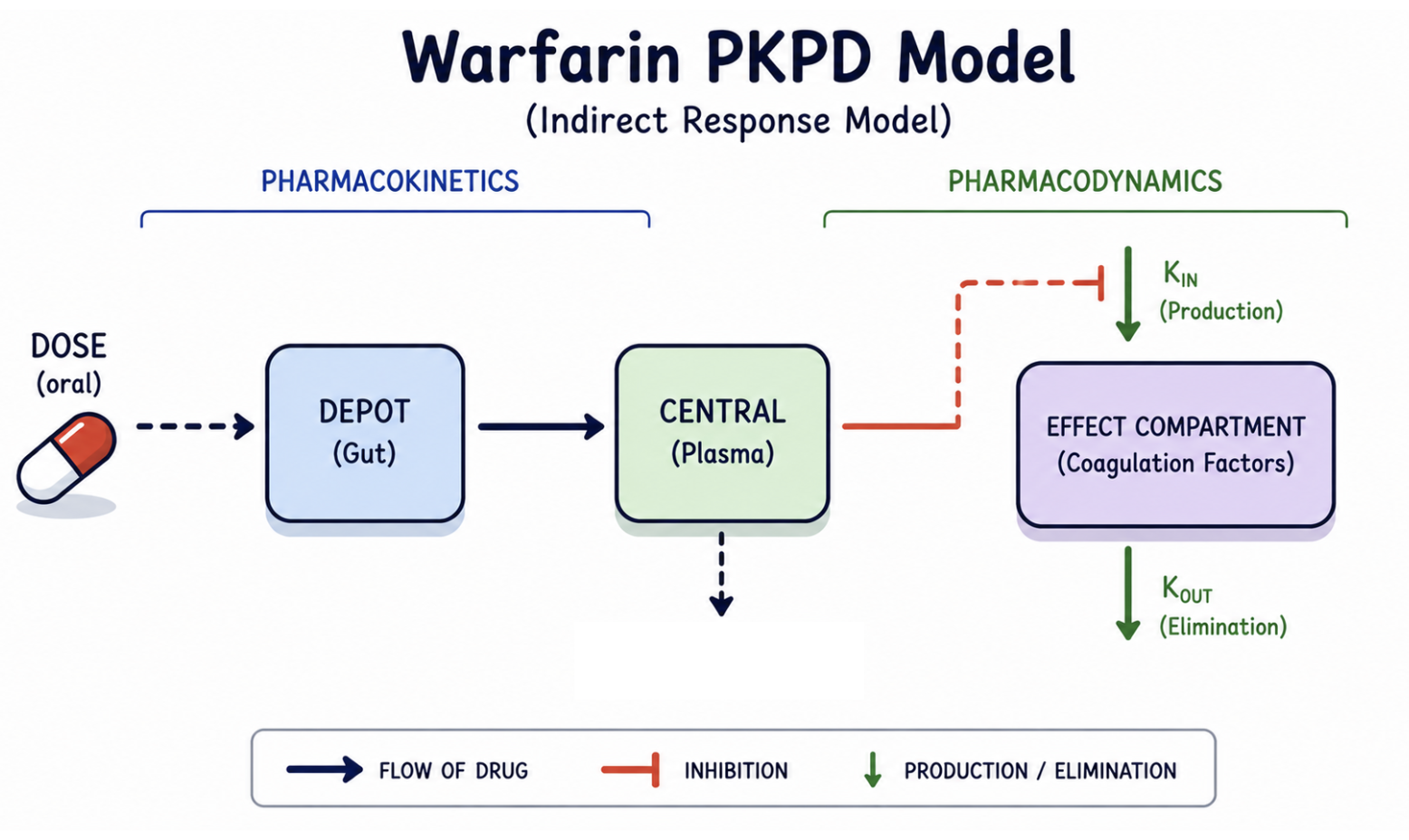
Notice:
- PK determines concentration (
cp) - concentration drives drug effect
- drug effect inhibits production
- the response (
pca) changes gradually over time
Response does not occur immediately.
This delayed behavior is why this is an indirect response model.
NoteWhy Is There a Transit Compartment?
You may notice:
Depot → Gut → CentralEarlier population PK examples often used:
Depot → CentralThis model adds a transit step.
Conceptually:
Dose
↓
Delay before absorption
↓
Systemic concentration
The transit compartment allows absorption to occur more gradually.
For this lesson, do not focus on the mathematics.
Focus on the bigger idea:
PK creates concentration
↓
Concentration drives PD
Later courses revisit transit and more advanced absorption models in greater detail.
Now inspect how this structure appears in nlmixr2.
pk_turnover_emax <- function(){

    ini({

        tktr <- log(1)
        tka <- log(1)
        tcl <- log(0.1)
        tv <- log(10)

        eta.ktr ~ 1
        eta.ka ~ 1
        eta.cl ~ 2
        eta.v ~ 1

        prop.err <- 0.1
        pkadd.err <- 0.1

        temax <- logit(0.8)
        tec50 <- log(0.5)
        tkout <- log(0.05)
        te0 <- log(100)

        eta.emax ~ 0.5
        eta.ec50 ~ 0.5
        eta.kout ~ 0.5
        eta.e0 ~ 0.5

        pdadd.err <- 10

    })

    model({

        ktr <- exp(tktr + eta.ktr)
        ka <- exp(tka + eta.ka)
        cl <- exp(tcl + eta.cl)
        v <- exp(tv + eta.v)

        emax <- expit(temax + eta.emax)
        ec50 <- exp(tec50 + eta.ec50)
        kout <- exp(tkout + eta.kout)
        e0 <- exp(te0 + eta.e0)

        dcp <- center / v

        pd <- 1 - emax * dcp / (ec50 + dcp)

        effect(0) = e0
        kin <- e0 * kout

        d/dt(depot) = -ktr * depot
        d/dt(gut) = ktr * depot - ka * gut
        d/dt(center) = ka * gut - cl / v * center
        d/dt(effect) = kin * pd - kout * effect

        cp <- center / v

        cp ~ prop(prop.err) + add(pkadd.err)
        effect ~ add(pdadd.err) | pca

    })

}
Notice two important parts.
First:
pd <- 1 - emax * dcp / (ec50 + dcp)Interpretation:
Higher concentration

↓

Stronger inhibition

↓

Lower production
Second:
d/dt(effect) = kin * pd - kout * effectInterpretation:
Rate of Change = Production − LossFinally, inspect the endpoint definitions.
cp ~ prop(prop.err) + add(pkadd.err)

effect ~ add(pdadd.err) | pca
Interpretation:
cp → PK observations

effect → PD observations
Each endpoint receives its own observation model.
This allows PK and PD behavior to be evaluated separately while remaining connected through concentration.
The | pca portion maps the model variable effect to observations whose endpoint identifier (dvid) is pca.
Conceptually:
effect state variable
        ↓
mapped to
        ↓
pca observations
Worked Example 3: Inspect the Parsed Model
Compile the model.
ui <- pk_turnover_emax()

ui
\[\begin{align*} {ktr} & = \exp\left({tktr}+{eta.ktr}\right) \\ {ka} & = \exp\left({tka}+{eta.ka}\right) \\ {cl} & = \exp\left({tcl}+{eta.cl}\right) \\ {v} & = \exp\left({tv}+{eta.v}\right) \\ {emax} & = expit({temax}+{eta.emax}, {0}, {1}) \\ {ec50} & = \exp\left({tec50}+{eta.ec50}\right) \\ {kout} & = \exp\left({tkout}+{eta.kout}\right) \\ {e0} & = \exp\left({te0}+{eta.e0}\right) \\ {dcp} & = \frac{{center}}{{v}} \\ {pd} & = {1}-\frac{{emax} {\times} {dcp}}{\left({ec50}+{dcp}\right)} \\ effect({0}) & = {e0} \\ {kin} & = {e0} {\times} {kout} \\ \frac{d \: depot}{dt} & = -{ktr} {\times} {depot} \\ \frac{d \: gut}{dt} & = {ktr} {\times} {depot}-{ka} {\times} {gut} \\ \frac{d \: center}{dt} & = {ka} {\times} {gut}-\frac{{cl}}{{v}} {\times} {center} \\ \frac{d \: effect}{dt} & = {kin} {\times} {pd}-{kout} {\times} {effect} \\ {cp} & = \frac{{center}}{{v}} \\ {cp} & \sim prop({prop.err})+add({pkadd.err}) \\ {effect} & \sim add({pdadd.err}){\lor}{pca} \end{align*}\]
Inspect endpoint mapping.
ui$multipleEndpoint variable cmt dvid*
1 cp ~ … cmt='cp' or cmt=5 dvid='cp' or dvid=1
2 effect ~ … cmt='pca' or cmt=6 dvid='pca' or dvid=2Interpretation:
cp → PK endpoint

effect → PD endpoint
Inspect the ODE structure.
Focus on:
d/dt(effect) = kin * pd - kout * effectInterpretation:
Rate of Change = Production − LossDrug concentration modifies the production term.
Worked Example 4: Fit the Joint PK/PD Model
Fit the model.
fit_warf <-
  nlmixr2(
    pk_turnover_emax,
    warfarin,
    est = "saem",
    control = list(
      print = 0
    ),
    table = list(
      cwres = TRUE,
      npde = TRUE
    )
  )
Notice that we changed estimation methods.
Earlier modules primarily used:
est = "focei"This lesson uses:
est = "saem"where SAEM stands for:
Stochastic Approximation Expectation Maximizationbecause this model combines:
- multiple endpoints
- ODEs
- nonlinear relationships
- more random effects
Conceptually:
Simpler Population PK → FOCEi often works well

More Complex PK/PD → SAEM is commonly preferred
Inspect the fit.
print(fit_warf)── nlmixr² SAEM OBJF by FOCEi approximation ──
OBJF AIC BIC Log-likelihood Condition#(Cov) Condition#(Cor)
FOCEi 1384.359 2310.053 2389.474 -1136.027 3337.016 18.81139
── Time (sec $time): ──
setup optimize covariance saem table compress
elapsed 0.002618 3e-06 0.04601 68.728 6.076 0
── Population Parameters ($parFixed or $parFixedDf): ──
Est. SE %RSE Back-transformed(95%CI) BSV(CV% or SD)
tktr 0.441 0.544 124 1.55 (0.535, 4.51) 111.
tka -0.262 0.269 103 0.769 (0.454, 1.3) 13.2
tcl -1.97 0.0511 2.6 0.14 (0.127, 0.155) 26.7
tv 2.01 0.0481 2.4 7.43 (6.77, 8.17) 21.7
prop.err 0.121 0.121
pkadd.err 0.803 0.803
temax 3.44 0.642 18.7 0.969 (0.899, 0.991) 0.248
tec50 -0.0934 0.136 146 0.911 (0.698, 1.19) 45.8
tkout -2.94 0.037 1.26 0.0531 (0.0493, 0.057) 6.01
te0 4.57 0.0115 0.251 96.6 (94.4, 98.8) 5.25
pdadd.err 3.6 3.6
Shrink(SD)%
tktr 45.0%
tka 81.2%
tcl 6.66%
tv 15.9%
prop.err
pkadd.err
temax 81.7%
tec50 9.45%
tkout 44.6%
te0 16.9%
pdadd.err
Covariance Type ($covMethod): linFim
No correlations in between subject variability (BSV) matrix
Full BSV covariance ($omega) or correlation ($omegaR; diagonals=SDs)
Distribution stats (mean/skewness/kurtosis/p-value) available in $shrink
Censoring ($censInformation): No censoring
── Fit Data (object is a modified tibble): ──
# A tibble: 483 × 44
ID TIME CMT DV EPRED ERES NPDE NPD PDE PD PRED RES
<fct> <dbl> <fct> <dbl> <dbl> <dbl> <dbl> <dbl> <dbl> <dbl> <dbl> <dbl>
1 1 0.5 cp 0 1.77 -1.77 -1.93 -1.53 0.0267 0.0633 1.38 -1.38
2 1 1 cp 1.9 4.07 -2.17 1.71 -0.954 0.957 0.17 3.87 -1.97
3 1 2 cp 3.3 7.94 -4.64 -1.93 -1.71 0.0267 0.0433 8.18 -4.88
# ℹ 480 more rows
# ℹ 32 more variables: WRES <dbl>, IPRED <dbl>, IRES <dbl>, IWRES <dbl>,
# CPRED <dbl>, CRES <dbl>, CWRES <dbl>, eta.ktr <dbl>, eta.ka <dbl>,
# eta.cl <dbl>, eta.v <dbl>, eta.emax <dbl>, eta.ec50 <dbl>, eta.kout <dbl>,
# eta.e0 <dbl>, depot <dbl>, gut <dbl>, center <dbl>, effect <dbl>,
# ktr <dbl>, ka <dbl>, cl <dbl>, v <dbl>, emax <dbl>, ec50 <dbl>, kout <dbl>,
# e0 <dbl>, dcp <dbl>, pd <dbl>, kin <dbl>, tad <dbl>, dosenum <dbl>This model may take longer than earlier PK examples.
Reasons:
- ODE solving
- multiple endpoints
- SAEM estimation
Worked Example 5: Inspect Model Output
Convert the fit output.
fit_tbl <-
  fit_warf %>%
  as_tibble()
Inspect available columns.
names(fit_tbl) [1] "ID" "TIME" "CMT" "DV" "EPRED" "ERES"
[7] "NPDE" "NPD" "PDE" "PD" "PRED" "RES"
[13] "WRES" "IPRED" "IRES" "IWRES" "CPRED" "CRES"
[19] "CWRES" "eta.ktr" "eta.ka" "eta.cl" "eta.v" "eta.emax"
[25] "eta.ec50" "eta.kout" "eta.e0" "depot" "gut" "center"
[31] "effect" "ktr" "ka" "cl" "v" "emax"
[37] "ec50" "kout" "e0" "dcp" "pd" "kin"
[43] "tad" "dosenum" Inspect the first rows.
fit_tbl %>%
  select(
    ID,
    TIME,
    CMT,
    DV,
    PRED,
    IPRED,
    CWRES
  ) %>%
  head()
# A tibble: 6 × 7
ID TIME CMT DV PRED IPRED CWRES
<fct> <dbl> <fct> <dbl> <dbl> <dbl> <dbl>
1 1 0.5 cp 0 1.38 0.504 -1.14
2 1 1 cp 1.9 3.87 1.63 -0.880
3 1 2 cp 3.3 8.18 4.32 -1.58
4 1 3 cp 6.6 10.6 6.60 -1.26
5 1 6 cp 9.1 12.2 9.65 -1.42
6 1 9 cp 10.8 11.8 9.72 -0.548Notice that endpoint information is now stored in:
CMTrather than dvid.
The fitted object now contains:
Predictions + Residuals + States + ParametersThis output becomes the foundation for diagnostics and model evaluation.
Worked Example 6: Explore Built-In Diagnostic Plots
nlmixr2 can generate diagnostic plots directly from the fitted object.
Instead of printing all plots at once, store them in an object.
pl <-
  plot(
    fit_warf
  )
Inspect the top-level structure.
names(pl)[1] "traceplot" "Endpoint: depot" "Endpoint: gut"
[4] "Endpoint: center" "Endpoint: effect" "Endpoint: cp"
[7] "Endpoint: pca" Interpretation:
The object separates diagnostics by endpoint.
You should see endpoint-specific groups such as:
Endpoint:  cp
Endpoint:  pca
This is useful for joint PK/PD models because PK and PD endpoints should be interpreted separately.
Inspect the available plots for the PK endpoint.
names(
  pl$`Endpoint:  cp`
)
[1] "dv_pred_ipred_linear" "dv_pred_ipred_log" "dv_cpred_linear"
[4] "dv_cpred_log" "dv_epred_linear" "dv_epred_log"
[7] "NPD_TIME_linear" "NPD_TIME_log" "RES_TIME_linear"
[10] "RES_TIME_log" "IRES_TIME_linear" "IRES_TIME_log"
[13] "IWRES_TIME_linear" "IWRES_TIME_log" "CWRES_TIME_linear"
[16] "CWRES_TIME_log" "NPD_EPRED_linear" "NPD_EPRED_log"
[19] "RES_EPRED_linear" "RES_EPRED_log" "IRES_EPRED_linear"
[22] "IRES_EPRED_log" "IWRES_EPRED_linear" "IWRES_EPRED_log"
[25] "CWRES_EPRED_linear" "CWRES_EPRED_log" "NPD_PRED_linear"
[28] "NPD_PRED_log" "RES_PRED_linear" "RES_PRED_log"
[31] "IRES_PRED_linear" "IRES_PRED_log" "IWRES_PRED_linear"
[34] "IWRES_PRED_log" "CWRES_PRED_linear" "CWRES_PRED_log"
[37] "NPD_IPRED_linear" "NPD_IPRED_log" "RES_IPRED_linear"
[40] "RES_IPRED_log" "IRES_IPRED_linear" "IRES_IPRED_log"
[43] "IWRES_IPRED_linear" "IWRES_IPRED_log" "CWRES_IPRED_linear"
[46] "CWRES_IPRED_log" "NPD_CPRED_linear" "NPD_CPRED_log"
[49] "RES_CPRED_linear" "RES_CPRED_log" "IRES_CPRED_linear"
[52] "IRES_CPRED_log" "IWRES_CPRED_linear" "IWRES_CPRED_log"
[55] "CWRES_CPRED_linear" "CWRES_CPRED_log" "NPD_tad_linear"
[58] "NPD_tad_log" "RES_tad_linear" "RES_tad_log"
[61] "IRES_tad_linear" "IRES_tad_log" "IWRES_tad_linear"
[64] "IWRES_tad_log" "CWRES_tad_linear" "CWRES_tad_log"
[67] "individual_1" "individual_17" You will see many available diagnostic plots, including:
- observed vs predicted plots
- residuals vs time
- residuals vs predictions
- individual profile plots
Examples include:
dv_pred_ipred_linear
CWRES_TIME_linear
CWRES_PRED_linear
individual_1
Interpretation:
We will not use every plot.
Instead, we will select a few diagnostic plots that answer the most important questions.
For this introductory PK/PD lesson, focus on:
| Question | Example plot |
|---|---|
| Do observations agree with predictions? | dv_pred_ipred_linear |
| Are residuals centered over time? | CWRES_TIME_linear |
| Are residuals centered across predictions? | CWRES_PRED_linear |
| Do individual profiles look reasonable? | individual_1 |
This keeps the lesson focused while still showing that the fitted object contains a rich diagnostic set.
NoteWhy Use
plot(fit_warf) Instead of ggPMX Here?
Earlier diagnostic lessons emphasized ggPMX.
That remains an excellent workflow for many population PK models.
This lesson introduces something new:
Multiple Endpoints + Joint PK/PD ModelsFor these models, plot(fit) provides a convenient advantage:
- diagnostics are already organized by endpoint
- PK and PD outputs stay separated
- many diagnostic plots are generated automatically
Conceptually:
Single Endpoint → ggPMX often works naturally

Multiple Endpoints → built-in endpoint diagnostics become convenient
This is not a rule.
Use the tool that makes interpretation clearer.
Worked Example 7: Observed versus Predicted by Endpoint
Inspect observed versus predicted behavior for the PK endpoint.
pl$`Endpoint: cp`$dv_pred_ipred_linear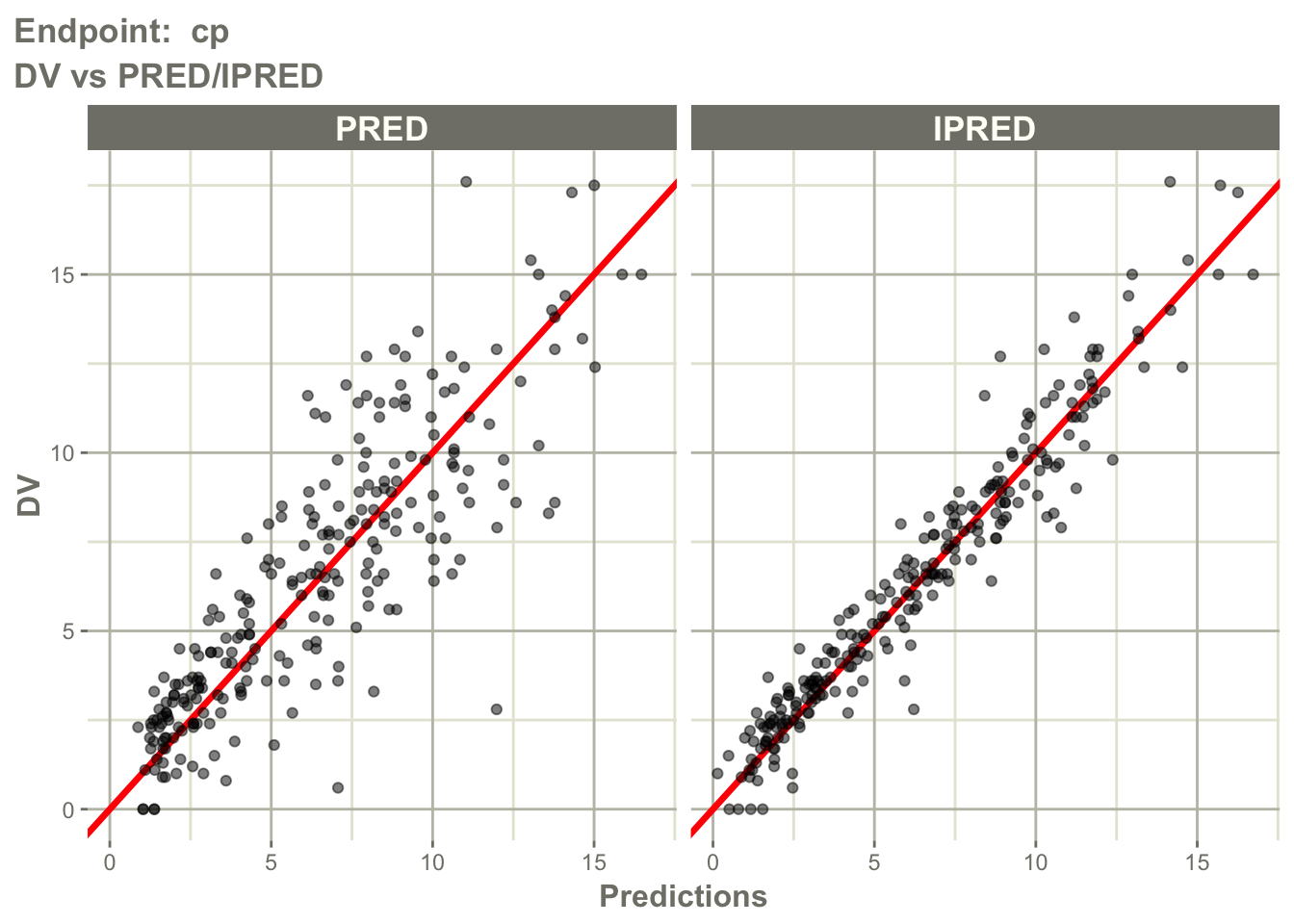
Inspect observed versus predicted behavior for the PD endpoint.
pl$`Endpoint: pca`$dv_pred_ipred_linear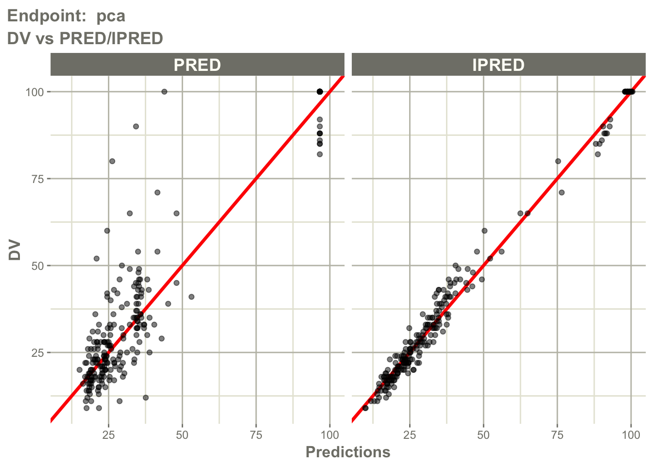
Interpretation:
Ask separately for cp and pca:
- are observations centered around predictions?
- does
IPREDimprove agreement compared withPRED? - is there endpoint-specific bias?
- does one endpoint fit better than the other?
This is important because a model may describe PK well but PD poorly, or the reverse.
Worked Example 8: Residuals versus Prediction by Endpoint
Inspect residual behavior for the PK endpoint.
pl$`Endpoint: cp`$CWRES_PRED_linear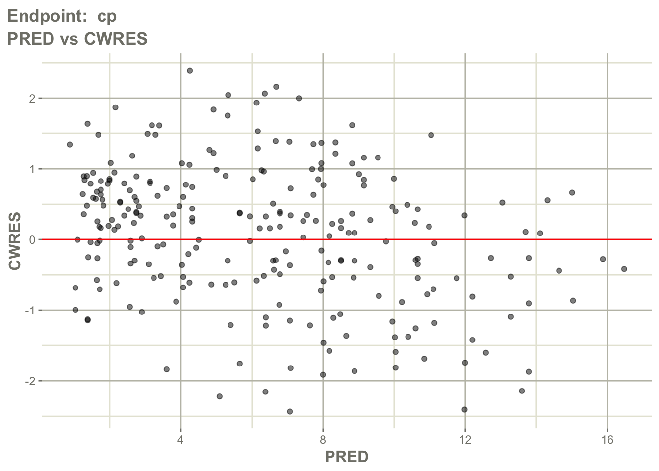
Inspect residual behavior for the PD endpoint.
pl$`Endpoint: pca`$CWRES_PRED_linear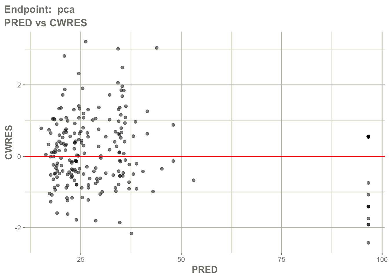
Interpretation:
Look for:
- residuals centered around zero
- absence of strong trends
- endpoint-specific residual spread
- extreme residuals
Question:
Are prediction errors random for both endpoints?Worked Example 9: Residuals Over Time by Endpoint
Inspect residuals over time for the PK endpoint.
pl$`Endpoint: cp`$CWRES_TIME_linear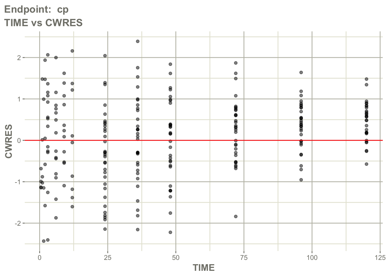
Inspect residuals over time for the PD endpoint.
pl$`Endpoint: pca`$CWRES_TIME_linear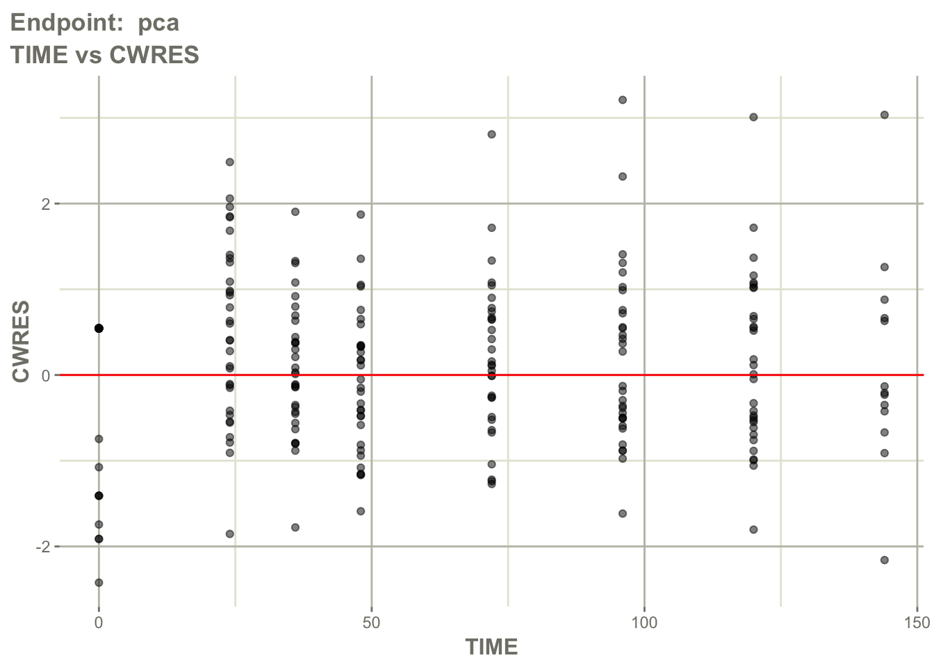
Interpretation:
Ask:
- is there time-dependent bias?
- does bias differ between PK and PD?
- does the delayed response appear adequately captured?
- are residuals worse at early or late times?
This helps evaluate whether the ODE structure captures response timing.
Worked Example 10: Individual Profiles by Endpoint
Inspect individual profile behavior for the PK endpoint.
pl$`Endpoint: cp`$individual_1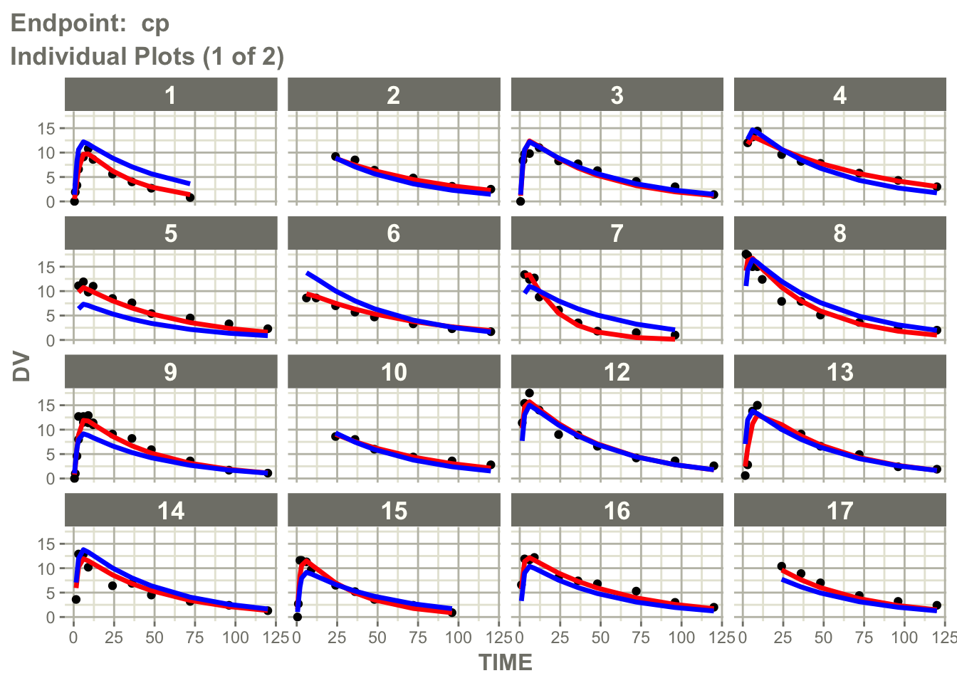
Inspect individual profile behavior for the PD endpoint.
pl$`Endpoint: pca`$individual_1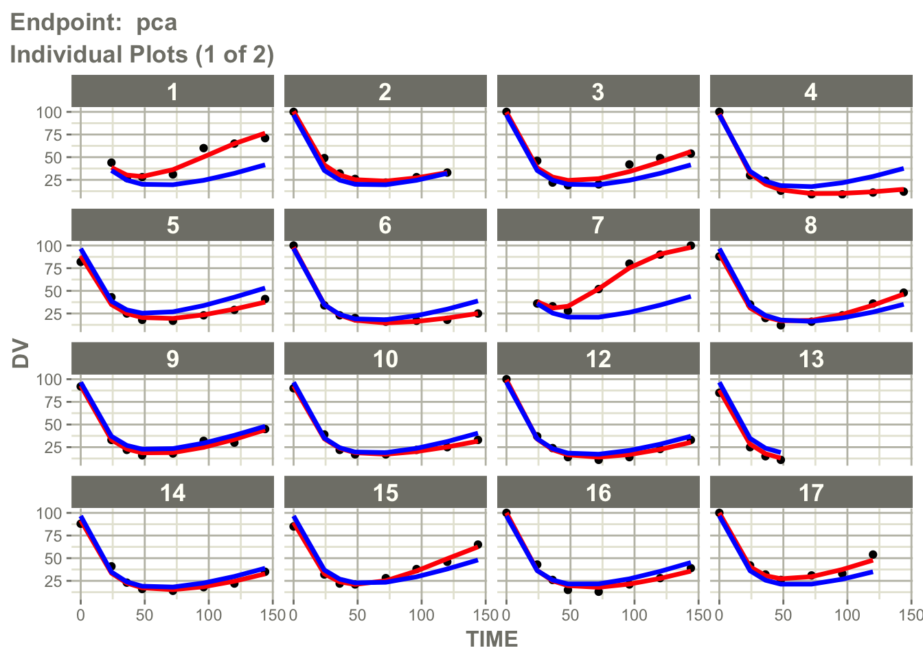
Interpretation:
Individual profile plots answer a different question than observed versus predicted plots.
Observed vs Predicted → point agreement

Individual Profiles → trajectory agreement
Ask:
- does the model reproduce individual profile shapes?
- are peaks and declines captured?
- does the PD response timing look reasonable?
- do some subjects show systematic mismatch?
This is especially useful in PK/PD models where timing and delayed response matter.
Worked Example 11: Visual Predictive Check for the Joint Model
VPCs remain useful for joint PK/PD models.
Question:
If the PK/PD model were true,
would simulated data resemble observations?
Generate a VPC.
vpcPlot(
  fit_warf,
  n = 100,
  bins = "jenks",
  scales = "free"
)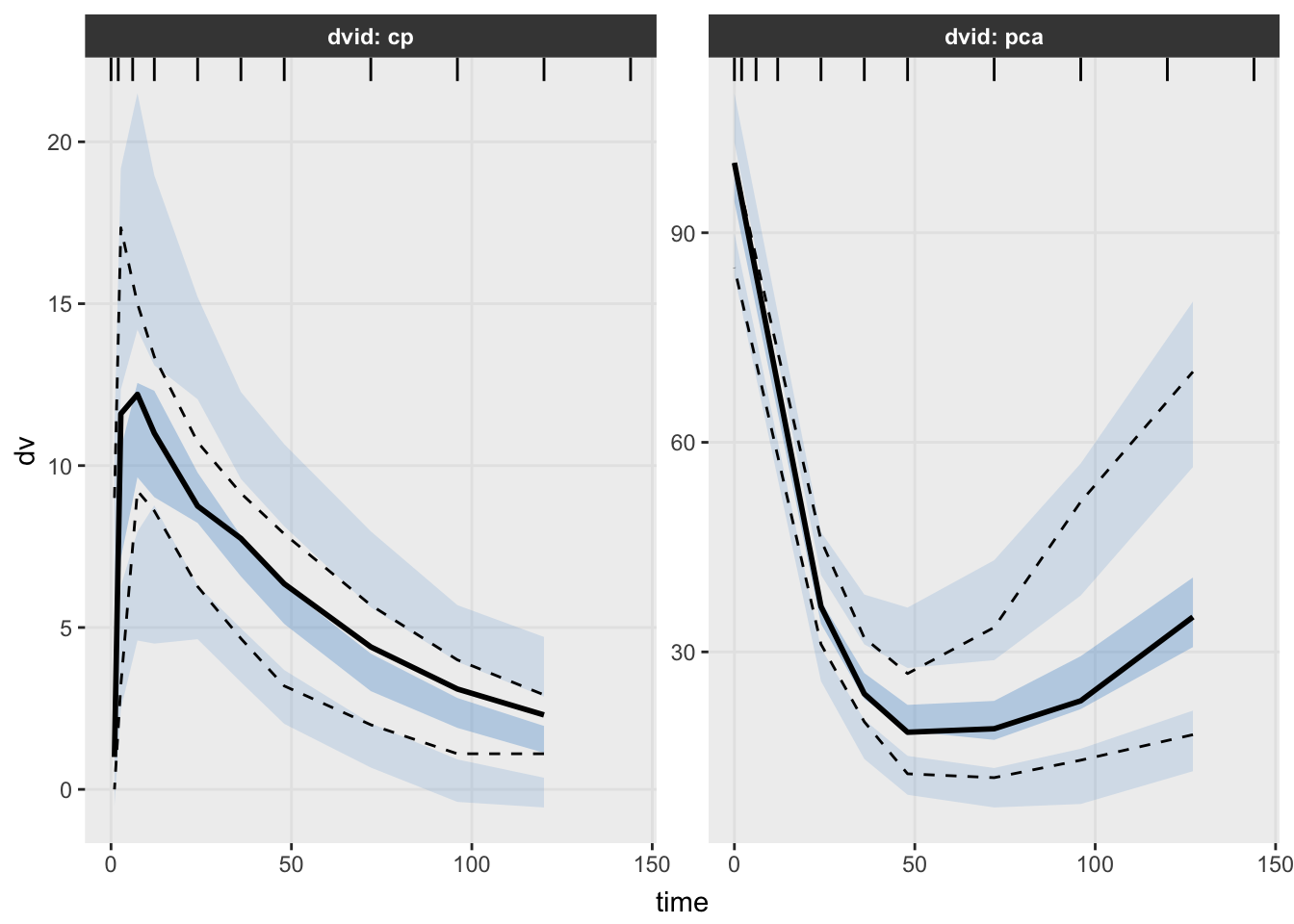
Interpretation:
Unlike earlier modules, interpret this VPC carefully.
This model contains:
PK Endpoint + PD EndpointLook for:
- agreement in central tendency
- agreement in variability
- delayed response behavior
- endpoint-specific deviations
Question:
Does the model reproduce both exposure and response?VPCs for multiple-endpoint PK/PD models are powerful, but they require careful interpretation because endpoints may have different scales and biological meanings.
What Changed Compared with Population PK?
Population PK:
Dose → ConcentrationJoint PK/PD:
Dose

↓

Concentration

↓

Response
The main new pieces are:
- multiple endpoints
- ODE implementation
- PD turnover
- endpoint-specific diagnostics
Looking Ahead
The next lesson focuses on interpretation.
We will interpret:
- \(E_{max}\)
- \(EC_{50}\)
- \(k_{in}\)
- \(k_{out}\)
- baseline response
- delayed response behavior
Strategies
- inspect endpoint counts
- interpret ODEs biologically
- evaluate PK and PD behavior separately
- use diagnostics and VPCs together
Common Mistakes
- assuming PD follows concentration immediately
- ignoring endpoint-specific residual error
- treating ODEs as abstract math
- assuming complexity means adequacy
Practice Problems
What does
dvidrepresent in the warfarin dataset?Why is the warfarin model an indirect response model?
What does this line represent?
d/dt(effect) = kin * pd - kout * effectWhy does the model need both
cpandeffectendpoints?Why should diagnostics be interpreted by endpoint?
TipStep-by-Step Solutions
Problem 1
dvid identifies the endpoint.
In this dataset:
cp → PK concentration
pca → PD response
Problem 2
The drug does not directly equal the response.
Concentration modifies a turnover process.
That turnover process changes the response over time.
Problem 3
This is the ODE for the PD response.
It means:
rate of response change = production/input - lossThe drug changes the input term through pd.
Problem 4
cp represents concentration.
effect represents response.
PK/PD modeling needs both because exposure and response are modeled together.
Problem 5
A model may describe PK well but PD poorly, or the reverse.
Endpoint-specific diagnostics help identify where the model is adequate and where it may need improvement.
Summary
- warfarin introduces joint PK/PD modeling
dvididentifies PK and PD endpoints- ODEs are implemented directly in
nlmixr2 - warfarin uses an indirect response structure
- diagnostics and VPCs still matter
TipQuick Tips
cp= PK endpointpca= PD endpoint- ODE = change over time
- PK drives PD
- Diagnostics still matter